2016 was an extraordinarily busy year for me. I was preparing for my October exhibition, Chopping Wood on the Astral Plane and I worked very steadily through the year, regularly seven days a week. I confess that I didn't get out much to see exhibitions. Like most artists, I feel torn about this. How do we, as artists, approach our art viewing? Is it a responsibility and an obligation? Is it a pleasure and a reward? Or, is it sustenance for our souls? To me, it's all of those things. When I am on an Art Ninja trip--that is, a vacation that is largely dedicated to viewing art--I will see anything and everything, voraciously and enthusiastically. I don't mind seeing shows that fall short, shows that disappoint, shows that "aren't my thing." However, when I am in town and in the studio with looming deadlines, I am very careful about my time management. I try to see friends' exhibitions, and things that I am particularly interested in. This year, I missed a lot. But, looking back, I experienced some wonderful work that punctuated my intensive hours in the studio. Here are a few highlights, in no particular order.
Christian Marclay: Six New Animations at Fraenkel Gallery. I loved this exhibition. Marclay, master of time and of whimsical, careful editing, has created mesmerizing animations from thousands of still photographs of urban detritus such as bottle caps, straws, cigarettes, old chewing gum and the like. The static images are arranged, stop-motion style, so that the objects transform: cigarettes appear to burn, from just-lit to down to the filter and then, miraculously, back to full length; bottle caps and lids appear as pulsating orbs, increasing and decreasing in size; straws assume the position of clock hands, playfully telling time. Like all of Marclay's work, these projected animations are amazingly clever, poignant and just plain fun.

CHRISTIAN MARCLAY, Bottle Caps (video still), 2016
Single-channel projected animation, silent

CHRISTIAN MARCLAY, Chewing Gum (video still), 2016
Single-channel projected animation, silent
Bridget Riley: The Interactive Character of Color, 1970-2014 at John Berggruen Gallery. Riley is one of my favorite painters and also an extraordinarily accomplished writer. I return to her writings on the subject of color again and again. The purity of her approach and her sensitivity to the elusive nature of color is what makes the work effective. It is difficult to focus one's eyes when viewing the paintings. Everything moves and shifts. Each shape and color, so deceptively simple and direct, is in flux. This exhibition included a selection of works (paintings as well as studies on paper) spanning thirty-five years.
“At the core of color lies a paradox. It is simultaneously one thing and several things – you can never see color by itself, it is always affected by other colors…Color relationships in painting depend on the interactive character of color; this is its essential nature.”

BRIDGET RILEY, Chord, 2014, oil on linen, 61 1/4 x 104 3/4 inches
I was very delighted to see this recent work. It was one of the most vibrant and compelling pieces in the exhibition.

Yes, I am one of those painters who obsesses over the sides and edges of paintings. This gave me a little thrill.
Nicole Couch (Pink, Fuchsia, Orange), 2010 by Liz Craft at Los Angles County Museum of Art. I spent at day at LACMA with my friend Tom during Thanksgiving weekend. We went for the express purpose of seeing the John McLaughlin exhibition, but we also perused the permanent collection. I hadn't been there in a number of years, so it was nice to reacquaint myself with the collection. I especially enjoyed the Giacometti installation, Matisse's 1953 La Gerbe, and Chris Burden's Urban Light and Metropolis II.
One work that I am still thinking about is Liz Craft's large figurative sculpture, which was part of her 2010 exhibition Death of a Clown at Patrick Painter, Inc. To be honest, I am not sure why this work has stayed with me over the past month. When time is short I am usually determined to see things that I know I will love. To me, the greatest reward is seeing a painting that I've read about and thought about for years. To experience it in real time and space and light... well, that is what I live for. So it is a bit of a surprise that one of the most memorable works that I saw this year is a downright weird, kitschy figurative sculpture.

LIZ CRAFT, Nicole Couch (Pink, Fuchsia, Orange), 2010, fiberglass and paint, 32 x 98 x 40.5 inches
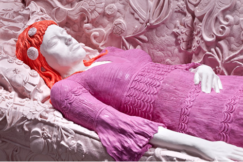
This life-size figure in repose on a sofa is odd. First, LACMA has the title wrong. On the card, the title is Death of a Clown, but as it turns out, that was the name of Craft's exhibition at Patrick Painter, Inc. Nicole Couch is a strange title. Why isn't it Nicole on the Couch or Nicole's Couch? Then, there is the color. The palette is limited to the pink of the couch, the magenta-purple gown, orange hair and near-white skin. Is the figure supposed to be asleep? Dead? There is a romantic, Pre-Raphaelite quality about the piece. The heavy relief texture of the sofa writhes around the still figure. The decorative details are sharply incised, yet the figure is somewhat ill-defined. The piece stands out, I think, because of it's anachronistic, romantic qualities, as well as the use of materials, which have the presence of unfired ceramic clay. There is something abject and grotesque about it; it's strangely half-baked. Because it is life-size and rather boxy, it is an awkward presence in the gallery. For the record, I'm not sure I would categorize this piece as "important." No matter. It certainly claims its space and it does not allow the viewer to ignore it. That counts for something, doesn't it?
John McLaughlin Paintings: Total Abstraction at LACMA. This exhibition was the real purpose for our visit to LACMA, and it did not disappoint. The museum's webpage for the exhibition includes a terrific video, Seeing John McLaughlin, in which artists Ed Moses, Mark Grotjahn, Roy McMakin, Marcia Hafif, Tony Berlant, Tony DeLap, and James Hayward share their insights on John McLaughlin and his paintings. It is a treat to hear them address the subtle qualities of McLaughlin's abstractions. See also Christopher Knight's terrific review of the exhibition.

Photo credit: Kirk McKoy / Los Angeles Times
McLaughlin is one of those artists who gives us all hope. He was an odd duck: self-taught and late to the game, having begun painting at age 48. His brand of abstraction was not so much in line with seemingly obvious antecedents, such as Mondrian; rather, it was based in his interest in Japanese art. He lived outside of the mainstream, he did not fit neatly into the LA art scene, nor did he teach at any of the local art schools. However, he (along with Karl Benjamin, Lorser Feitelson and Frederick Hammersley) was included the groundbreaking exhibition Four Abstract Classicists, which opened at SFMOMA in 1959. How I wish I could go back in time to see that show! According to the current exhibition's catalogue (which is a great resource and well worth the price) Four Abstract Classicists was organized by LACMA, but opened at SFMOMA because of a scheduling conflict. The catalogue thoroughly documents the legendary exhibition, which is reason enough to buy it.
“Utopianism, however, was not his goal. European abstraction provided a form for his art’s embodiment of Japanese aesthetic philosophy.
McLaughlin had looked at Japanese paintings since his childhood outside Boston. Son of a jurist on the state’s Superior Court, he was a regular visitor to the illustrious Japanese collection at the Museum of Fine Arts. His great-uncle was a collector, and he left his Japanese paintings to McLaughlin’s mother.”

Photo credit: Kirk McKoy / Los Angeles Times
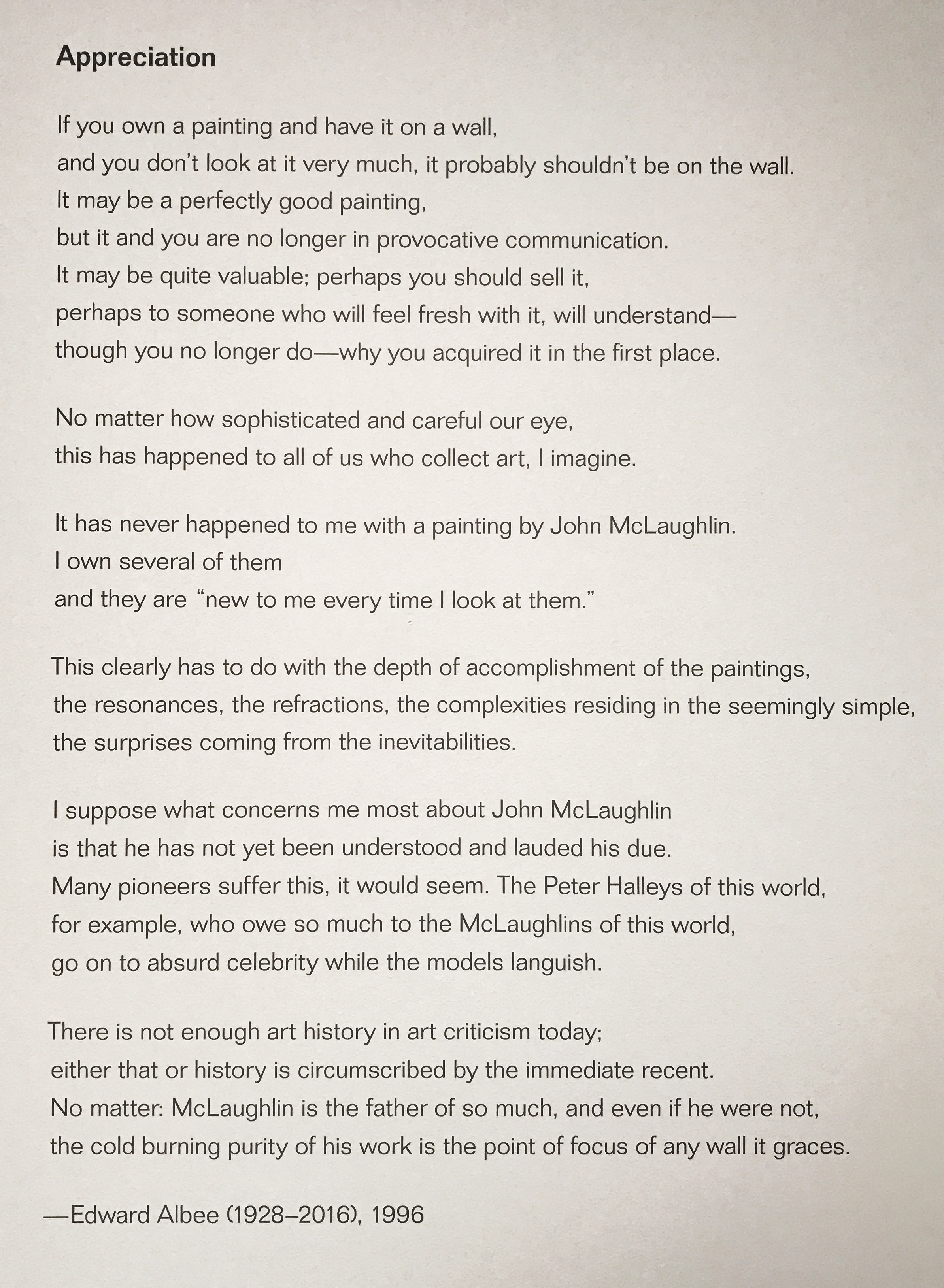
In LACMA's video, Seeing John McLaughlin, each of the artists attempts to describe the qualities that make McLaughlin's paintings effective. Tony DeLap says that they exhibit "a depth of feeling." Yes. And yet...how, exactly, do paintings show feeling? Feeling. It is essential, yet elusive. In the exhibition, there is a text written by Edward Albee, who owned several of McLaughlin's works.
Finally, there is the matter of the patina of age on these works. It is something that I think about a lot. Over time, all paintings change-- either a lot or, at best, a little. Colors darken and yellow, cracks appear in the paint, edges are scuffed during handling. I worry about how my own work will hold up over time. I want my paintings to look exactly as they do today until the end of time. And yet, as a viewer and as a lover of painting, I enjoy the physical history of work; the little bumps and bruises that accumulate over time.

Joan Brown: Presence Known at Anglim Gilbert Gallery. This terrifically strong show included paintings form 1974-81. I was bowled over by the power of these works. Everything about them is strident, direct and forthright. Every formal decision seems necessary and right. There's so much freedom and humor in these works. They are personal, yet matter of fact. The works cross through the categories of Beat, Funk and Pop, but they also go beyond, touching on painterly concerns that have preoccupied artists for hundreds of years. I greatly enjoy Brown's exploration of the confines of the picture plane and her sophisticated sense of pictorial space.

JOAN BROWN, The Bicentennial Champion, 1976, oil and enamel on canvas, 96 x 78 inches
JOAN BROWN, The Room, Part I, 1975 , enamel on canvas, 85.5 x 73.5 inches
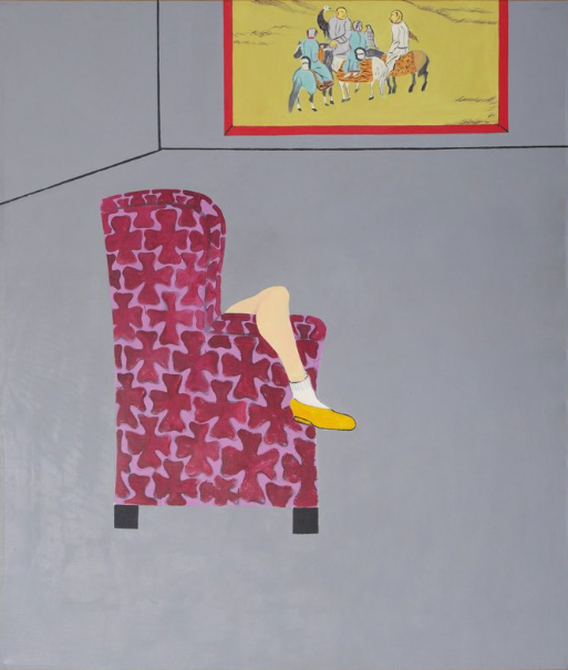
My favorite piece in the show was The Room, Part I, 1975. This painting is odd and mysterious. It took me a while to realize that the bent knee reminded me of several Balthus paintings. It's a familiar gesture: a slumping posture that connotes petulance and boredom, but also flirtatiousness and sexual availability-- at least when rendered by a male artist. In this case, in the hands of a female painter, the figure is largely hidden by the chair. The viewer's gaze is directed (by the yellows and reds) back and forth between the shoe, the chair and the painting on the wall in the otherwise bare grey room (which reminds me of Francis Bacon's simply rendered rooms, defined only by a few succinct lines). The male gaze--that of the viewer regarding the petulant, flirty girl-- is subverted. Instead, the viewer looks at a girl who is (presumably) looking at the painting. The room is otherwise empty. Nothing else matters. The painting within the painting depicts a group of people (men?) and horses. Perhaps it is a pre- or post-battle congregation of sorts. The men seem to be "other." Their hair, garments and horses indicate that perhaps they are Native Americans. I have been thinking about this painting for months. It interests me on so many levels: formally (color, composition, spatial sense), art historic connection (Balthus, Bacon), state of mind of the artist (the importance of painting), and gender/identity (position of the subject, position of the object).

BALTHUS, Girl with Cat, 1937

BALTHUS, The Golden Years, 1945

Landfill/Bedrock at Guerrero Gallery
Guerrero Gallery's new space. Like many in San Francisco, I am happy to see that Guerrero Gallery has found a new location. Finding it is a bit of an adventure, as it is tucked behind an interior design warehouse that's full of giant amethyst crystals, Buddha statues, hunks of petrified wood, air plants and antique doors and furniture from Asia. Once you make your way through, into the bright, clean gallery space, your are in a world beyond a world. The experience is like emerging from a primeval land into PeeWee's Playhouse. Two shows caught my attention this year: Landfill/Bedrock and PURPLE [Tears of Rage]. Both were bright, fun, light, brash and pleasingly rough around the edges. The exhibitions were beautifully installed, the light is gorgeous, and it is great to see this new incarnation of the gallery, which previously skewed heavily toward young male artists. Perhaps it's too soon to tell, but Guerrero seems to be showing more abstraction and more women artists in its new location.

JAMES GOBEL, I Used To/Still Care, 2014-16. Felt, acrylic,
yarn, and embroidery thread on canvnas, 58 x 42 in.
I was excited to see this new piece by James Gobel in Landfill/Bedrock. I'm not sure if this is a one-off or a new direction for him, but I love the looseness, even as he adheres to his usual labor-intensive process of piecing together 'paintings' out of felt and yarn. This piece looks like a sheet of ruled paper, turned vertically and covered with text and scribbles. Very strong.
PURPLE [Tears of Rage] was another solid group show at Guerrero. I enjoyed Sofie Ramos' monochromatic paintings, even though they tend to reside in the 'one-liner' category, consisting of pre-fab textile materials saturated with paint and mounted on panels. My favorite is outrage, our rage, orange (FTD), which looks like a patch of shag carpet dipped in orange paint, or a pile of cheetos standing up on end. Of course, it recalls Yayoi Kusama's accumulation works, as well.

SOFIE RAMOS, outrage, our rage, orange (FTD), 2016. Latex, hand sponge mounted to panel. 5.5 x 4.5 x 4.4 inches.

YAYOI KUSAMA, Compulsion Furniture (Accumulation), c. 1964
I was happy to see Linda Geary's new work at Guerrero. During the run of PURPLE [Tears of Rage], Linda had work in a concurrent exhibition, I Dreamt Bees Made Honey From My Past Failures at George Lawson Gallery. When I saw Linda's large painting at Lawson, I thought: "That painting is coming apart. It wants to be pulled apart. It's barely holding together." So, it was surprising and gratifying to see Linda's installation, Everything Comes from Something, Only Something Comes from Nothing, an installation of 100+ shaped paintings, most of them quite diminutive, arranged along one rough wall of the gallery.
These small works look like they have been cut from existing paintings on panel with a jigsaw or a scroll saw. The installation takes full advantage of the gallery's architecture; forms are arranged along a ragged concrete ledge. The shapes are engaged in conversation with the other works in the show and with each other. As a group, they are quite lyrical. They remind me a little of Jean Arp's relief works. Linda Geary is a painter who is always pushing the boundaries, exploring the depths and mixing things up. I always feel the urgency of her painterly inquiry when I see her work.

LINDA GEARY, Everything Comes from Something, Only Something Comes From Nothing, 2012-2016.
100+ paintings, various sizes, acrylic and oil on panel

LINDA GEARY, Everything Comes from Something, Only Something Comes From Nothing, 2012-2016.
100+ paintings, various sizes, acrylic and oil on panel
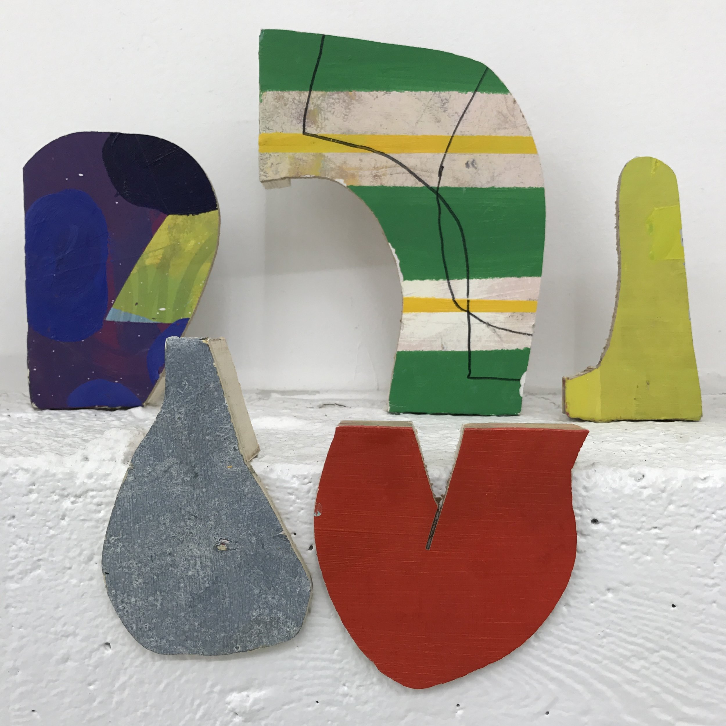
LINDA GEARY, Everything Comes from Something, Only Something Comes From Nothing, 2012-2016.
100+ paintings, various sizes, acrylic and oil on panel
A confession: I have a soft spot for kitsch. Therefore, I greatly enjoyed Laura Rokas' works in PURPLE [Tears of Rage]. These paintings and ceramic sculptures are so fun, personal and clever. The work suggests that her process involves a continual circuit between 2-D and 3-D object; she makes paintings of sculptures, and sculptures of paintings. I am really looking forward to seeing Rokas' work develop over time.

LAURA ROKAS, Stabbed in the Back, Let Your Rage Guide the Way, 2016. Hand sewn patches on felt and linen; cotton embroidery floss, acid washed denim, synthetic hair, 30 x 24 inches

LAURA ROKAS, R.O.K.A.S. (Rage Out Kut And Scratch), 2016. Hand sewn patches; cotton embroidery floss on felt, vinyl, canvas, 20 x 18 inches.
I am in love with these custom hand-sewn patches. These works remind me of Matthew Palladino's plaster reliefs.

LAURA ROKAS, various works, ceramic

LAURA ROKAS, Seeing Red, 2016. Oil on canvas, 28 x 36 inches
This painting makes me grin from ear to ear.

Suzanne Blank Redstone at Jessica Silverman Gallery
Suzanne Blank Redstone: 1960s Portal Paintings at Jessica Silverman Gallery. I loved this exhibition! What a treat to see these works unearthed by Silverman. While I don't know how this show came about, I am delighted that it did (even though it falls into the problematic category of "exhibitions-by-ignored/overlooked-women-artists-rediscovered-by-hipster-gallerists-hoping-to-make-a-killing"). Redstone is in her 70s and has spent most of her career without the support of a gallerist. Looking at the works online before I saw the show, I wasn't sure if they would hold up, but indeed they did. Some of them remind me of my favorite Al Held paintings. The paintings have a nice, 'complete, yet not overworked' quality. Some aspects are a bit rough, such as the blended gradient areas, which makes them seem more urgent. I mused that, if these were made today, they would be more slick, more labored. Redstone's faster, lighter touch works somehow, and helps to locate the paintings within their timeframe. Her works on paper (which I would categorize as studies) are beautiful, too--very assured--and nearly as powerful as the large paintings, despite their small scale.

SUZANNE BLANK REDSTONE, Portal 1, 1967. Acrylic on shaped masonite, 44.5 x 66 inches

SUZANNE BLANK REDSTONE, Portal - Descent, 1968. Acrylic on masonite, 41 x 74.5 inches
A few other shows worth mentioning, below. Please click links to view.
RADICAL: Monochrome Paintings from the Goodman Duffy Collection at George Lawson Gallery
WINSTON ROETH, Insider, 2001. Acrylic on Hexcel® honeycomb panel
45 x 32 in.

LOUISE NEVELSON, Untitled, 1964
I love the satiny black of this piece, which reads almost like graphite. Once your eyes adjust to the value scale, the whole piece comes into focus.

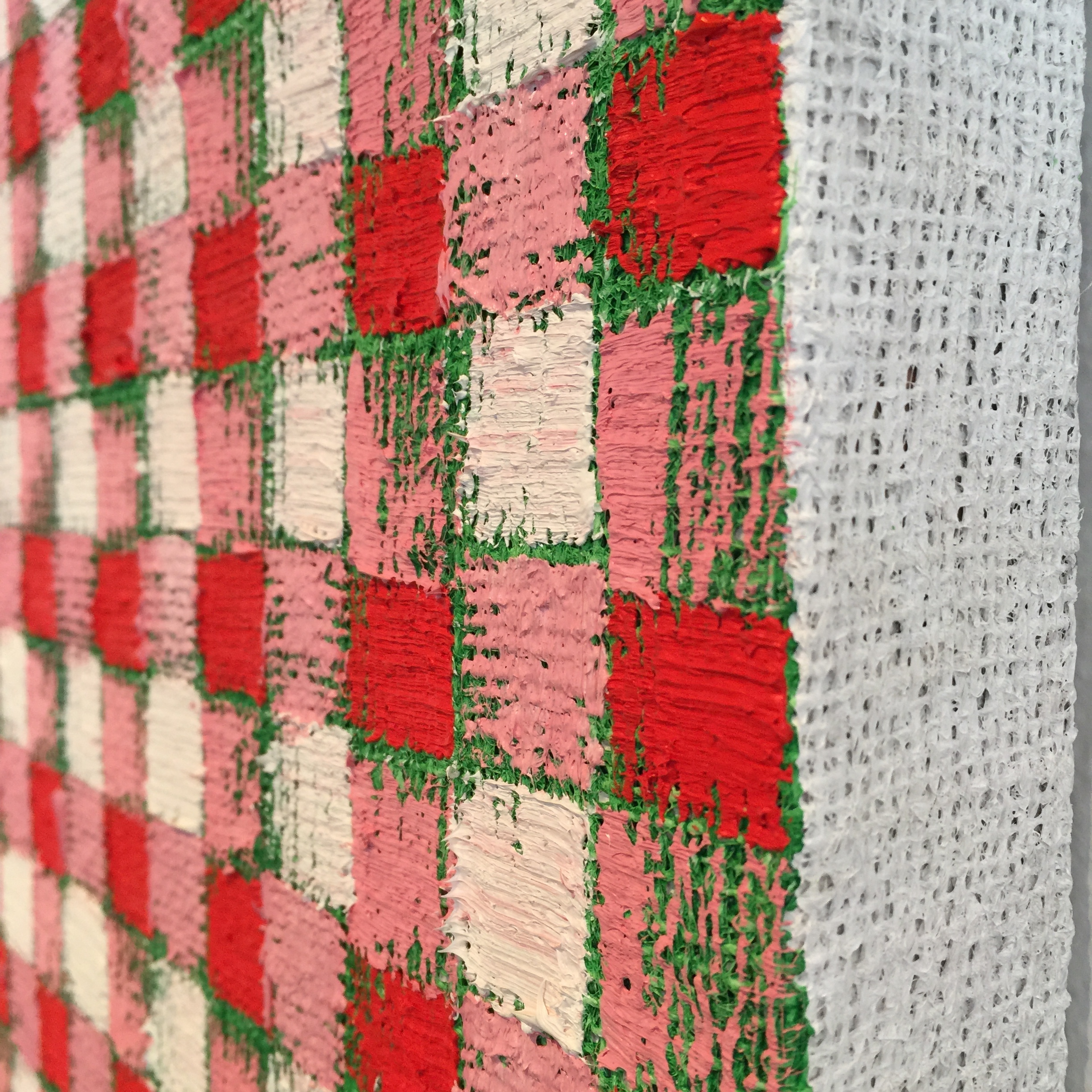
““My plan is to grow these physical fields of pattern into monumentalized paintings,” says Grabner. “At such a scale, the gingham fields will continue to evoke an American domestic nostalgia but they will also speak to the authority of painting.” With some canvases measuring nearly 100 inches tall, these gingham paintings usurp the viewer’s periphery.”

It's interesting and surprising to me what work sticks over time. I'd like to write about exhibitions while they're on view, but my thoughts don't solidify quickly, so I like to wait and see what rises to the top over a period of weeks or months. In the New Year, I'll be writing about my recent trip to London and Paris, so please stay tuned.