
In autumn 2016, I made my first trip to Magnolia Editions in Oakland, CA for the stated purpose of "seeing what's possible," at one of the Bay Area's most respected and innovative printmaking and fabrication studios. As it turns out, just about anything is possible at Magnolia!
First, a bit of background. Of course, most everyone in the Bay Area is familiar with Magnolia, and working with the team was a long held dream of mine. Till now, I had very little printmaking experience, and I confess that I barely knew the difference between an etching and a relief print. But, as it so happens, Nicholas Price is one of Magnolia's master printers. I've known Nicholas for several years, through our mutual involvement with Root Division, a local non-profit arts organization. Nicholas mentioned to me that Magnolia might be interested in inviting me to do a project. Of course, I was intrigued, but with deadlines stacked up at the time, I felt I had a bit too much on my plate. When the dust finally cleared, about a year later, I'd had a good long time to do a bit of subconscious work on ideas for a project. I wonder, artist friends, if you work in this way? I sometimes feel I have two levels in my brain. It's as if that symbolic "back burner" is real. Ideas are simmering, with just an occasional stirring every now and then. Anyway, when I finally sat down to work on some preliminary sketches, they jumped out of my laptop in full form. I sent them over to Nicholas and thus the project commenced.
What follows is a photo journal, from the beginning of the process to the end. I took loads of photos on each of my visits to Magnolia, ever fascinated by the very complex process of making the prints. The project, Identical/Variation (green, red, blue, black), is a suite of four prints, each comprising an etching in black ink; elements of vibrant UV acrylic ink; and a woodblock relief, printed in four different colors in variable orientation. Like the Identical/Variation theme that I have revisited over the years in my paintings, Identical/Variation (green, red, blue, black) employs a variable matrix that allows for the possibility of originality within the parameters of repetition.

Magnolia has been in the same building for a very long time. It's a privilege just to hang out in their studio. Every nook is perfectly attuned to purpose and task. I love seeing how other people organize their studios, and I took mental notes on Magnolia's organization and flow. It's orderly, but well lived-in, and flexible enough to be fluid and a bit funky. Don and Era, artists and proprietors, are ever-present. Don, like a brilliant mad scientist, was deeply engaged in learning how to duplicate the minute fibers and texture of Renaissance paper during the months that my project took to complete, while Era serenely presided over other projects, as well as the business end of things. On any given day, artists flow in and out, working on their projects, the phone rings, and people pop in for tours of the studio. All the while, master printers Nicholas Price and Tallulah Terryll calmly and expertly do the meticulous work of making prints and other works of art.

Magnolia is known for combining traditional and digital techniques. We determined that the first step would be an etching, derived from my digital file, and printed (in the negative) onto the etching plate, in a series of 8 steps, each with a longer duration in the acid bath. In the foreground, you can see the negative of the design for my etching plate, and in the background, the big flatbed printer. Tallulah is the master of this beast!
Printing the etching plate on the flatbed printer.

Here, you can see how the acid has burned lines into the copper plate. Since we printed and etched multiple times, some lines are deeper than others, resulting in lovely line variety in the print.

The copper plate on the flatbed printer, awaiting another layer of black acrylic ink. The acrylic ink resists the acid, and will later be cleaned off.

This is the plate after the final pass of ink and the final acid bath. Each time, the ink covers more of the image. The exposed areas are etched with acid multiple times, resulting in deeper lines that will eventually hold more ink.

The copper plate is shiny as a new penny, until Nicholas begins spreading ink onto the surface. Every little incised line must be filled.

After the plate is inked, the excess ink is wiped off. This takes time. A lot of time! The ink must sit only in the etched line, while the rest must be removed.

The plate, inked and wiped. Now it is ready to print! The paper is slightly damp, and wrapped in plastic so that it won't dry out. Magnolia has a special drying room for the etchings. Ideally, they will all dry and shrink at the same rate. Since my prints have multiple steps, registration was an issue. The shrink rate had to be carefully calculated and monitored, so that subsequent steps will register with the etching.

Very precise instructions on the printing press!
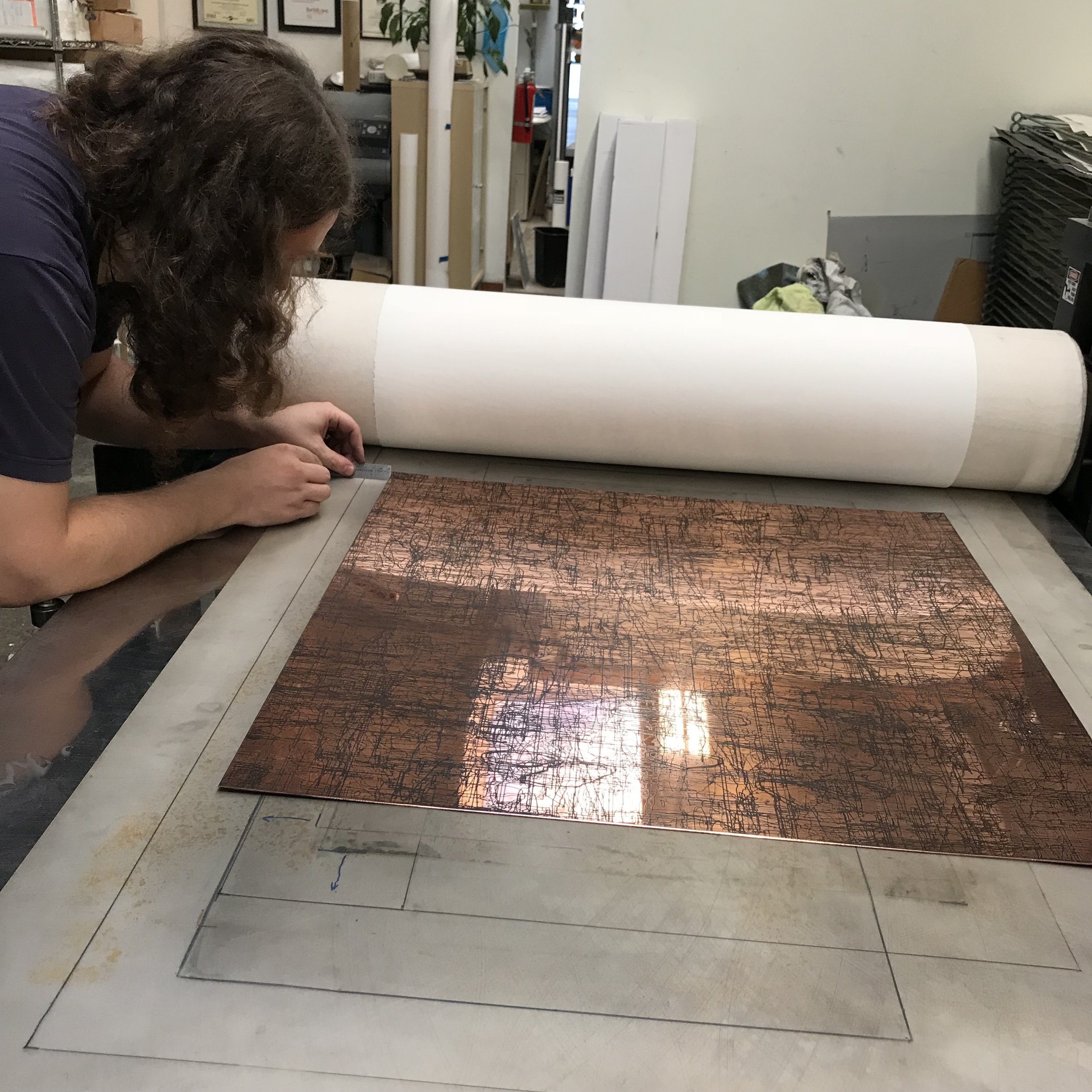
Further precision in the placing of the plate on the press. Each of these steps must be checked and double-checked.

Wow! Our first glimpse of the etching! Pulling the print is very exciting. There is so much labor and methodical process in printmaking. Seeing the print for the first time is like opening a gift!

One reason I am so excited about this project: printmaking allows for such extreme complexity and detail.

This is what blew me away: the etching is hard and soft at once, with an abundance of line variation, somewhat similar to a hand-drawn pencil line, but in rich, deep black. This is due to Tallulah's decision to do 8 passes with the printer and 8 successively longer acid baths. It really paid off!

Once we felt good about the etching (although it would take weeks for Nicholas to print enough for the edition) we were able to move on to the next step: the UV acrylic ink. Tallulah once again masterminded the flatbed printer, getting the registration just right and adjusting each color.
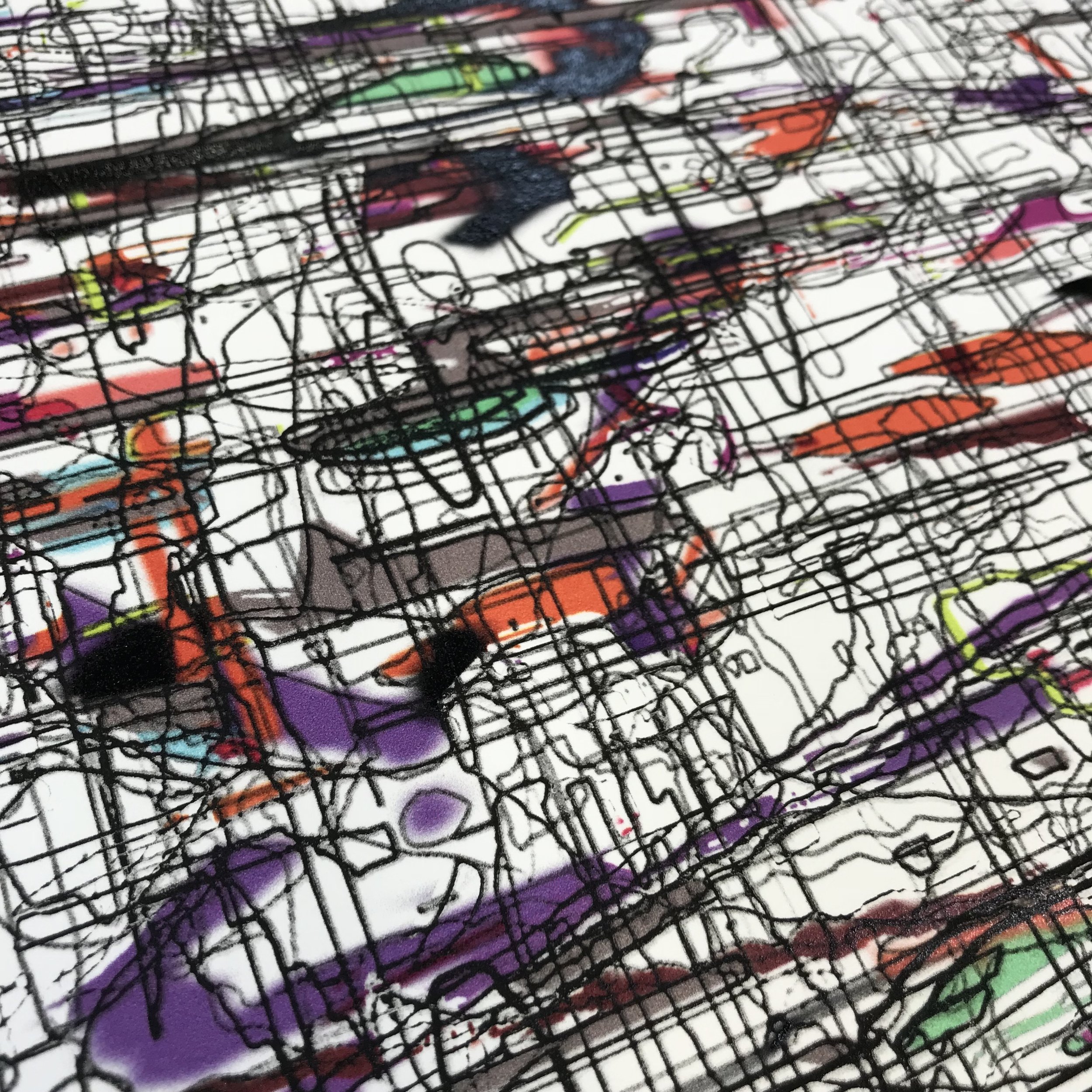
In my original file, the colors were very loosely placed, as you see here. They align to the shapes, but I wanted them to have a looser, almost hand-painted feel.
Once we figured out the acrylic printing, it was time to prepare for the final step: the woodblock relief print. We decided to laser-etch the block. I have always wanted to do woodblock printing, and it's great to have the option of using digital technology to cut the block. Although I love the idea of carving the block by hand, in this case, I wanted to preserve the pixilation and precise detail of my image.

The block, before inking.
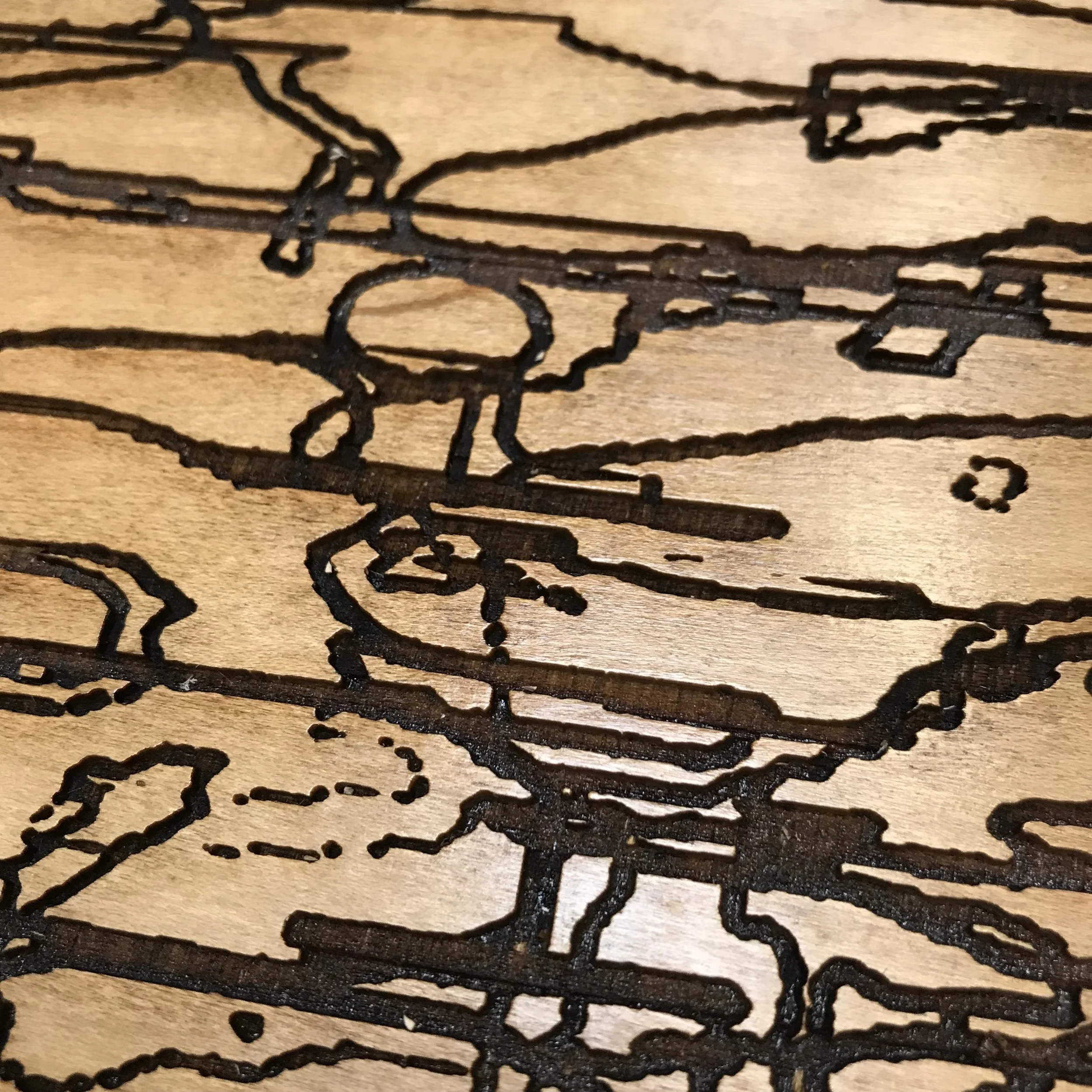
I love the detail we were able to achieve with the laser.

Once the woodblock was cut, Nicholas and Tallulah worked on building up a number of prints, complete with the etching and the acrylic printing, in preparation for printing the whole edition of Identical/Variation (green), the first color in the series.

Of the four colors in the group, the green was the most difficult to mix. I wanted it to be relatively opaque, and was amazed to see how different in character ink is from, say, oil paint. It is so saturated, even when transparent.

Even the task of applying the ink to the roller takes a lot of patience. We remixed the green perhaps 6 or 7 times. Each time, Nicholas had to thoroughly clean the palette and the roller before testing the adjusted color.
If you want to build big muscles, become a printmaker! The large roller is quite cumbersome and heavy.
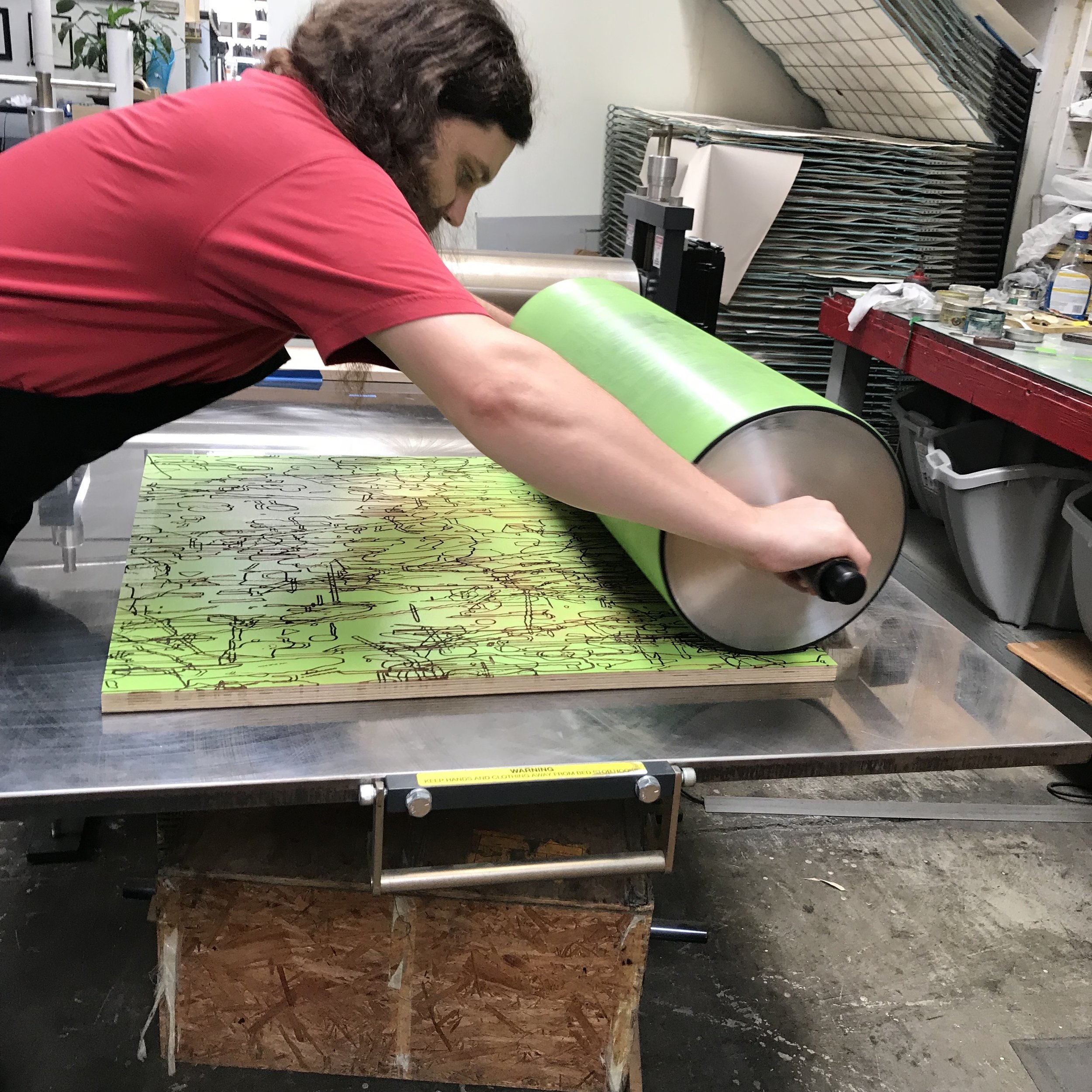
Rolling the ink onto the block. It is very tricky to get just the right amount of ink on the block, with even coverage over the entire surface. Nicholas showed me that the goal is to achieve an 'orange peel' texture with the ink. Assessing the ink requires attention not only to the appearance of the ink on block, but also to how the ink sounds as it is being rolled and how it feels.

Perfect coverage. Ready to print!

Testing the green alone, without the etching and inkjet steps.
Testing the green woodblock.

A detail of one of the early test prints. There is a lot of variation in the surface, due to how the ink sits on the first two elements.

The color that we finally settled on!
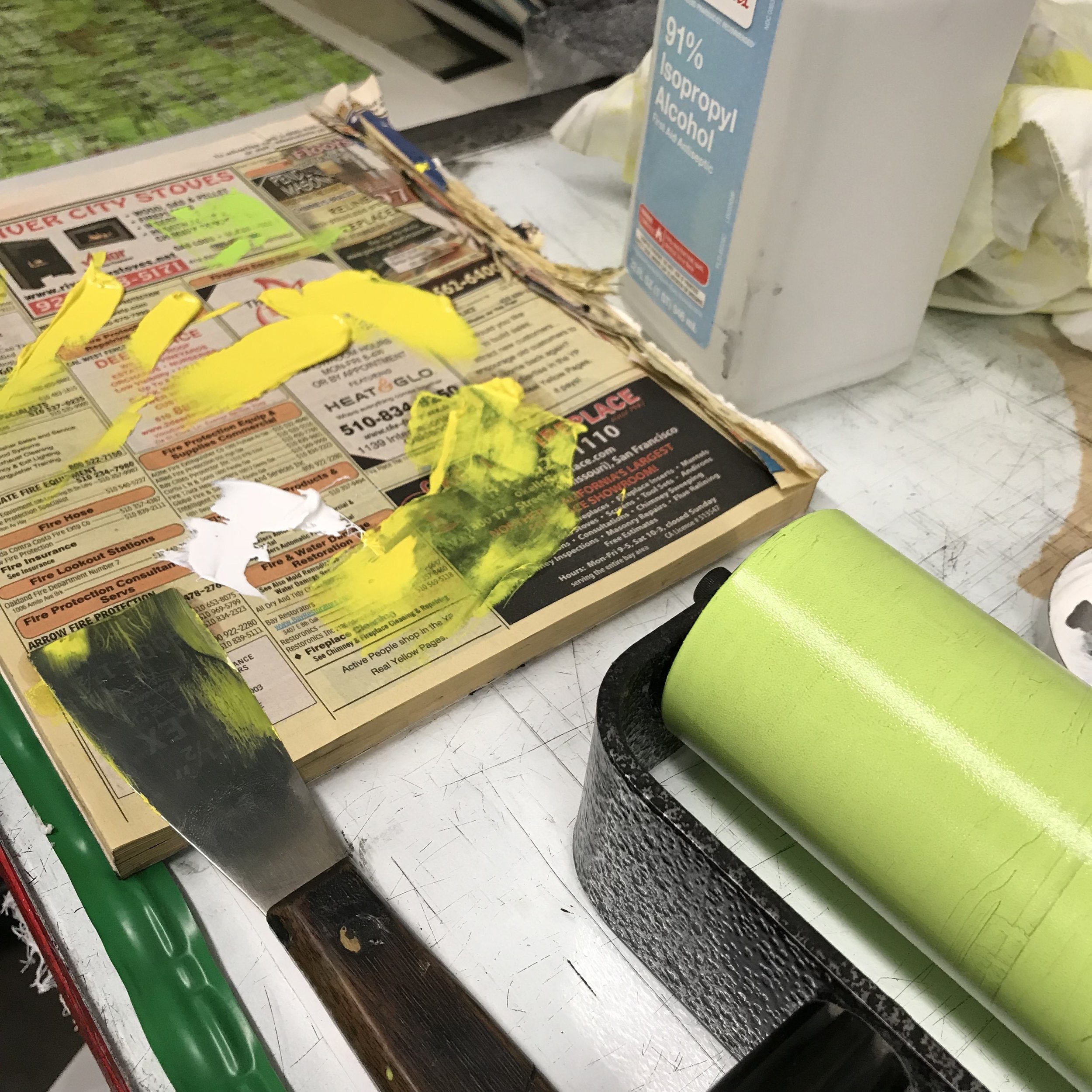
Are printmakers the only people who still use phonebooks?
Pulling the green print.

Once we finalized the green, we moved on to the red. We nailed the color quickly this time around.

A detail of the red test print. Even though the ink sits on top of the first two steps, it seems to fall back in the red print, as if it's in the background.

Delicious reds!
Pulling red.

A striated view of the press, the woodblock and the print.
Rolling blue. Like the red, we had a relatively easy time mixing the blue ink.

A shot of the block with the blue ink applied. It had a metallic sheen to it.

To check the colors, Nicholas would draw them down on raw paper with a mixing knife. However, the quality of the ink is different when it is printed, due to the way the ink is rolled on the block and the pressure that the press creates.

Drawing down the black ink on a test print.

Transparent base. We mixed this into our colors to create more transparency in the ink. I was amazed by the high color saturation, even when mixed down with the transparent base.

What do you do with rejected prints? Make buttons! Magnolia has a button making machine, so I spent a few hours cutting circles out of some of the rejected prints, which I then mounted onto metal button forms.

Last but not least: the black print. Again, the ink looks almost metallic on the block. You can clearly see the orange peel texture of the ink.
Pulling the black print. With this, we neared the end of the project, at least in terms of the major esthetic decisions. Our next task was to curate the prints, going through each color methodically to determine which made the cut for the edition, the printers' proofs and the artist proofs. I also signed and numbered the prints, after Nicholas and Tallulah applied Magnolia's chop and my chop. I felt surprisingly anxious about signing the prints. Even though the paper is very sturdy and tough (it has to be, considering how much it is handled) it is very hard to cleanly erase pencil lines.

Identical/Variation (green)

Identical/Variation (red)

Identical/Variation (blue)

Identical/Variation (black)
I am so grateful to Magnolia Editions for the invitation to work on this project. The generosity of Don, Era, Nicholas and Tallulah, along with the fantastic vibe of the studio, the other artists who flowed in and out, and even the neighborhood (with other artist-run businesses in close proximity) made for a dynamic environment in which to collaborate.