I recently returned from a jaunt to New York City, where I saw A LOT of art. Here’s a quick overview.
Day 1: Upper East Side
My itinerary, Day 1
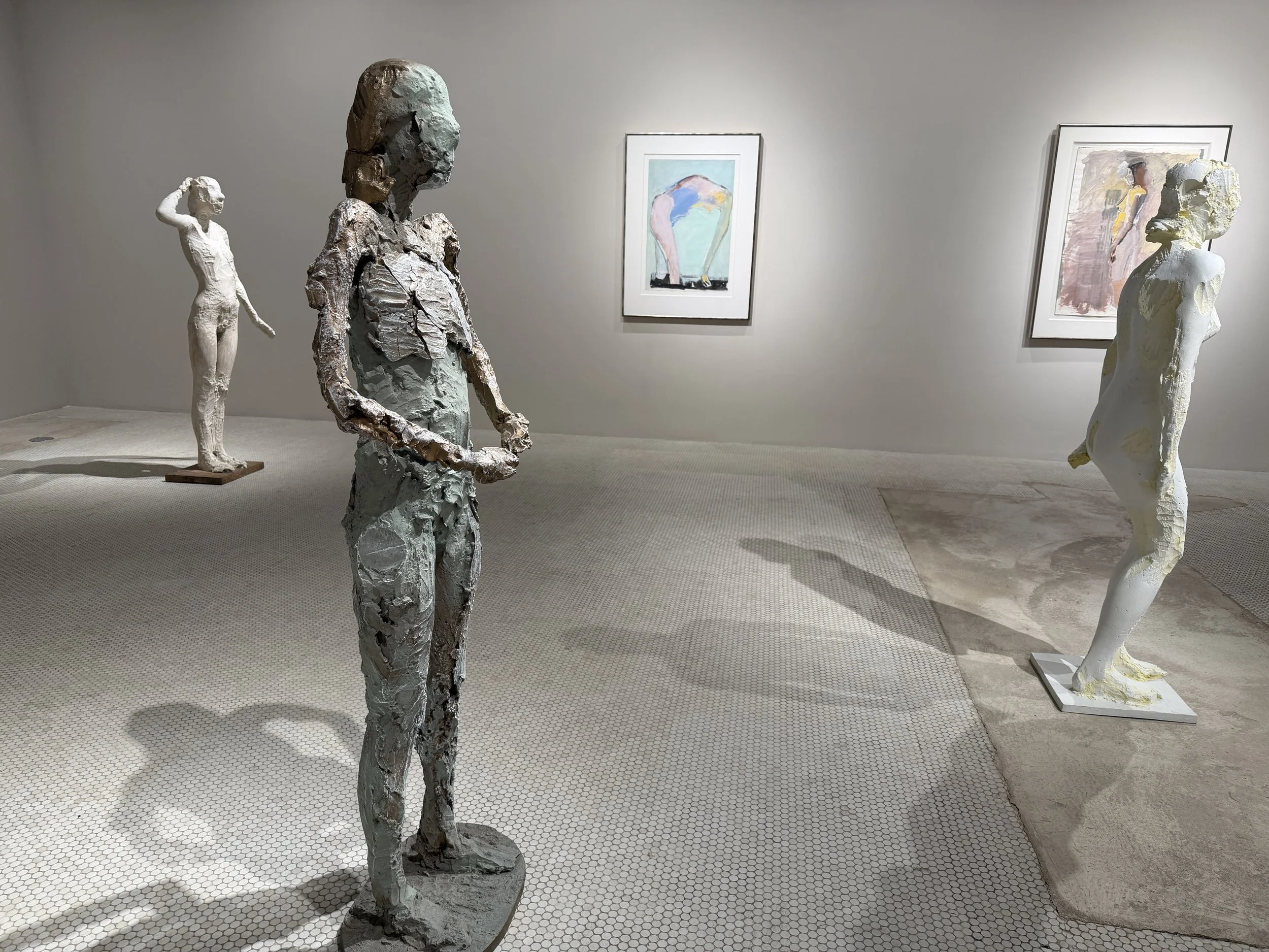
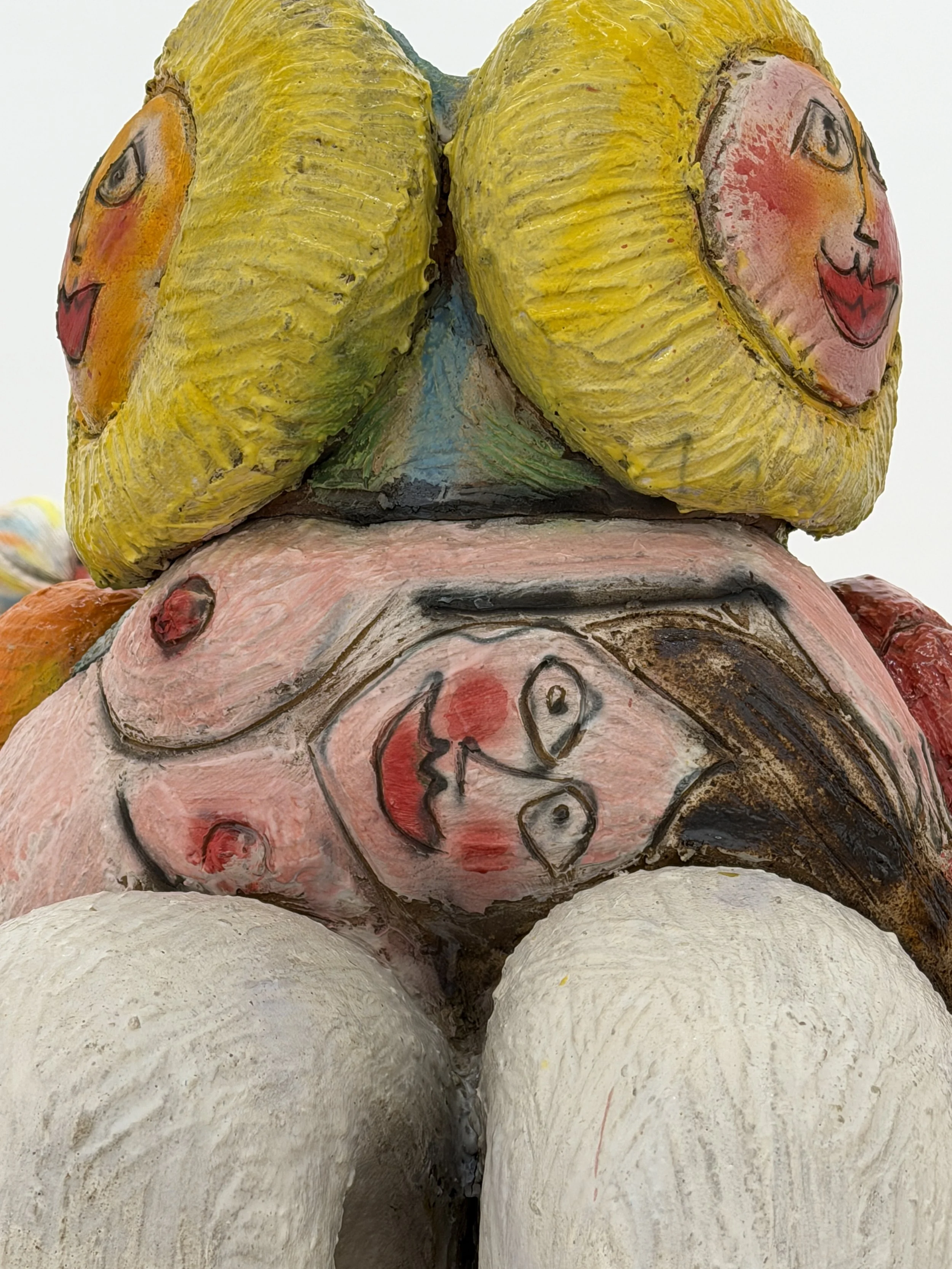
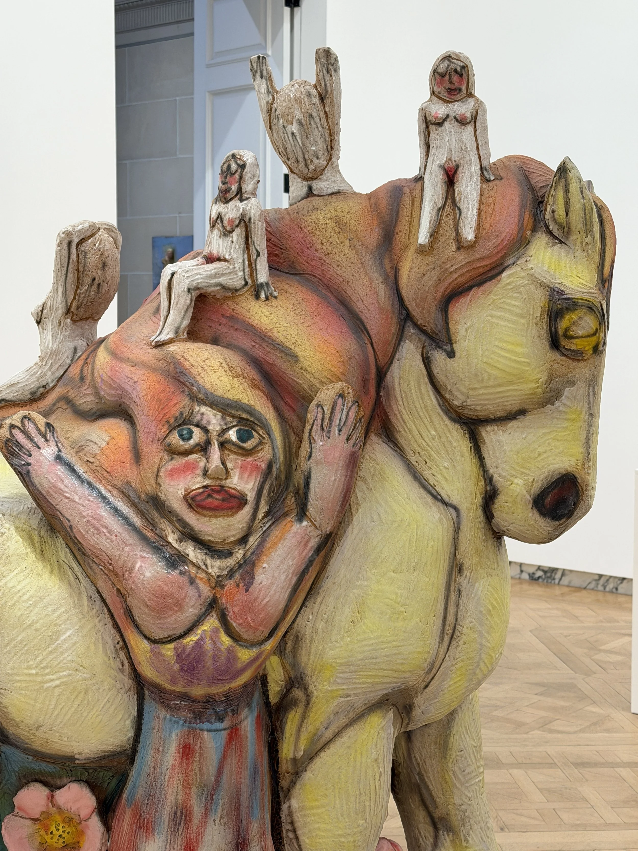
Salon 94, Manuel Neri and Ruby Neri. REALLY enjoyed seeing both artists’ work at Salon 94’s beautiful space, where the lower floor was filled with Manuel Neri sculptures and works on paper, selected by his daughter, Ruby, whose work occupied the upper floor. Back in the day, my sculpture professor, Aldo Casanova, was iffy about Neri, because he disapproved of polychrome finishes on sculptural works; he thought one should rely on basic patinas or, if using color at all, that the palette should restricted to black, white, or the primary colors. Still, I enjoyed seeing these works, especially in contrast to Ruby’s incredibly lively, fun, sexy, bawdy sculptures.
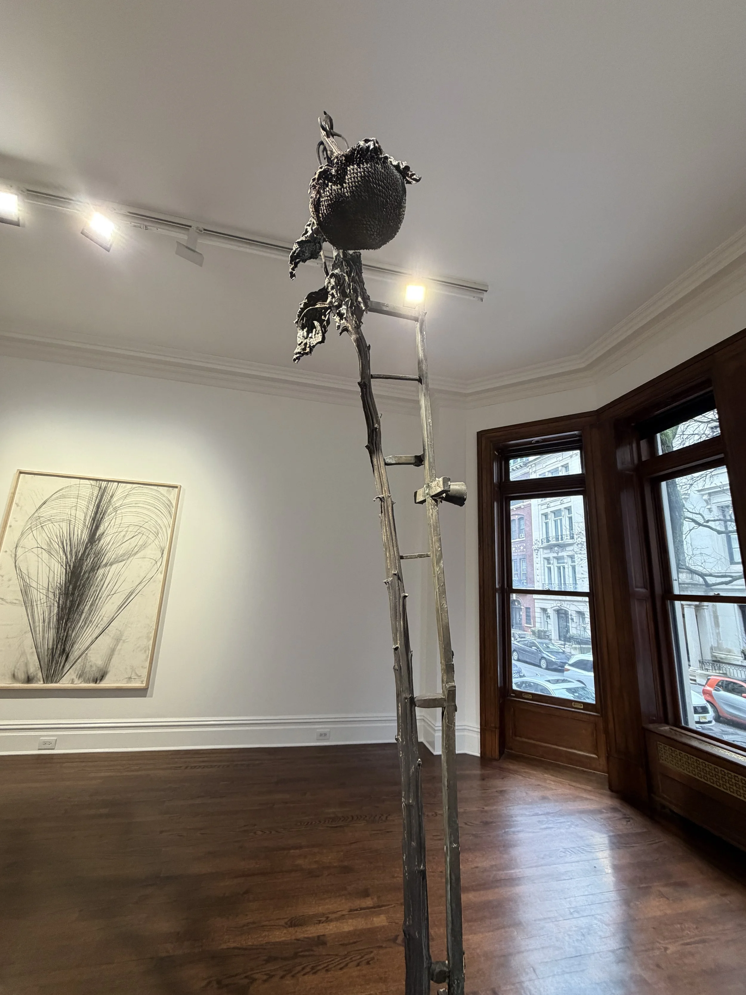
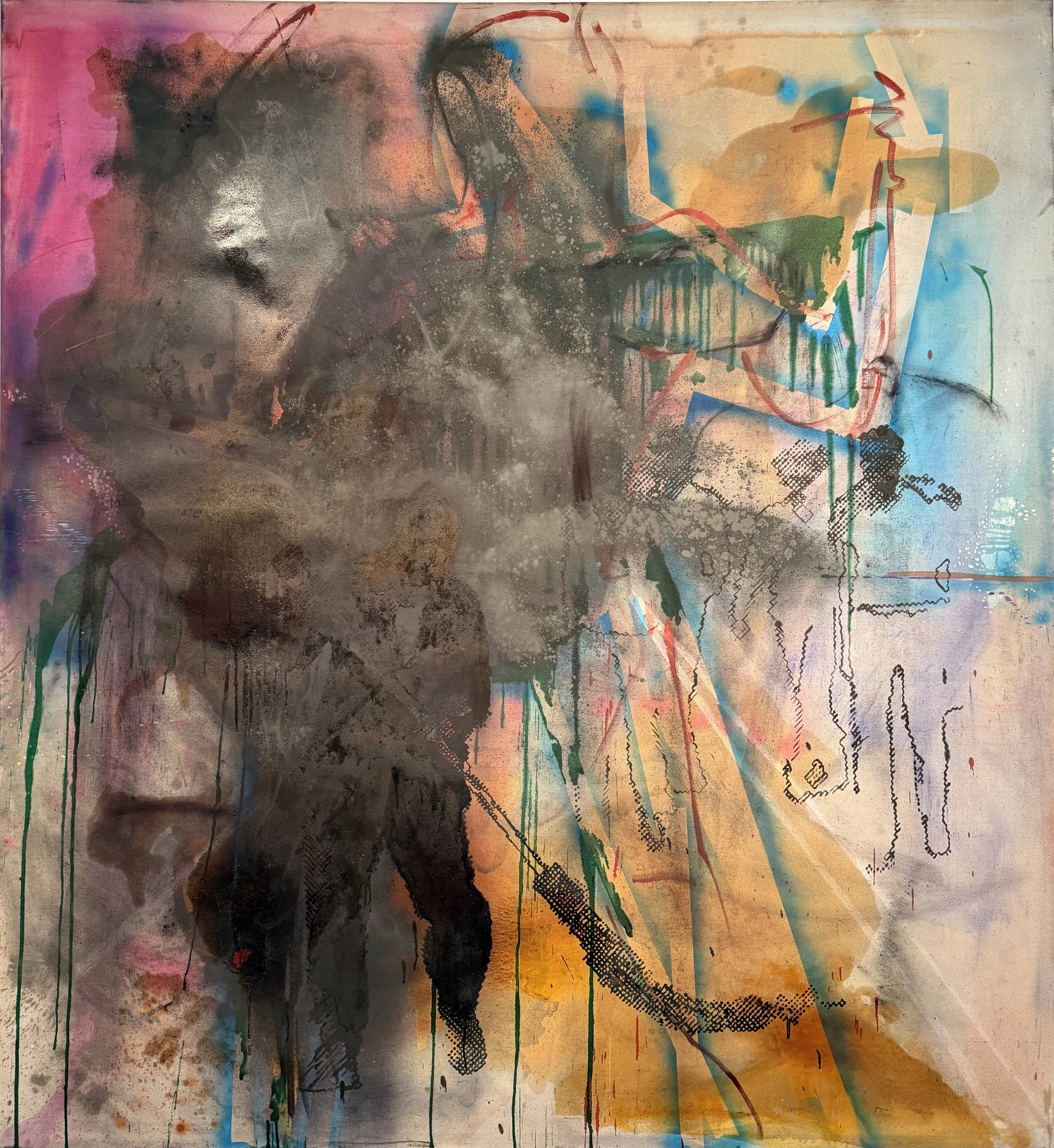
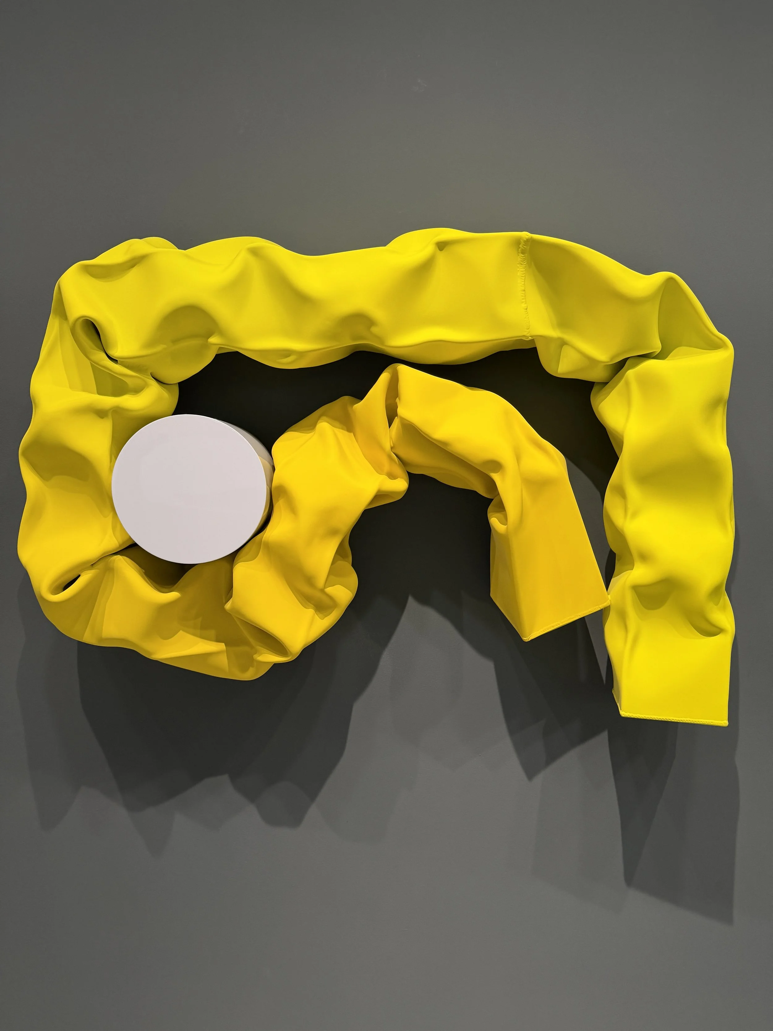
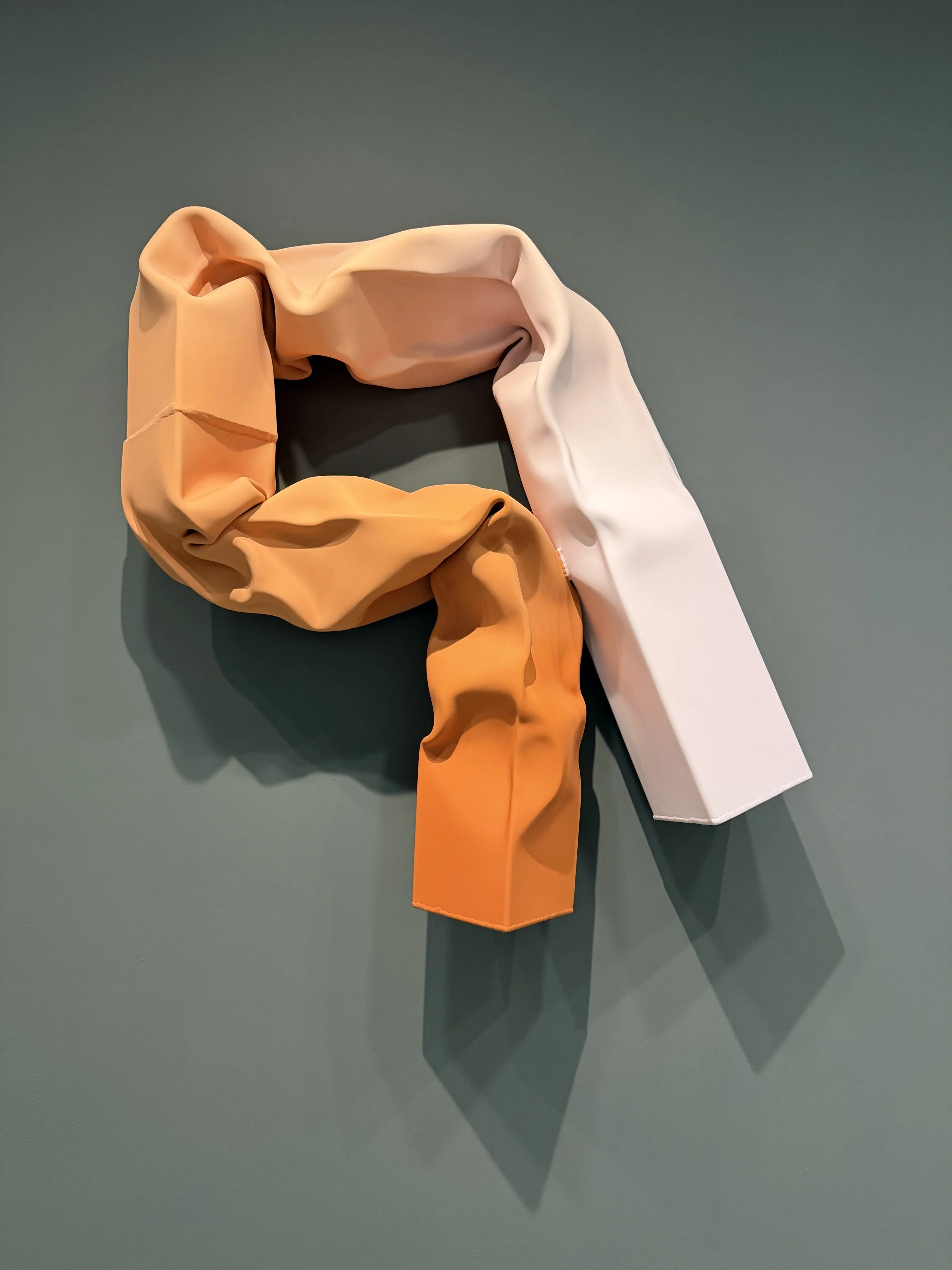
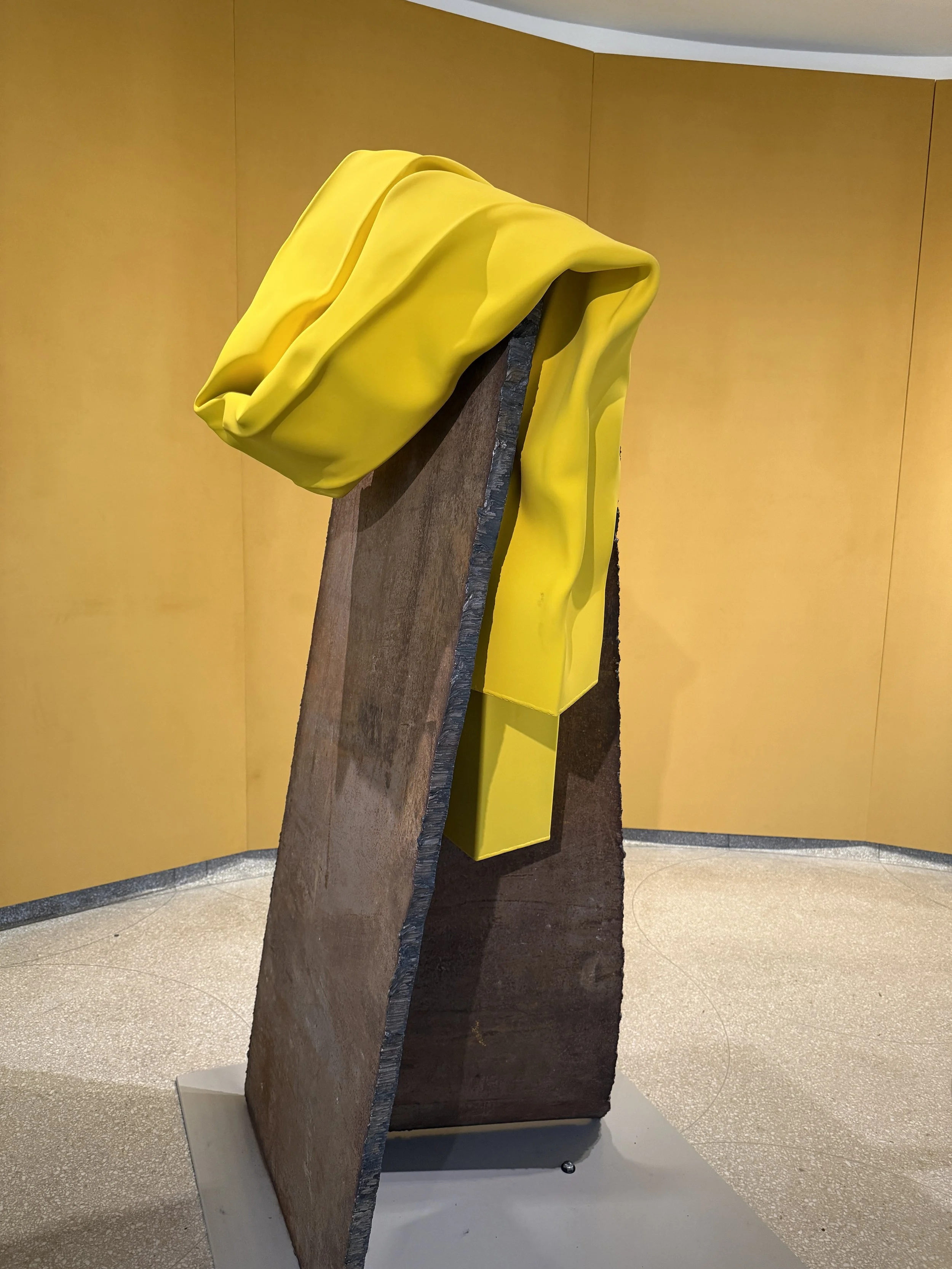
Sterling Ruby at Sprüth Magers. I am not an avid Sterling Ruby fan, but I popped into to see this show, and was glad I did. The drawings have real, frenetic energy, and the sculptures—of cast plants propped up by armatures—were rather interesting. The largest, which involved a dead sunflower, reminded me of my favorite Anselm Kiefer sculpture, which I’ve seen at the Margulies Collection a couple of times. I think of it often; I love how the precarious stack of detritus—drywall, wood, cardboard, rocks—is combined with the dead husks and stalks of sunflowers. There’s something so damned sad about this piece, which reminds me of demolition sites, cairns, and—amazingly—the very fragile form of the Apollo 11 Lunar Module.
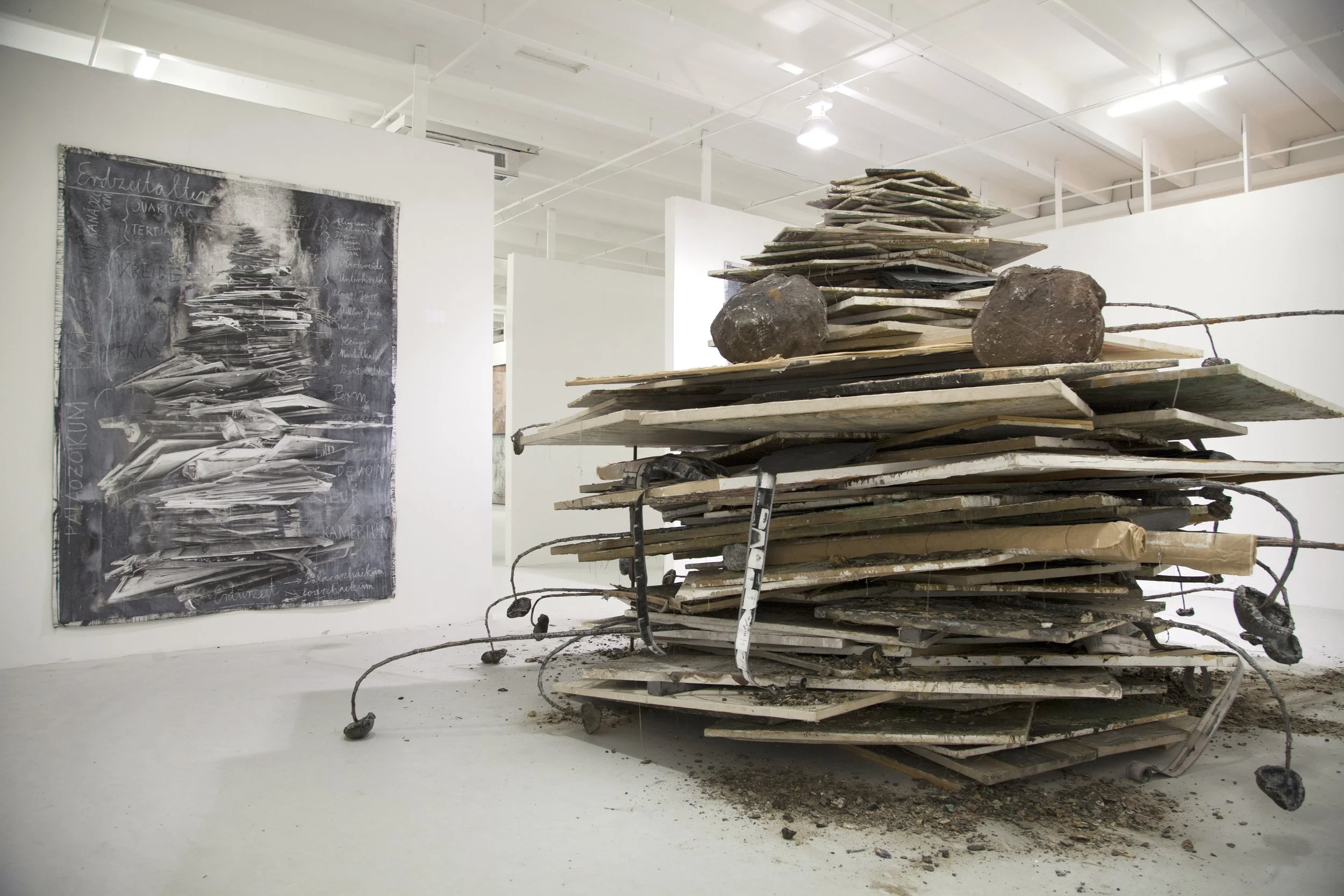
Anselm Kiefer, Die Erdzeitalte (translation: The Ages), 2014, on view at the Margulies Collection at the Warehouse, Miami
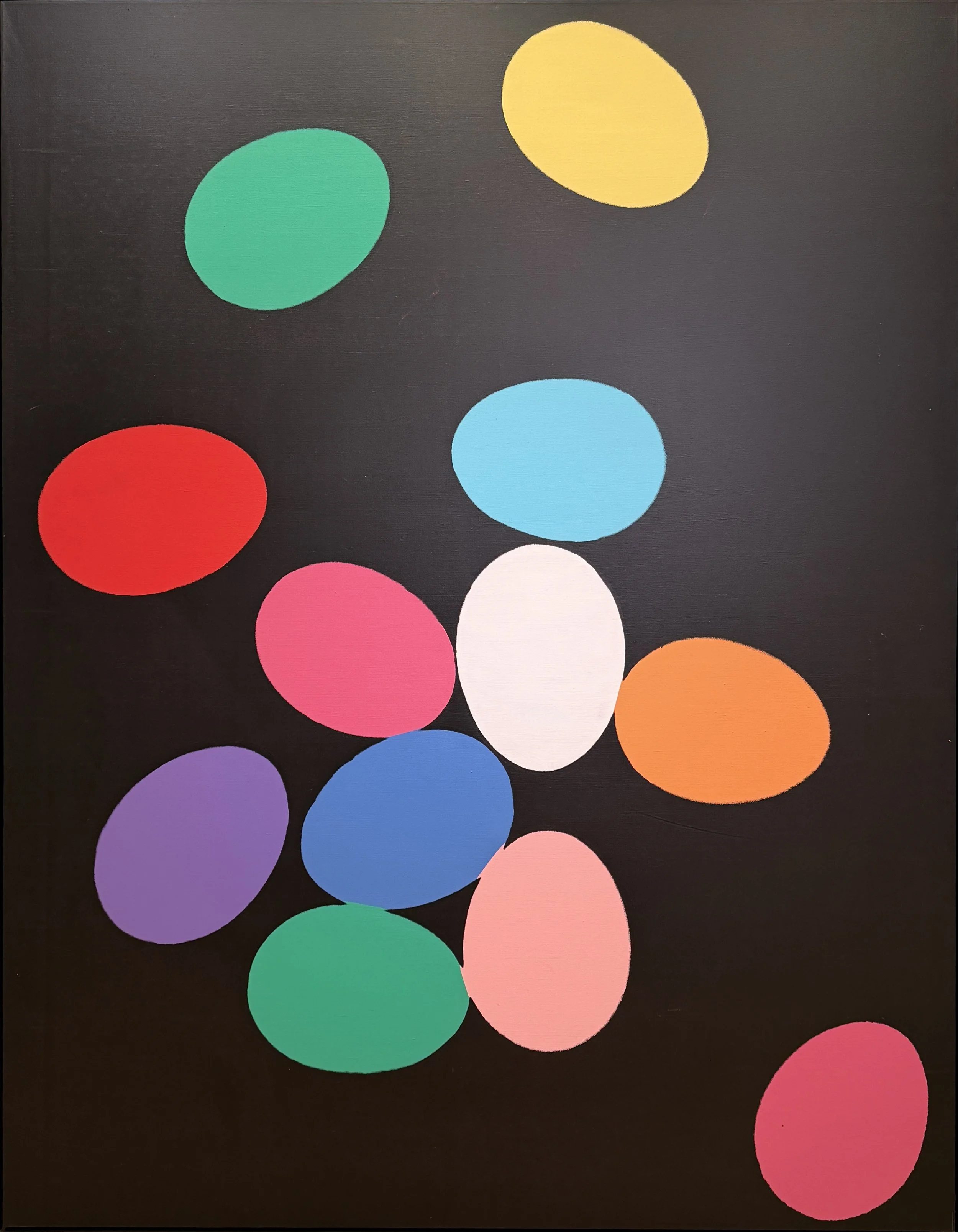
Silkscreen Paintings: Prince, Warhol, Wool at Skarstedt. This show was a bit thin for my taste— a little too cool and deadpan, which is never what I’m looking for in a painting exhibition. However, I did enjoy seeing this Warhol, with its multicolored easter egg shapes on a stark black ground. I loved the irregular edges of the forms, and the way that the fill colors didn’t quite line up.
Sigmar Polke at VeneKlasen. Really enjoyed this cycle of gorgeous paintings, The Dream of Menelaus, from 1982. They hold up well. Great energy, gesture and color.
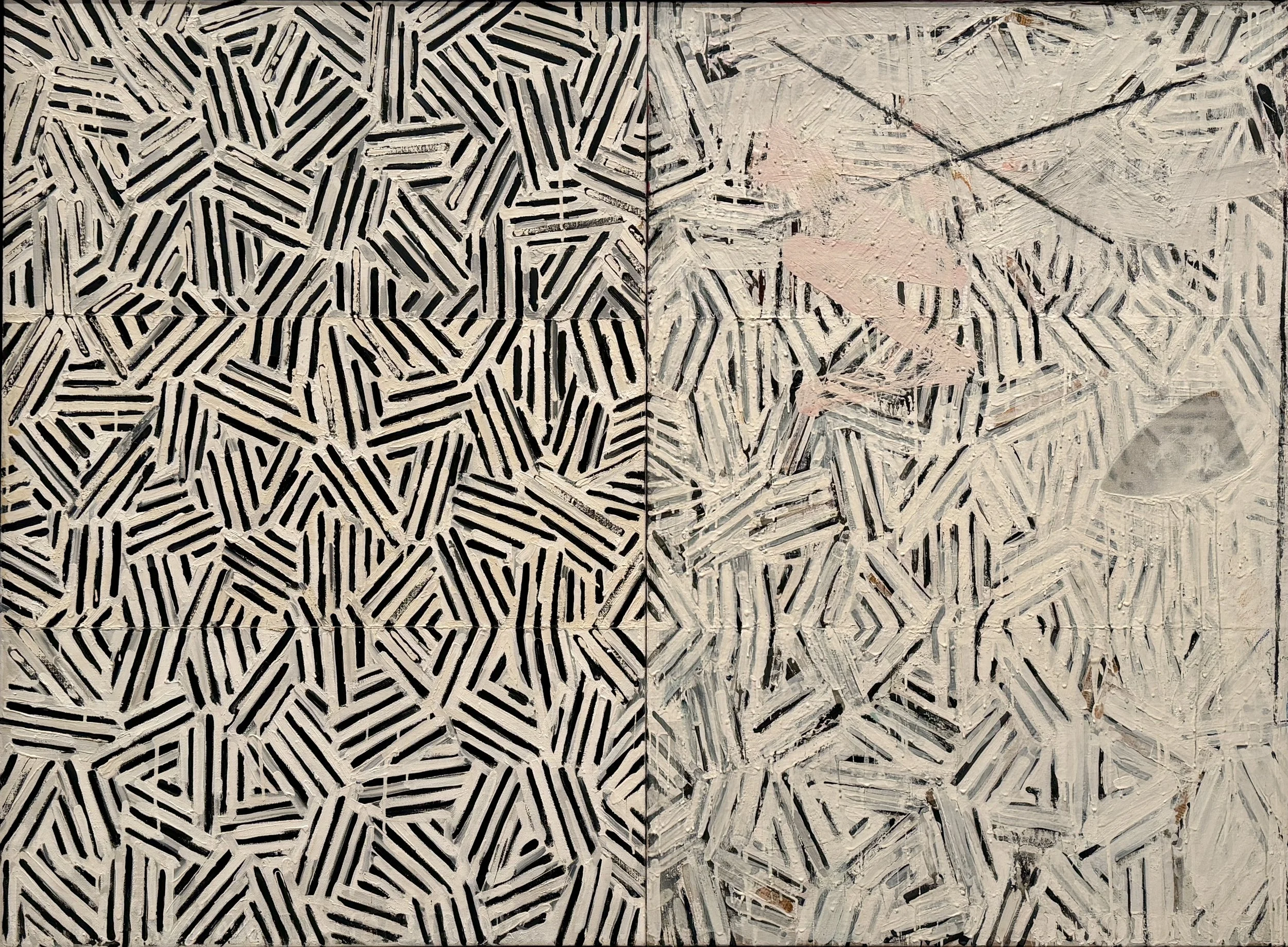
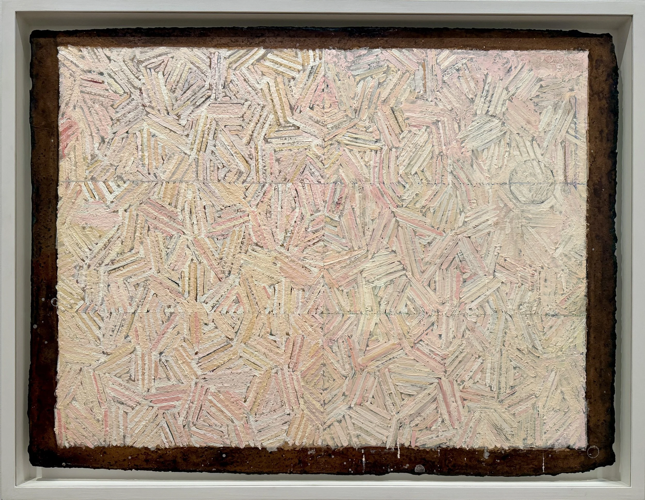
Jasper Johns, Between the Clock and the Bed, at Gagosian. Back when I was a wee undergrad, I adored Jasper Johns. Since then, I have slowly fallen out of love with him… maybe because I sense an old school, repressed homo vibe, likely the result of near-heroic sublimation that ends up kind of killing the work. (Takes one to know one, you might say) Anyway, there’s something in Johns’ work that I find mildly disturbing. But, I am happy to report that I ADORED this exhibition, which is comprehensive and beautifully installed. The cross hatch works, in a variety of media and scale, looks fresh, and the tried and true sex/death dynamic comes through in a subtle way, mostly through color shifts that move across the paintings horizontally. Some have a very yummy, fleshy feel, and somehow, even with the weight of the theme, they come off a bit lighter than much of Johns’ work. This was one of the highlights of my trip. Definitely see the show if you can. According to Gagosian (yes, I followed up with them) there will be a catalogue available at some point.
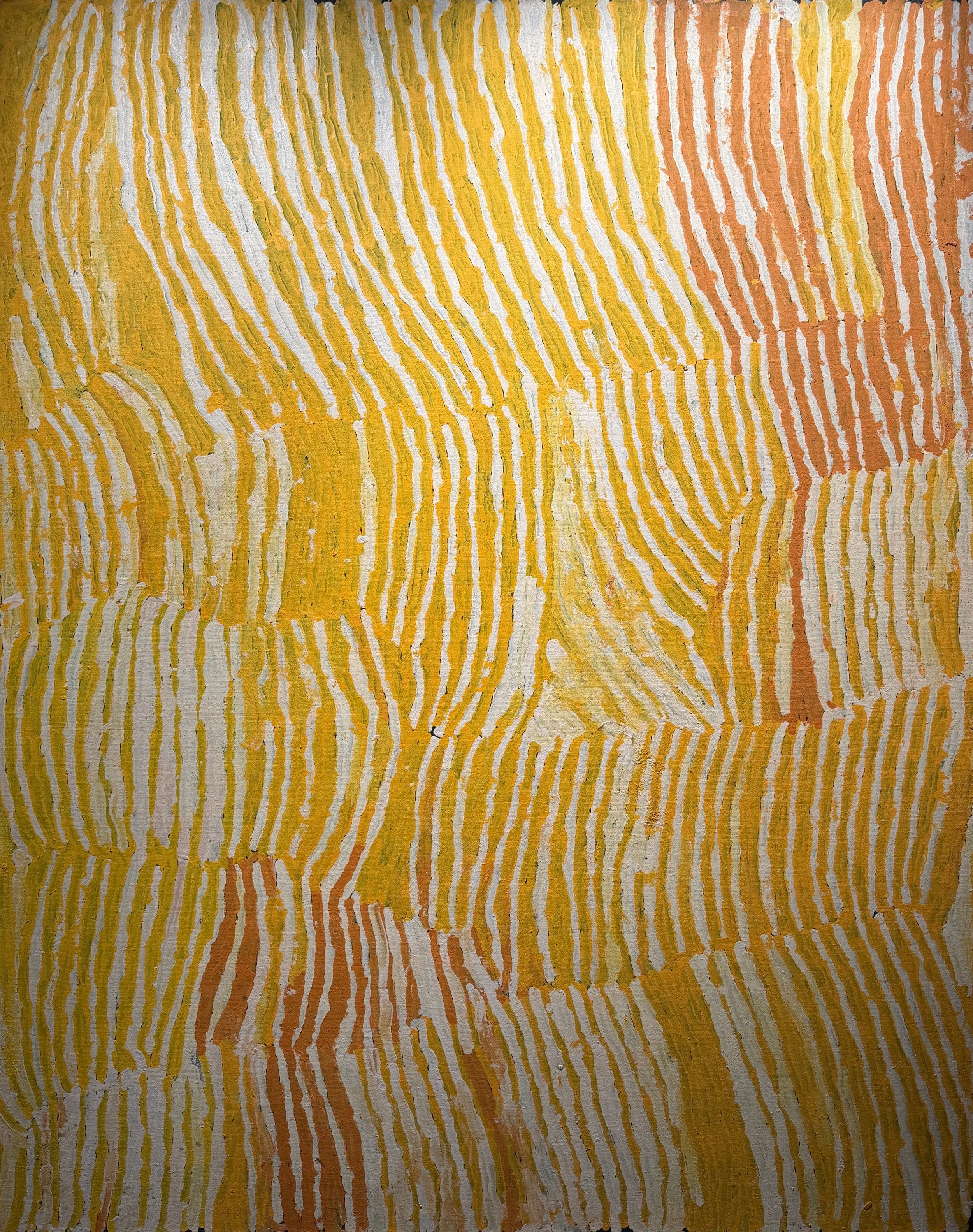
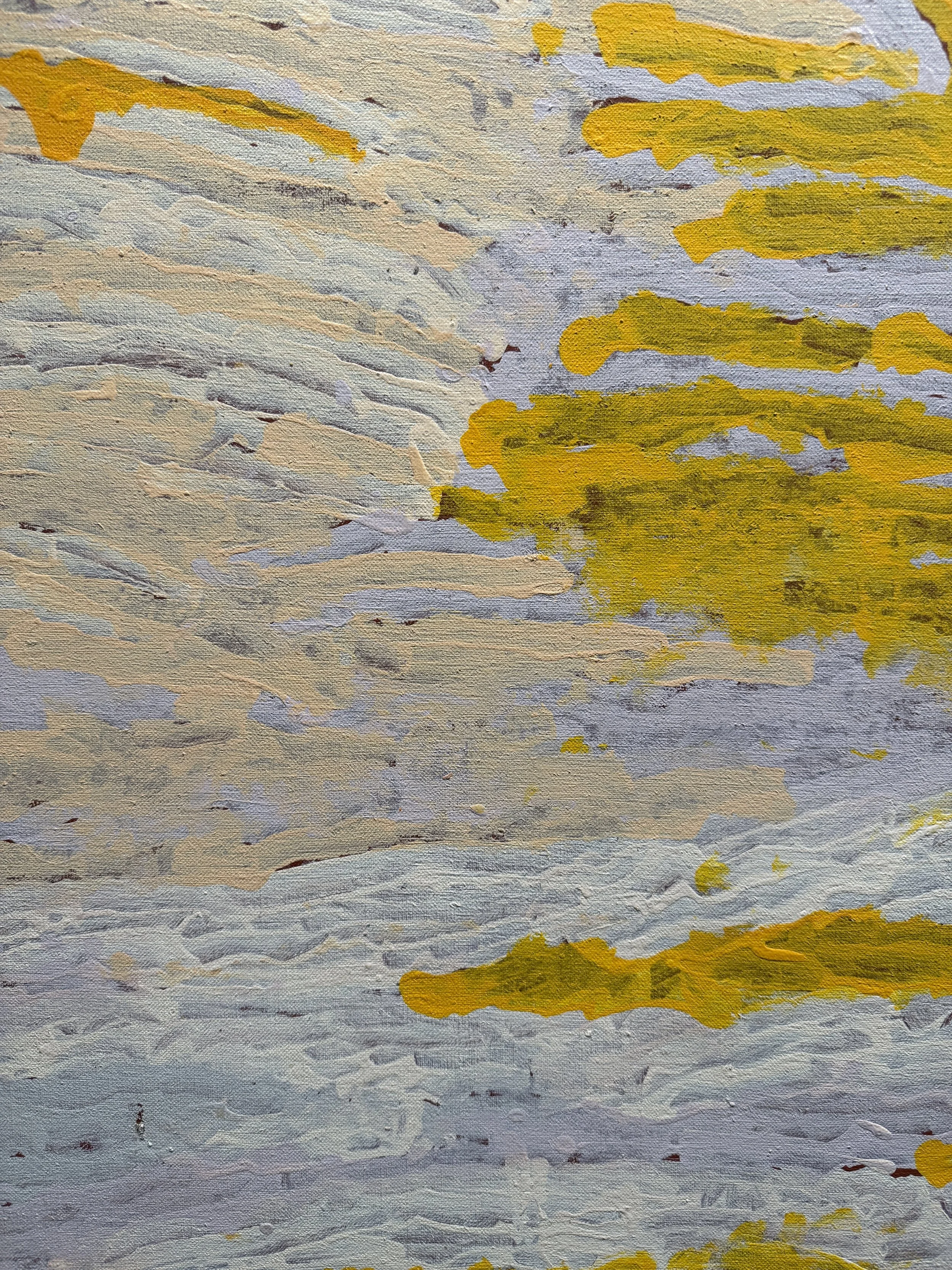
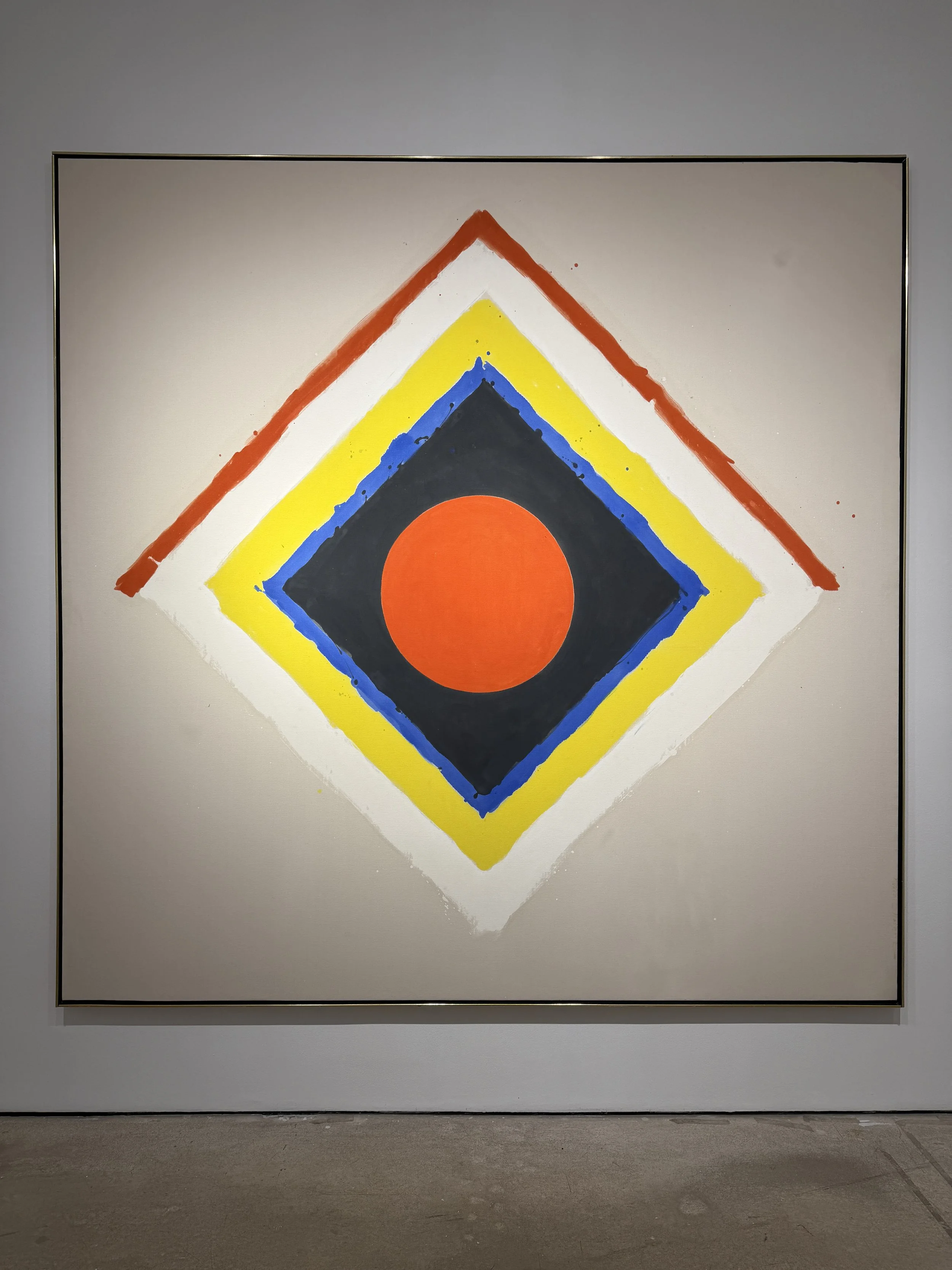
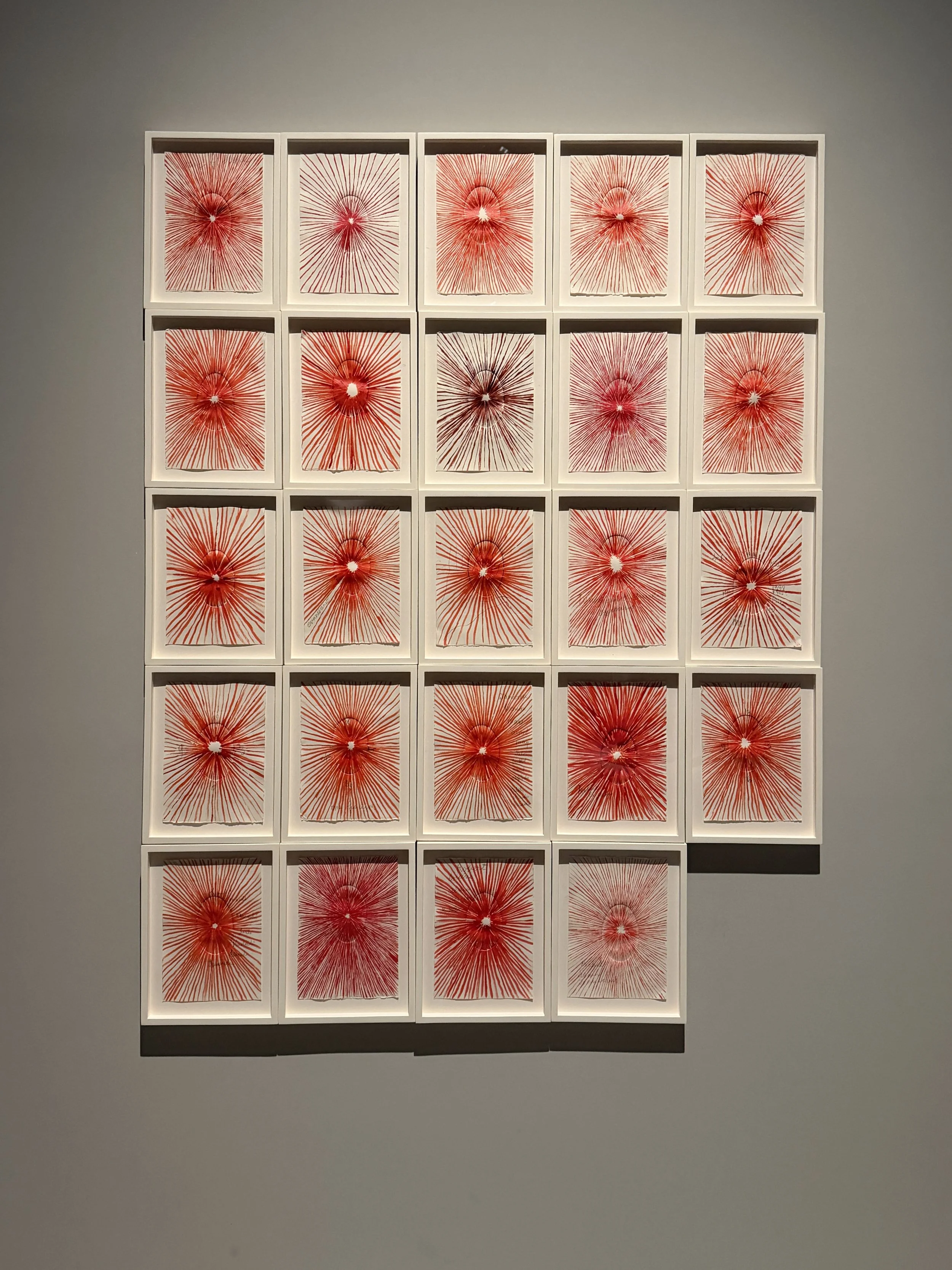
Makinti Napanangka at d lan gallery. I loved this exhibition of works by Aboriginal painter Napanangka. All were executed in a range of yellows and oranges, all laid on to dark grounds of either black or a deep, oxblood red. In some cases, pinks, lavenders and grays were used as well. But boy, she did a lot with this very limited palette. The gestures, rather jittery, with varying opacity, have a beautiful, lively energy. Really wonderful.
I also saw an interesting pairing of paintings by Stanley Whitney with works by Matisse at Craig Starr Gallery, the 40th anniversary exhibition at Franklin Parrasch Gallery, and Mark Bradford’s Thievery by Servants at Lévy Gorvy Dayan.
Day 2: Chelsea
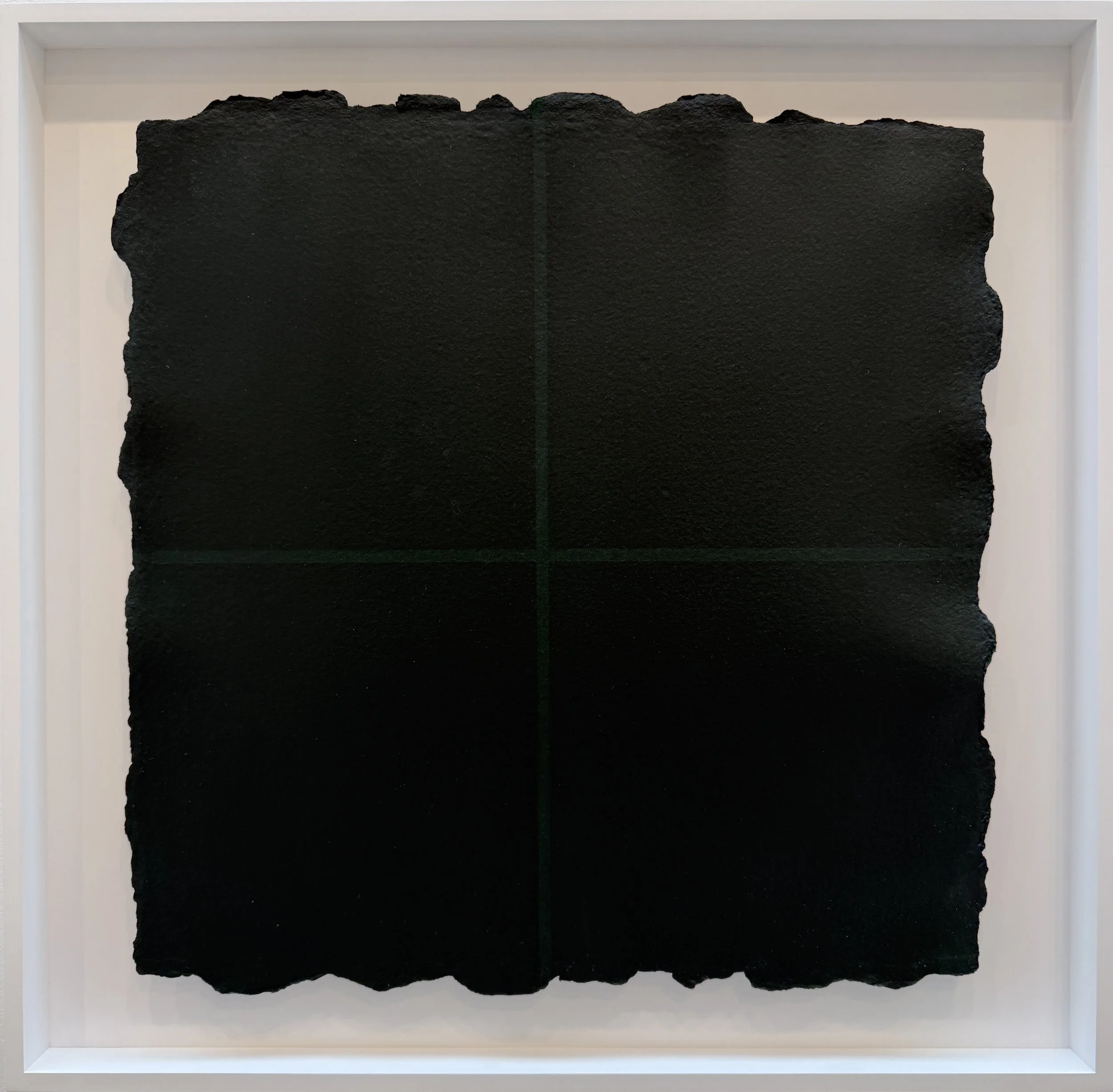
Marcia Hafif at Fergus McCaffrey. Really gorgeous exhibition of one of my favorite minimalists. Hafif’s sensitive application of mineral color allows each pigment to just do what it does. Looking at these, you become so aware not just of color, but of pigment, the medium, the substrate, the brush, and the hand. I loved this show, and was delighted by the works on paper, which I had never seen before.
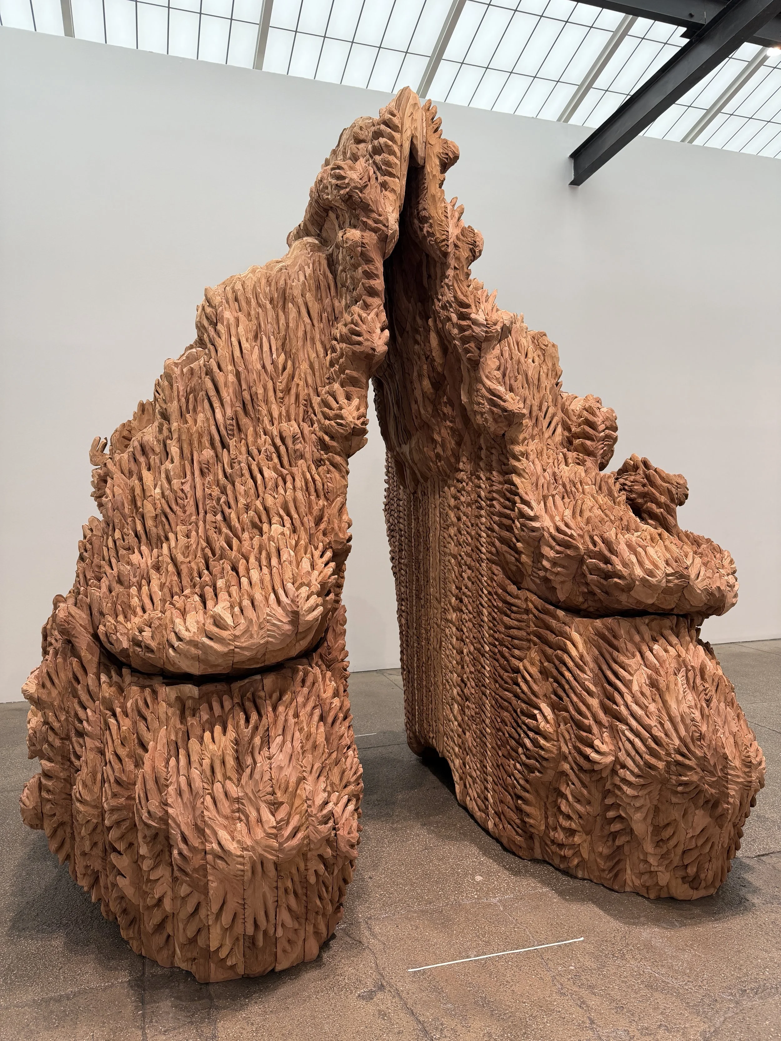
From there, I popped into Berry Campbell to see the Lillian Thomas Burwell exhibition. It was…okay. I really admire Berry Campbells’s efforts to show somewhat obscure mid-century artists, especially women, but this one didn’t quite do it for me. From there, I went to Galerie Lelong where I saw a terrific Ursula von Rydingsvard exhibition.
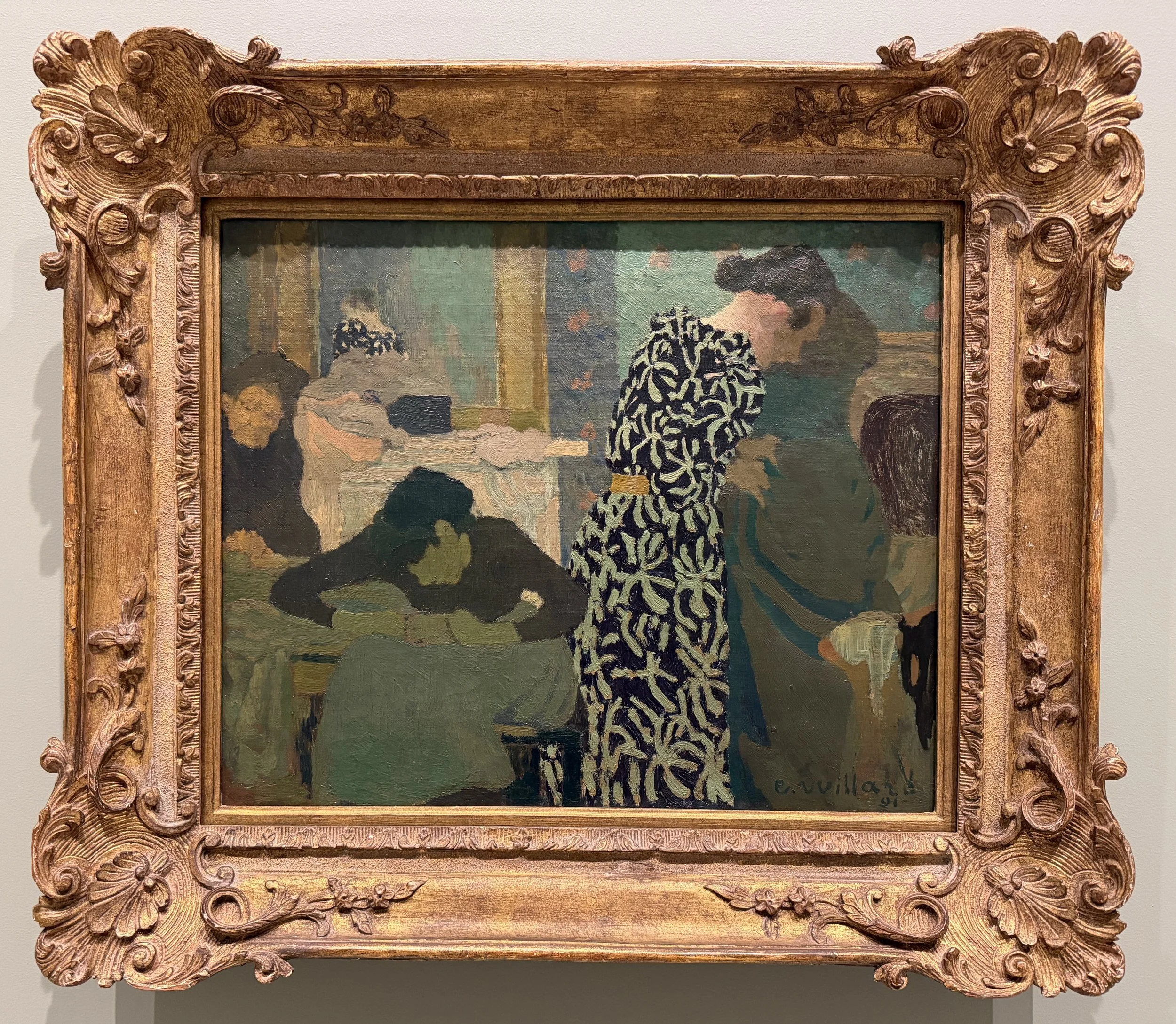
Skarstedt Chelsea had an incredible Edouard Vuillard exhibition, which was one of my favorites of the trip. Really focused curation, perfectly installed. These pantings appear humble at first; they are small scale domestic interiors, with figures, furniture, and architectural details. But they do something that all of the best abstract paintings do: they guide your eye through the picture plane, where it alights on one detail or another. Eventually, you realize that everything in the scene is important; there is no primacy of one rendered person or thing over another. It’s of a whole, with each element asserting itself.
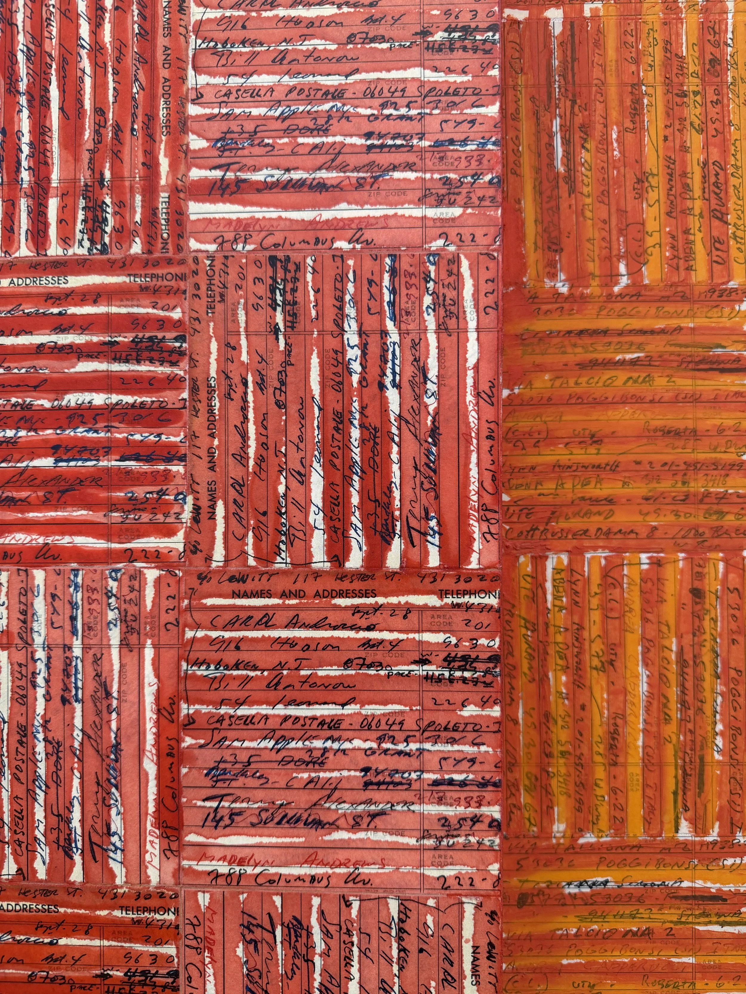
Next up, McArthur Binion at Lehman Maupin. I love how he plays with the modernist grid, using personal details, notes and loose painting. This shot is a detail of one of the works.
After that, I saw Kwamé Azure Gomez at Marianne Boesky. Not sure how I feel about these gestural abstractions. They don’t seem to break any new ground.
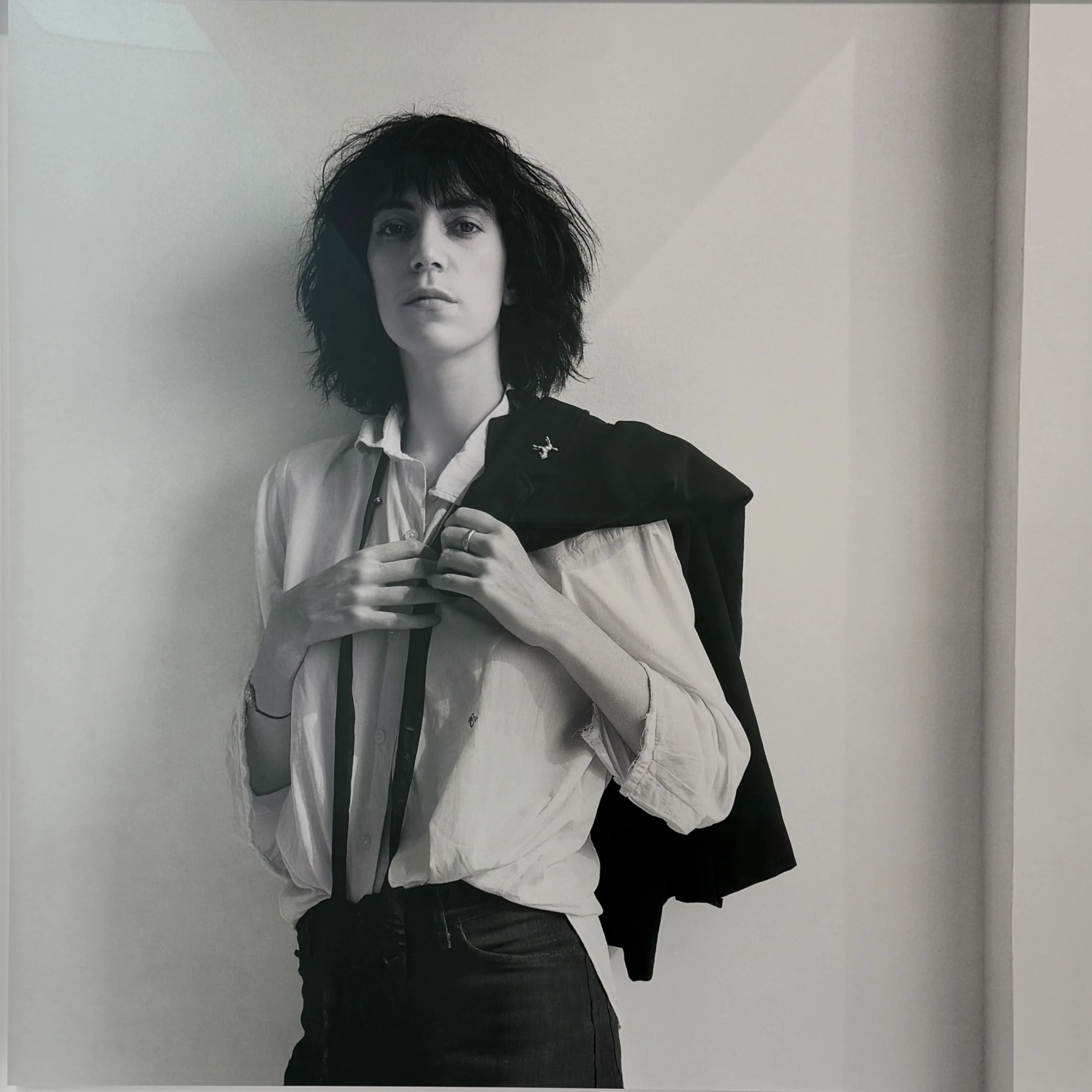
Robert Mapplethorpe at Gladstone. Wow, these images still pack a punch all these years later. Still stunningly powerful and beautiful. These prints are 60 x 60 inches…not sure if he ever printed this large during his lifetime, but apparently this exhibition is in collaboration with the Robert Mapplethorpe Foundation.
Anne Truitt at Matthew Marks. What a lovely exhibition, beautifully installed. Really loved the late works on paper, especially, in a range of pinks, buttery yellows, grays and black, with a subtle division of space, barely perceptible.
Though it wasn’t on my list, I stopped into Hunter Dunbar Projects to see a group show. Happy to bump into a terrific Kenneth Noland.
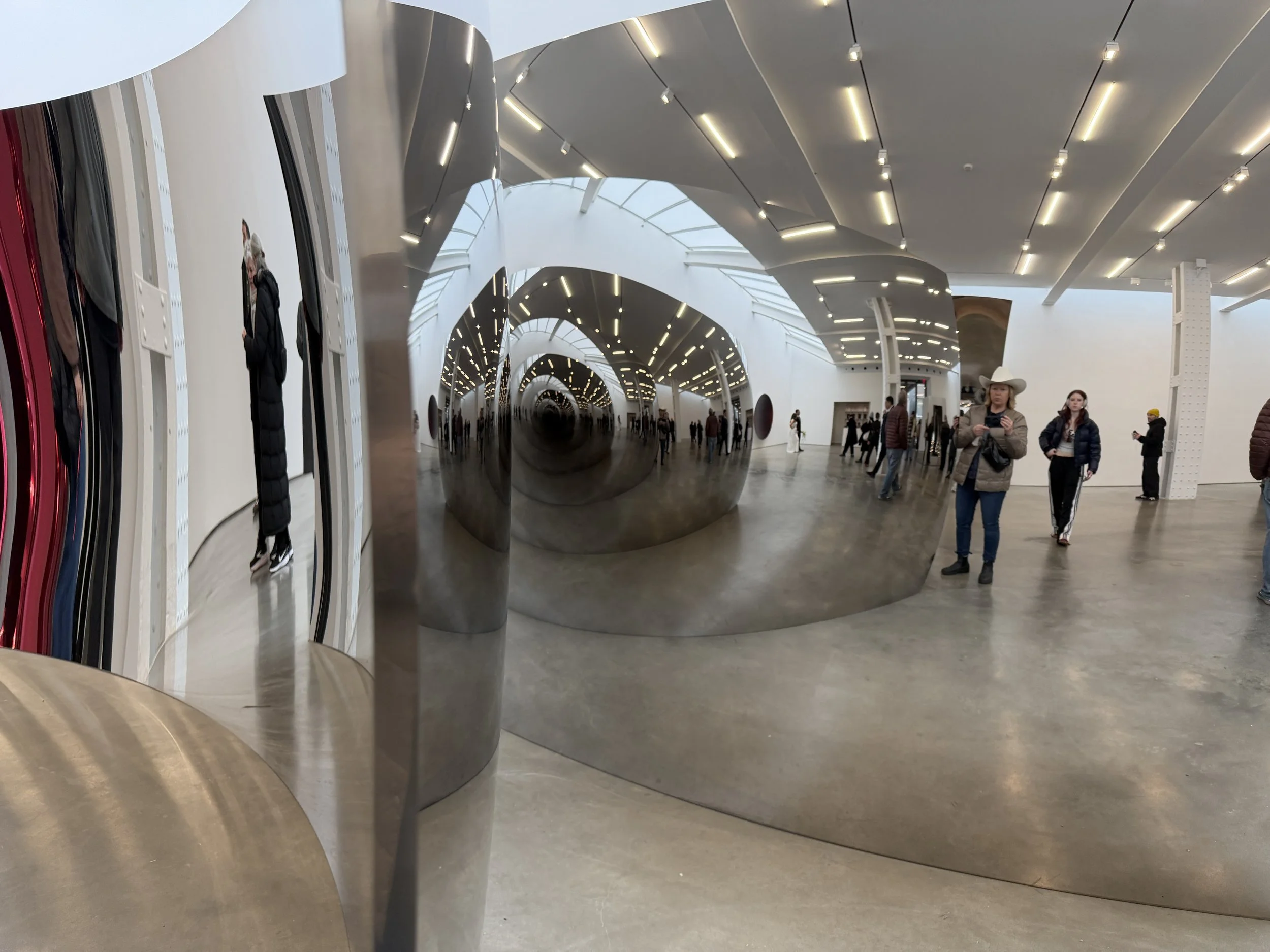
Then…oh boy, what a scene: the Anish Kapoor exhibition at Lisson Gallery. Really, this is a giant selfie opportunity. It was the most crowded gallery I saw all day, and there were even a bride and groom in their wedding finery doing a photoshoot. Yikes…
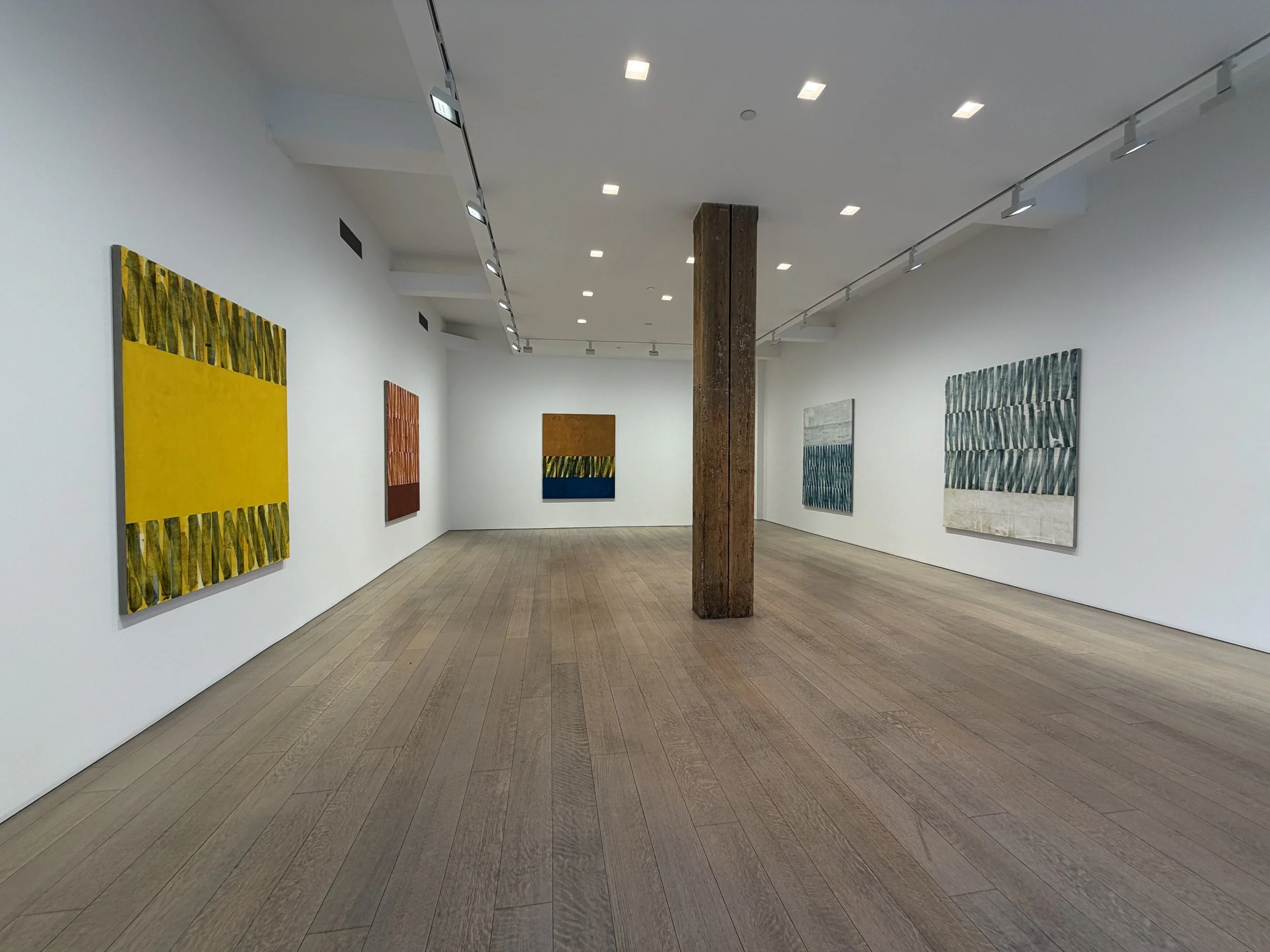
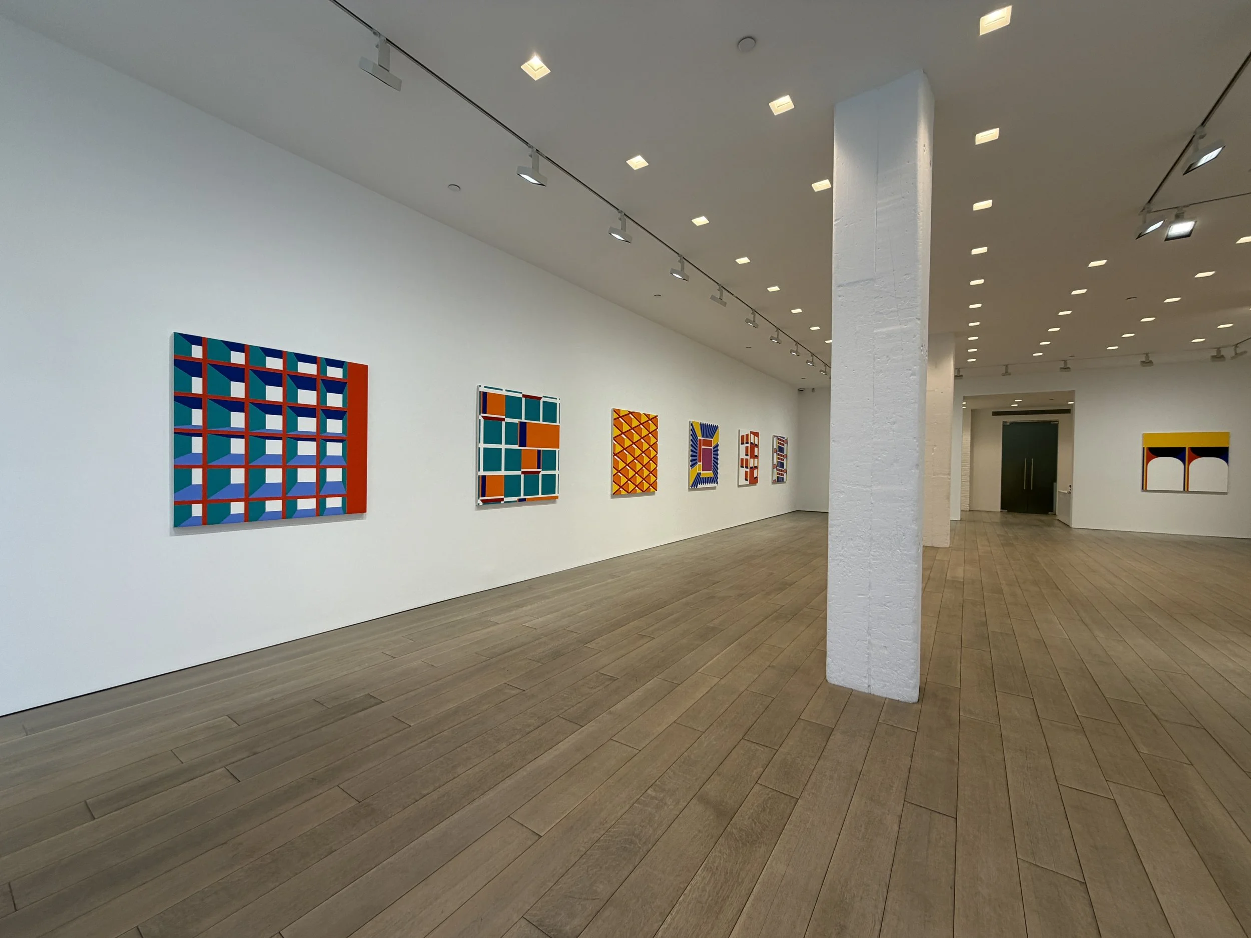
And then on to all four of the Miles McEnery Gallery locations, three of which were showing Southern California painters that I have followed for decades: Kevin Appel, Jim Isermann, and Alexander Ross. I probably enjoyed Ross’ works the most—super lively and fun. The fourth location had a group show called Line/Form, where I saw a very nice Beverly Fisherman installation.
Kevin Appel
Jim Isermann
Alexander Ross
Beverly Fishman
Lots of heavy hitters at Hauser & Wirth: Louise Bourgeois (I loved the works on paper best), Felix Gonzalez Torres’ Untitled (Go-Go Dancing Platform (poignant and powerful, and installed alone in a very large gallery) and, in the gorgeous top floor space, Qiu Xiaofei’s paintings, which remind me of Marc Chagall, Gustav Klimt, story book illustration, and lots of other things. Most important, they are beautifully and skillfully painted, with exceptional color and paint handling.
Bourgeois
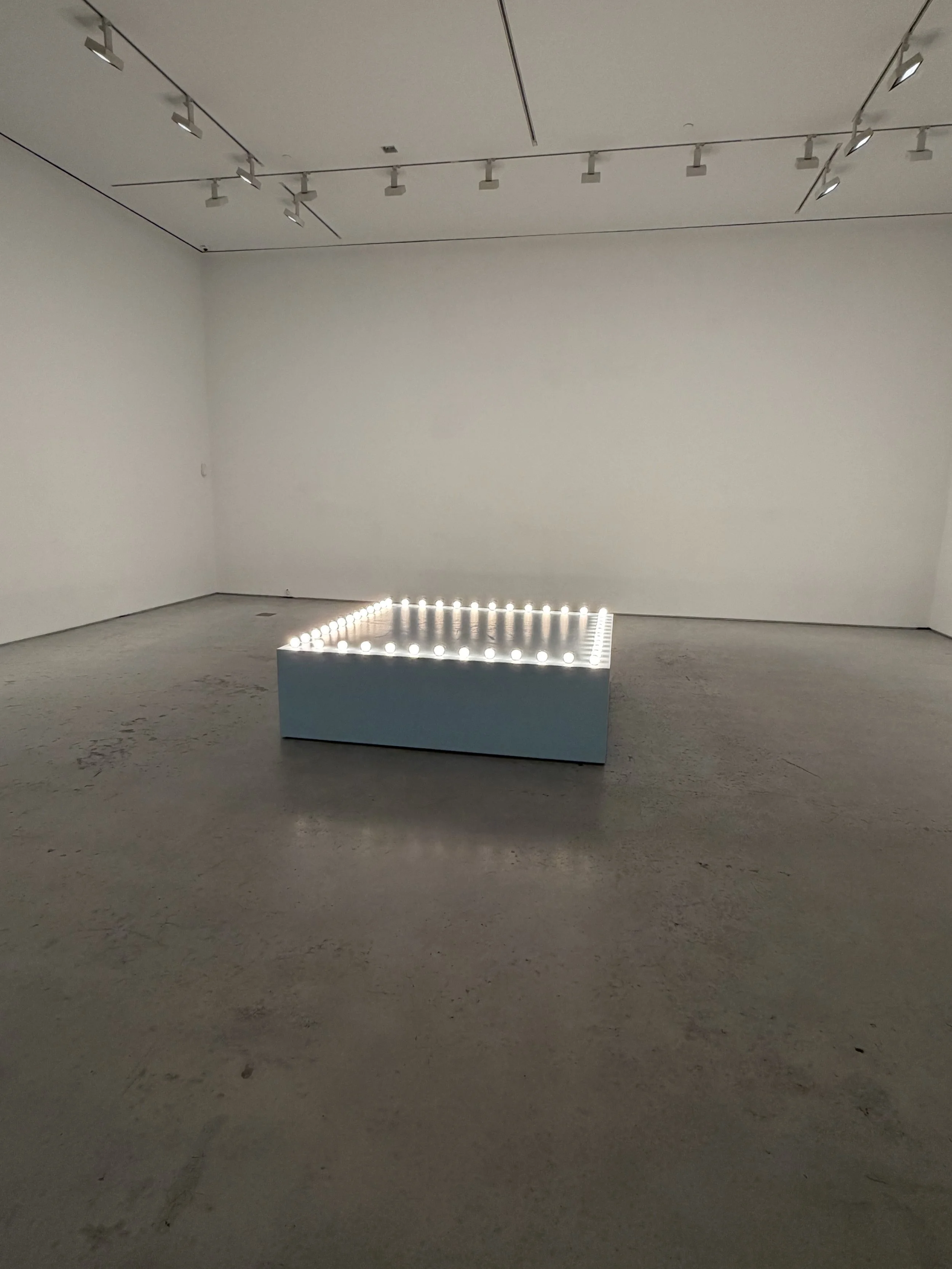
Torres
Qiu Xiaofei
Qiu Xiaofei
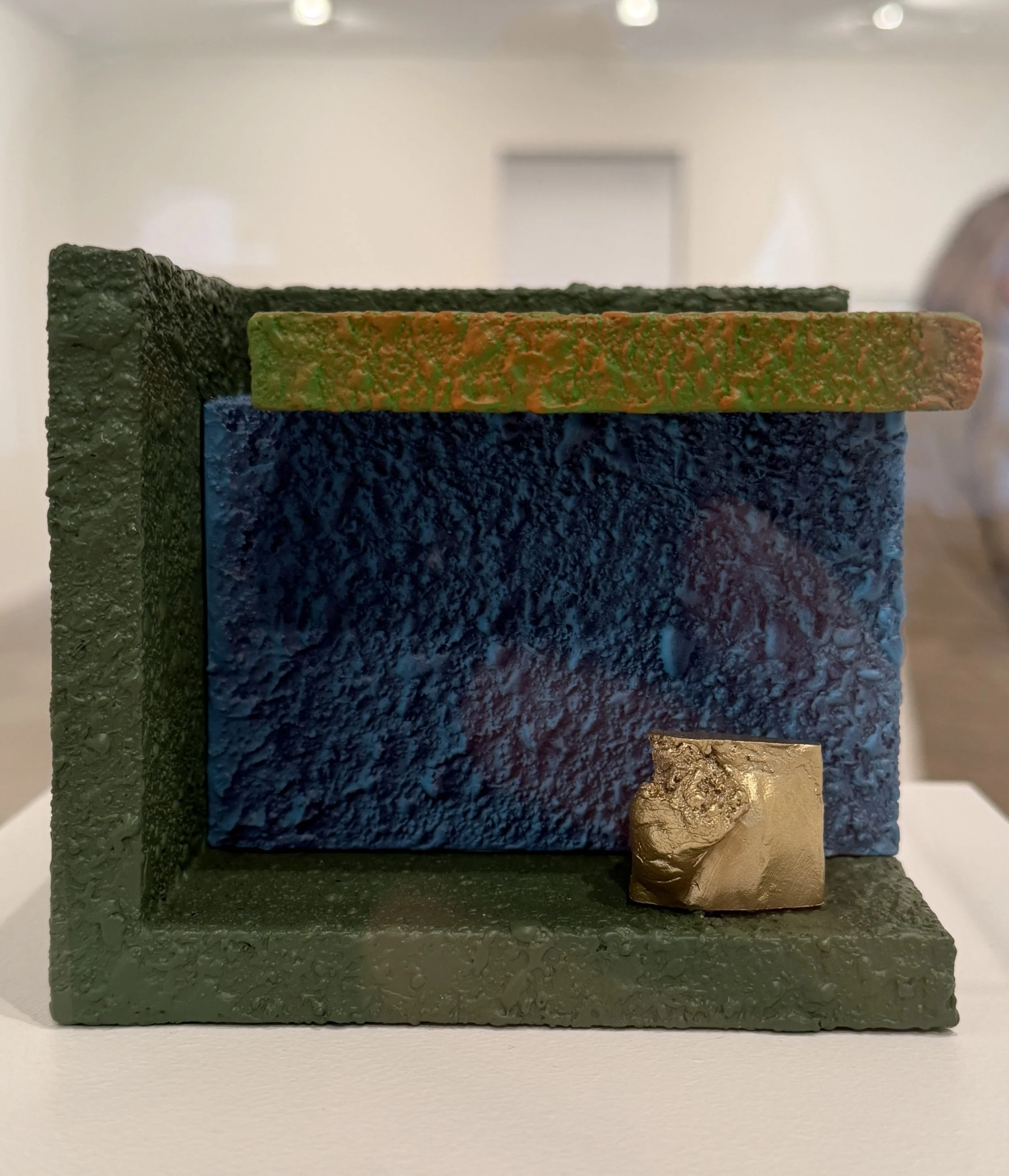
Okay, my energy was flagging a bit at this point, but I pressed on! Saw a great Ron Nagle exhibition at Matthew Marks. As always, super evocative, funny, mysterious, and idiosyncratic. Some of them felt like tiny stage sets. Great colors, textures, and very tightly wound compositions. They were in plexiglass vitrines, which was disturbing to me, and to others. One fellow gallery-goer even complained to the guy sitting at the desk, “WHY ARE THESE IN VITRINES?!” He was outraged, which made me very glad to be taking in the art with like minded folks.
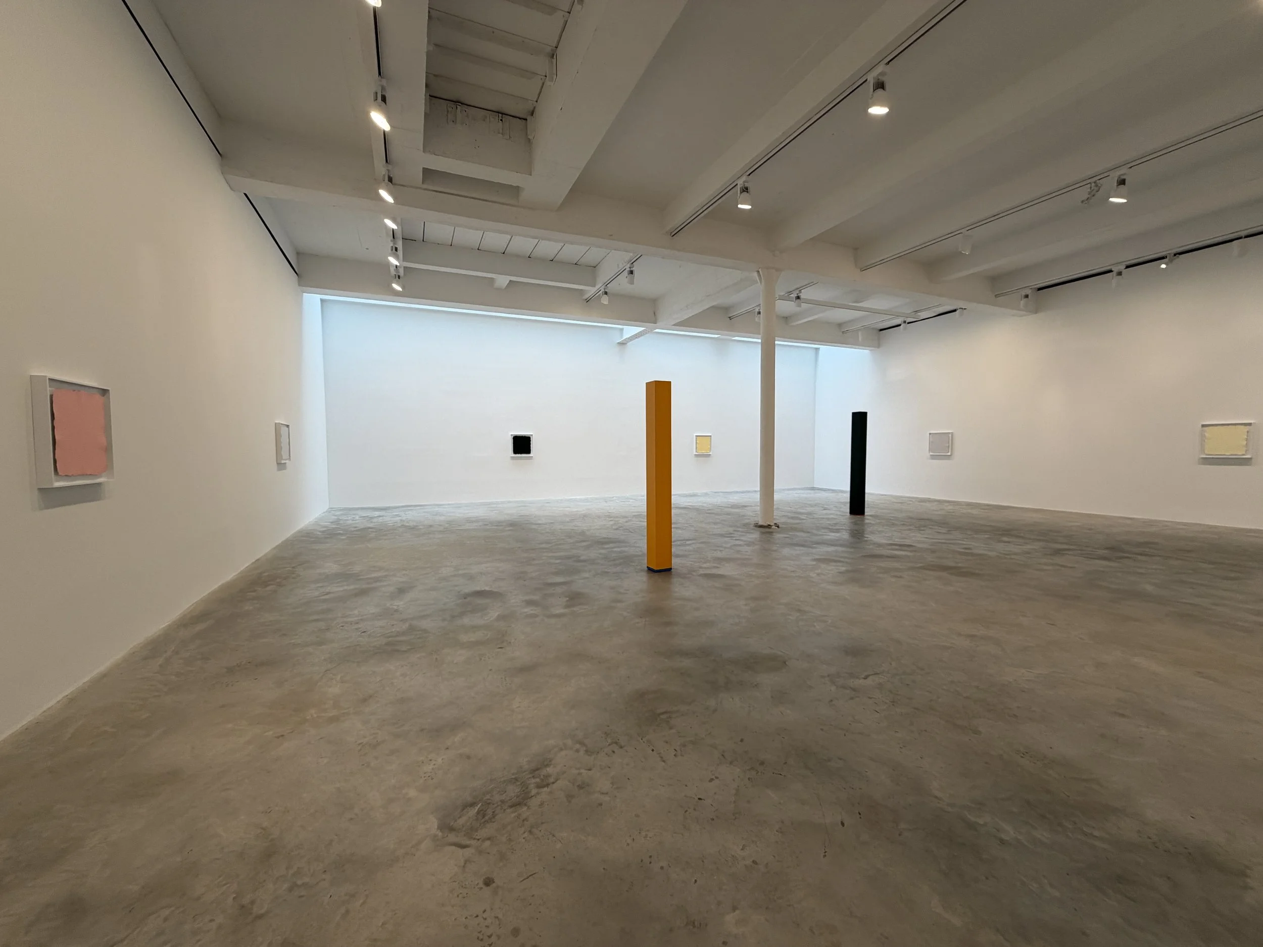
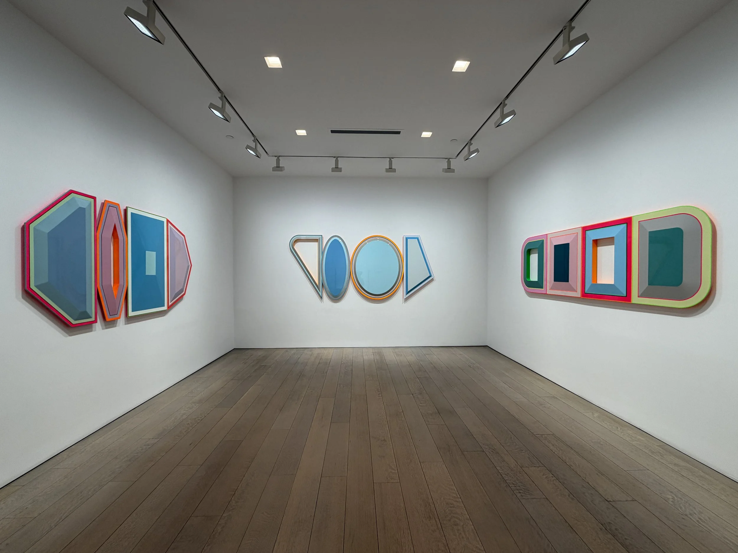
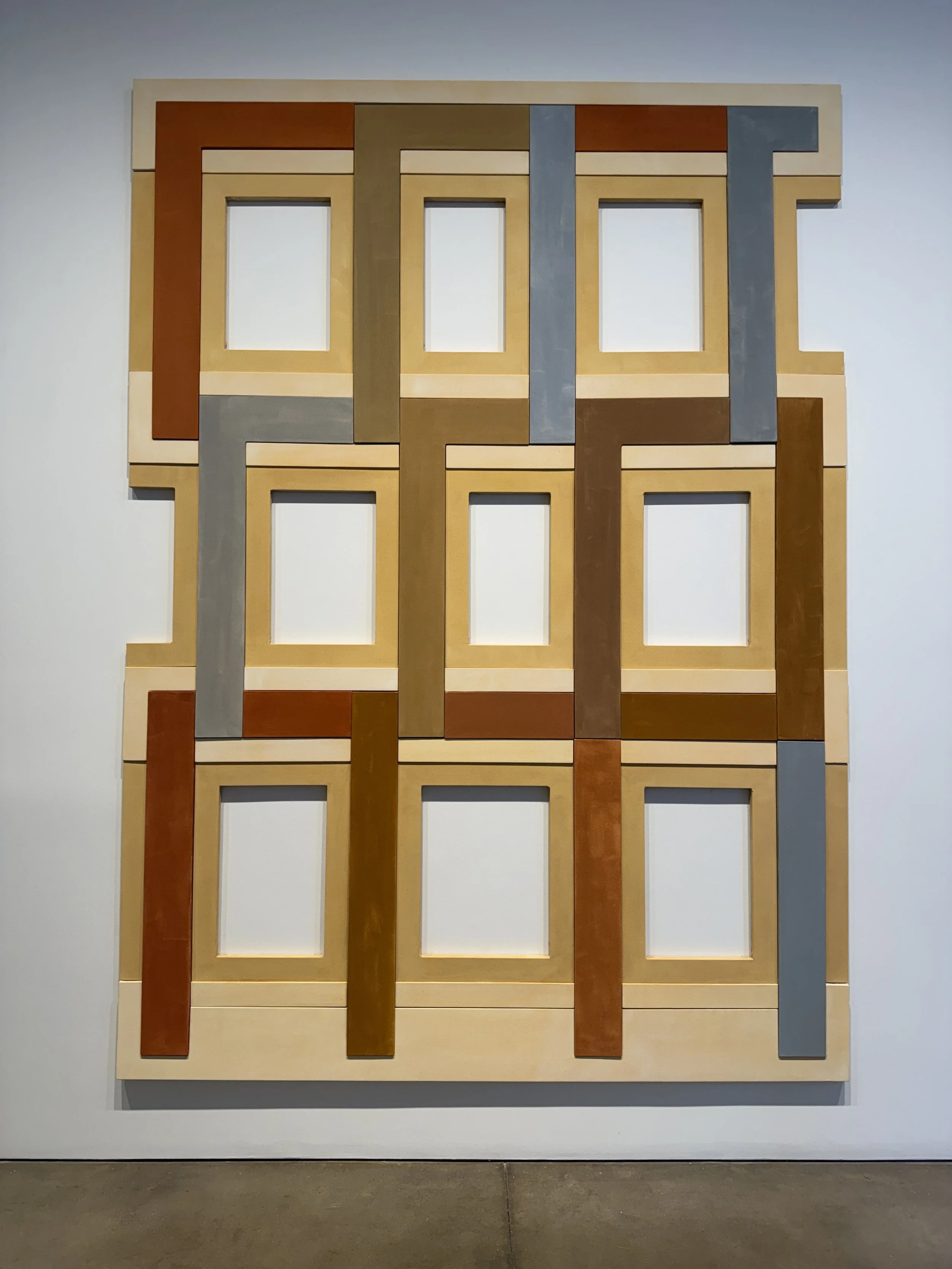
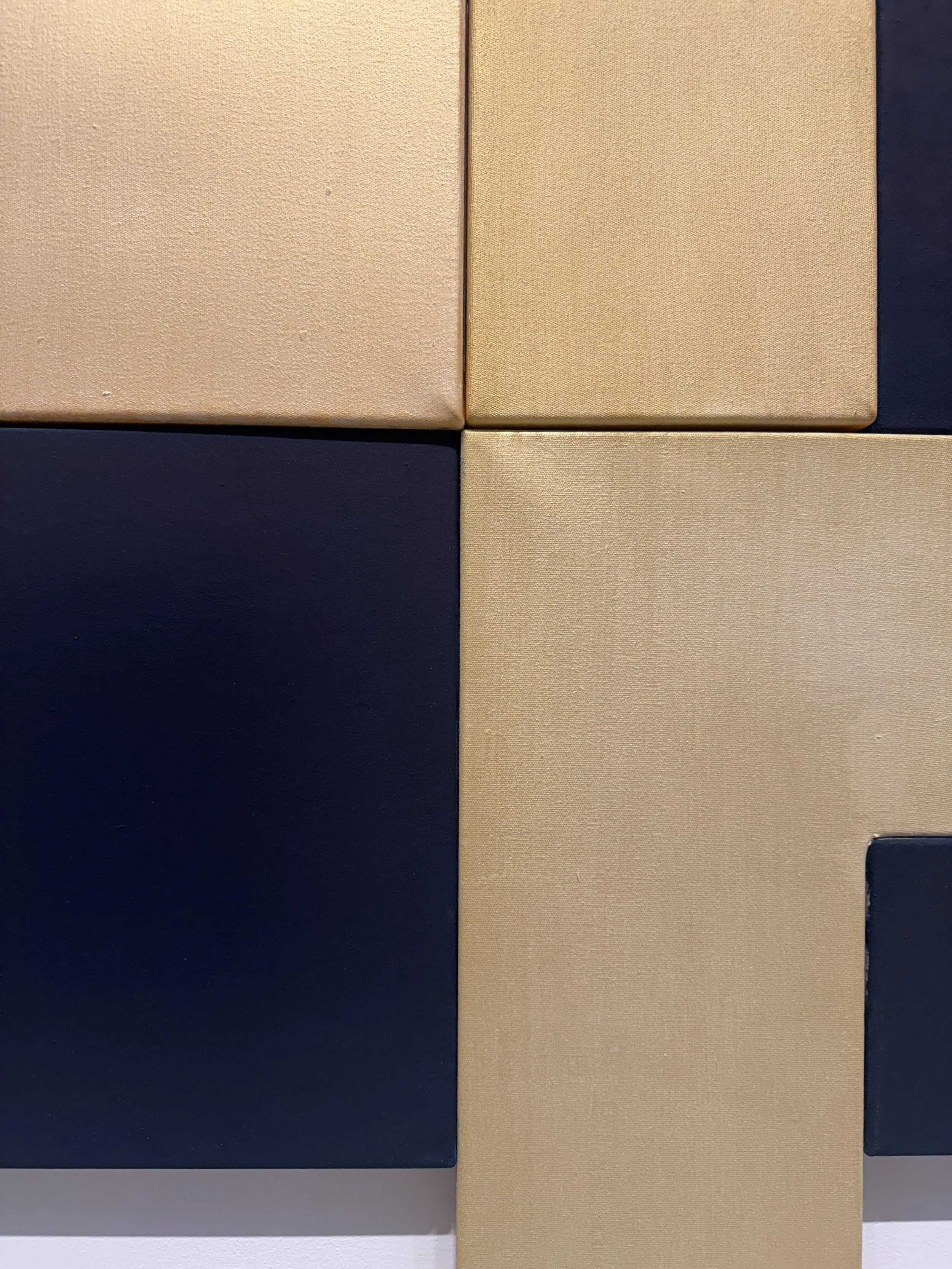
David Novros at Paula Cooper. Really great show of shaped, multi-part paintings. I enjoyed the way they were constructed, and the subtle optical effects that resulted from the slightly imperfect junctures of the forms. There’s something wonderfully off-kilter about them, which disrupts the minimalist vocabulary and methodology.
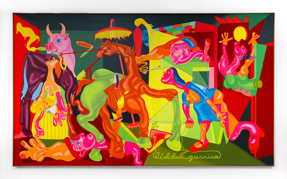
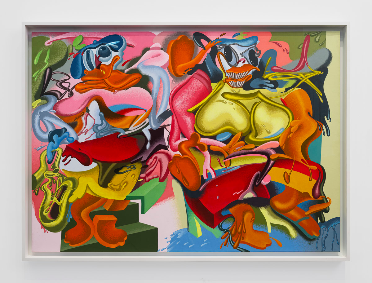
Peter Saul at Gladstone. You might be surprised to know that I adore Peter Saul’s insane paintings. This show, Peter Saul’s Art History, included historic as well new works, each reinterpreting other famous works of art (by de Kooning, Picasso, Duchamp, etc.). I LOVED the color, the intensity, the humor, and the all-in commitment to color and opticality. Saul has the complete tool box. This was exactly what I needed to revive my energy and refresh my eyeballs.
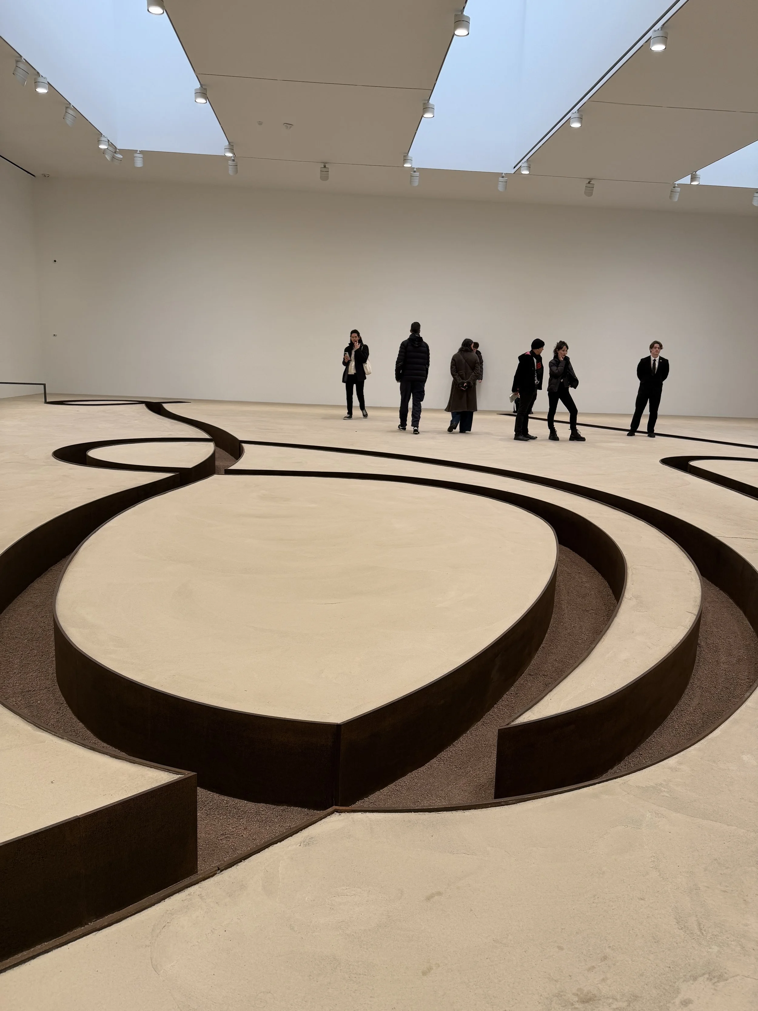
On to Michael Heizer’s Negative Sculpture at Gagosian. I wanted to love it, but I only liked it, mostly due to some imperfections in the concrete. Somehow, it felt that it needed to be really pristine and perfect. Still, a very impressive project.
Okay, Day 2 nearly killed me. By this time, I was nearly due to meet friends for dinner, so I hopped in a taxi and headed down to the West Village.
Day 3: Guggenheim, Jewish Museum, Morgan Library
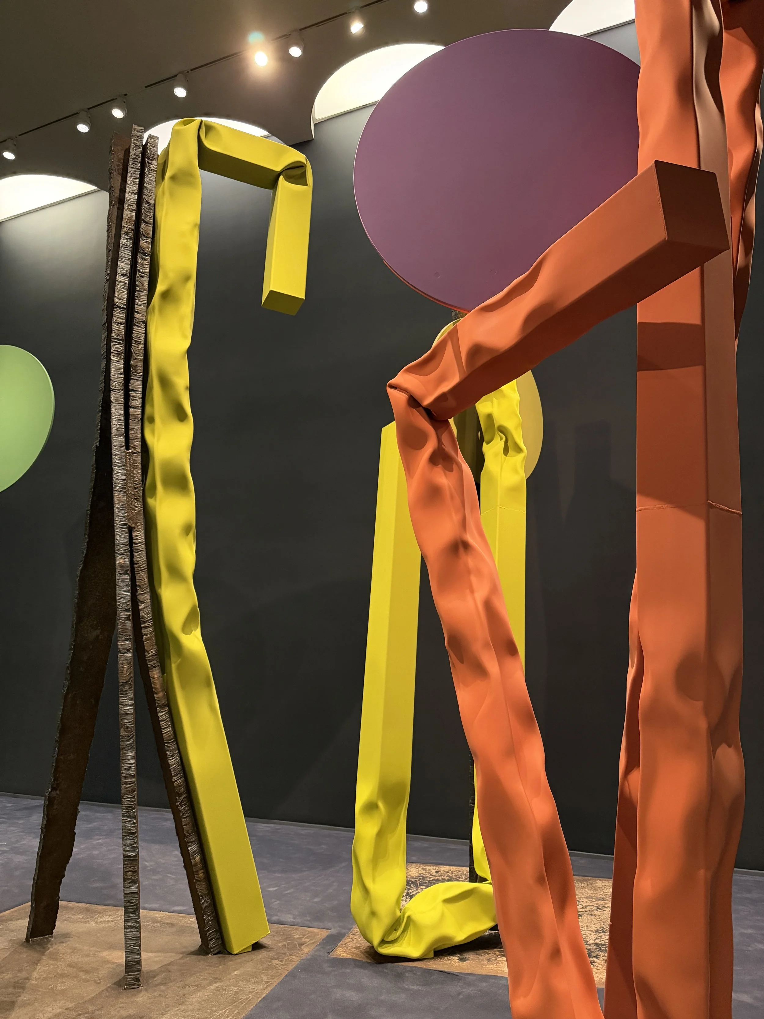
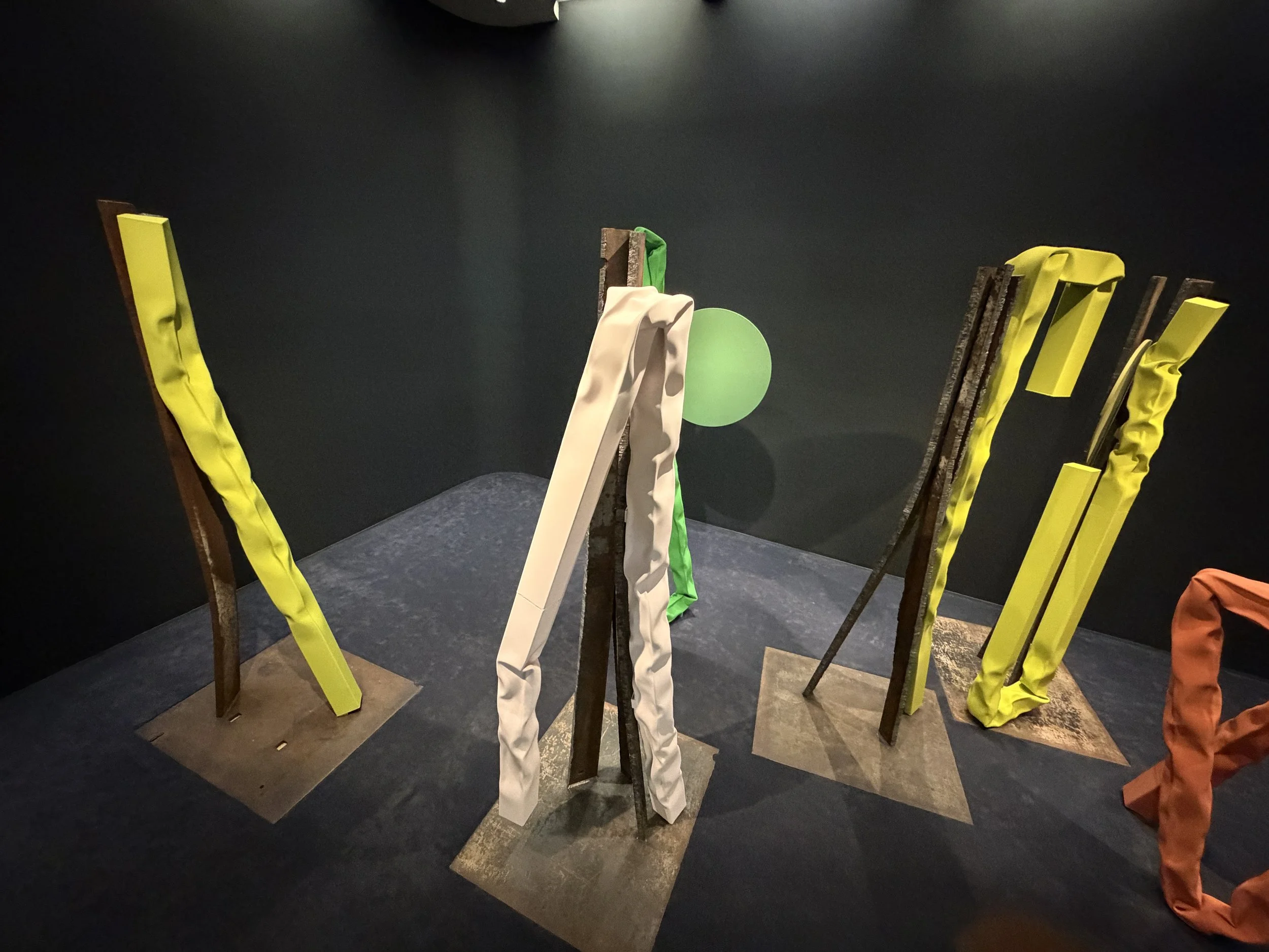
I had the earliest entry time to see Carol Bove at the Guggenheim. I had very mixed feelings about this wide-ranging exhibition; some of it just didn’t work for me, but some of it was terrific. I think the most successful works are the bent square steel tubes; the installation Sweet Charity was like a fanciful forest of these forms, combined with slab-like armatures propping them up. I was reminded of Japanese tree-propping, along with all of the usual associations with Bove’s antecedents: Serra, Chamberlain, and even Henry Moore and Joel Shapiro. Interestingly, the day before (my Upper East Side day) I was walking on Madison Ave., past all of the designer clothing stores, where I saw shop after shop displaying gorgeous spring frocks in the most delicious colors: lemony yellows, soft lime greens, gorgeous pinks. When I entered the Guggenheim the next morning, something about Bove’s surfaces reminded me of these chiffon dresses. Her paint surface is almost velvety, and the hard metal has been bent and crumpled under enormous pressure, creating sinewy folds and draping, It’s a neat trick to be sure. I wasn’t as convinced by the rest of the show— the sad arrangements of detritus (nets, feathers, driftwood, etc.) were particularly weak. The early bookshelf works fared slightly better. The reflective metal circles, placed on the edges of the winding ramp, were a nod to Frank Lloyd Wright, but didn’t float my boat. Anyway, I had a lot of complaints about much of the work in this exhibition, but I left with greater appreciation for the crushed metal works, which are lyrical, humorous, art historically relevant, technically ambitious, and really fun to look at.
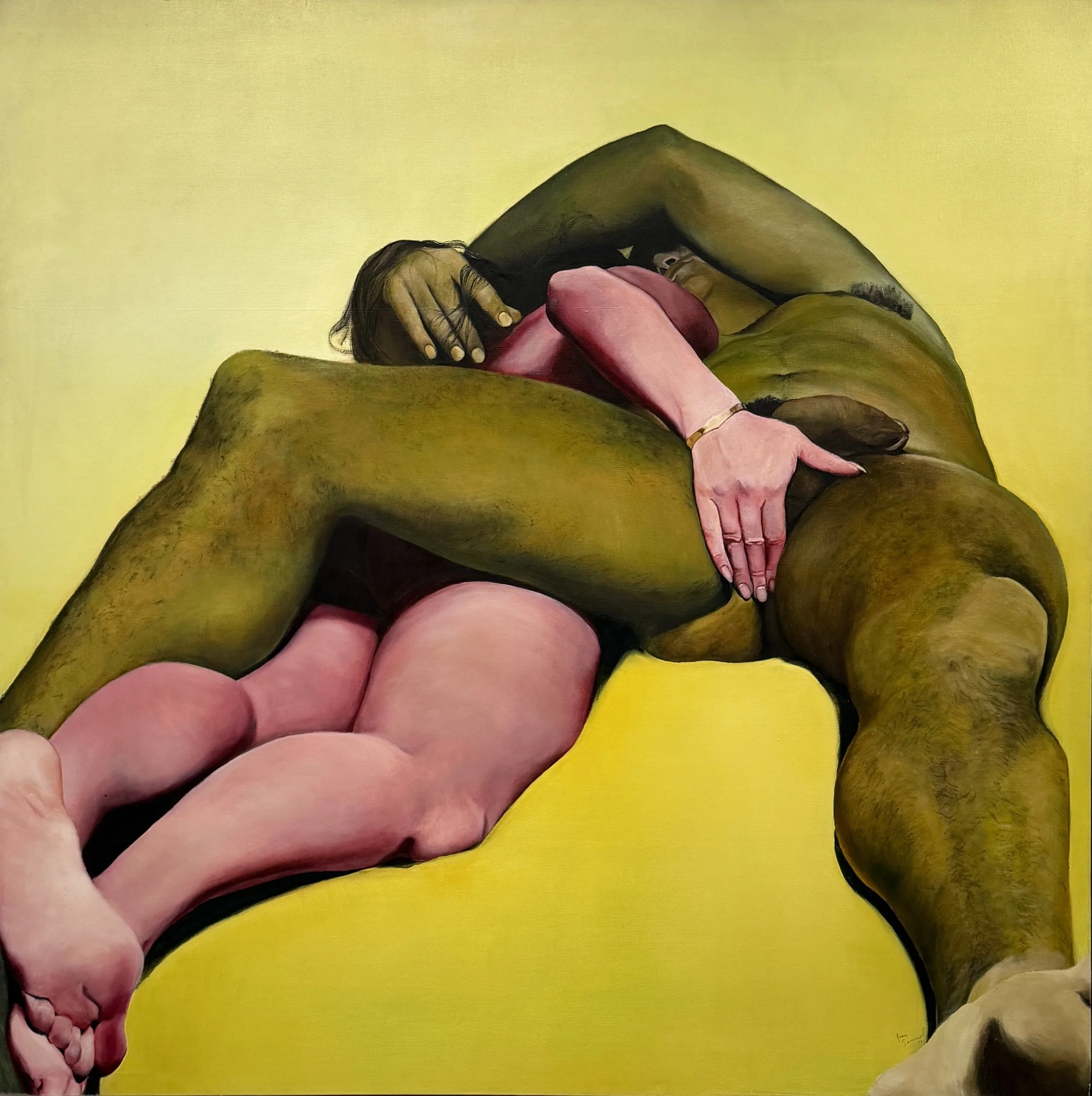
I grabbed a quick lunch and walked up to the Jewish Museum, which had a Joan Semmel exhibition on view. These paintings still feel pretty radical. I had seen a few in a memorable show in Dallas about 10 years ago, and was eager to see this exhibition, which included recent work along with the classic works of the 70s. Some of the paintings verge on photorealism, while others employ bright, acidic color. The show was not very extensive, but the museum was quiet and I stayed for quite a while, visiting the rest of the galleries.
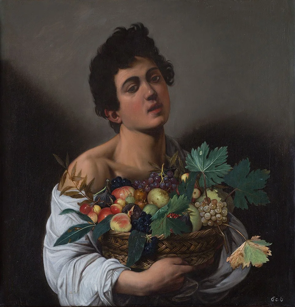
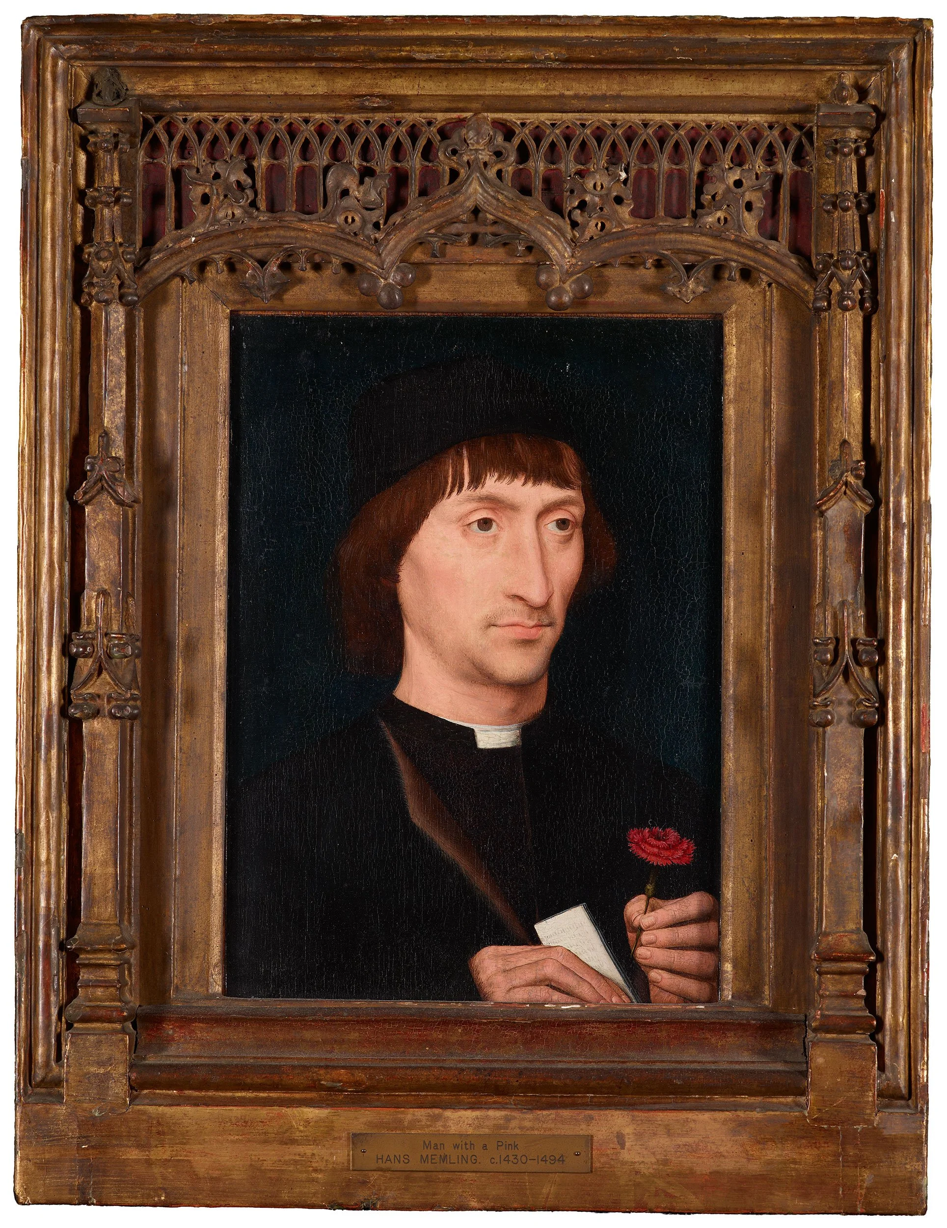
After that, I walked down to the Morgan Library. There was a wonderful exhibition, Come Together: 3,000 Years of Stories and Storytelling, that I enjoyed, but it was soooooo crowded and claustrophobic, so I buzzed through, and made my way downstairs.. Amazingly, Caravaggio’s Boy with a Basket of Fruit is on loan from the Galleria Borghese in Rome. Very nice to see this exquisite painting again. Of course, I had to check on the three Memlings in the collection. Portrait of a Man with a Pink (love the title, BTW) is one of my faves.
Another long day of stuffing my eyeballs to the gills. Met a friend for a late afternoon beer and dinner, then headed home.
Day 4: Guggenheim Museum
By Day 4, my energy was flagging a bit, so I spent the morning with a leisurely breakfast and my laptop. I’m not a fan of Whitney Biennials….no, not because I am a curmudgeon, but because I am just not interested in art that is about “now.” I think the best art is always about now, and also always about eternity. The Biennial is usually short on the latter… Anyway, I started on the top floor, where Calder’s Circus was on view, accompanied by the 1961 film, which is delightfully mesmerizing. Points for that. Then I went down to see some of my old favorites: Jacob Lawrence, Kusama, Frankenthaler, deFeo, and many more. So far, so good.
I’m always happy to be reunited with deFeo’s The Rose. San Francisco readers (and deFeo fanatics) will recall that this painting was encased behind a wall in a seminar room at the San Francisco Art Institute for 25 years. I TAUGHT in that room! The story of this painting is almost as wonderful as the painting itself. At nearly 2000 pounds, and nearly a foot thick in spots, it has the most delicious gravity to it. I should have left the museum at this point, but instead I girded my loins and braved the Biennial.
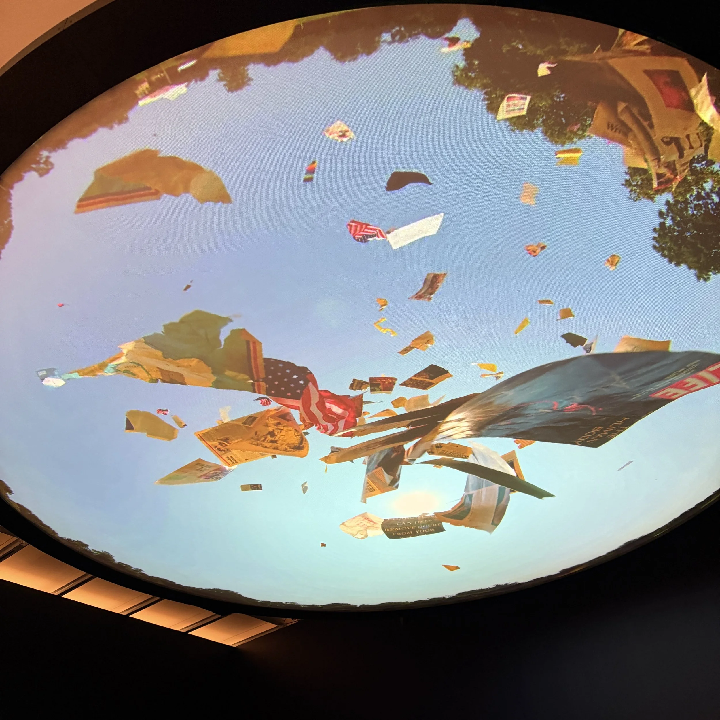
I don’t like to bash people, or exhibitions, so I will restrain myself, but I will say that the whole thing was kind of depressing, materially/formally lacking, and hell bent on commenting on things that I am not terribly interested in. I prefer work that is more of a perceptual experience. I did not glean any feelings of joy, love, hopefulness, beauty, or even deep personal impetus. The one work that will most definitely stay with me is Michelle Lopez’ Pandemonium, which is a high definition video projected onto a circular screen on the ceiling of a dark gallery. Lopez had created a tornado machine that whips up detritus and spins it round in a terrifying, apocalyptic fashion overhead. It’s literally as if the sky is falling. It reminded me of natural disasters, papers and ash cascading down from the World Trade Center on 9/11, and lots of scary movies. The soundtrack is very horror-film—whirring and ominous. Of course, you can hear it throughout the gallery, so it rather casts a pall on things, amplifying the sad sack, downer feeling that seemed to pervade most of the Biennial.
Well, that’s enough of that! I was really, really bummed at this point, so I marched around and found a really yummy spot for an early dinner alone.
Day 5: MoMA
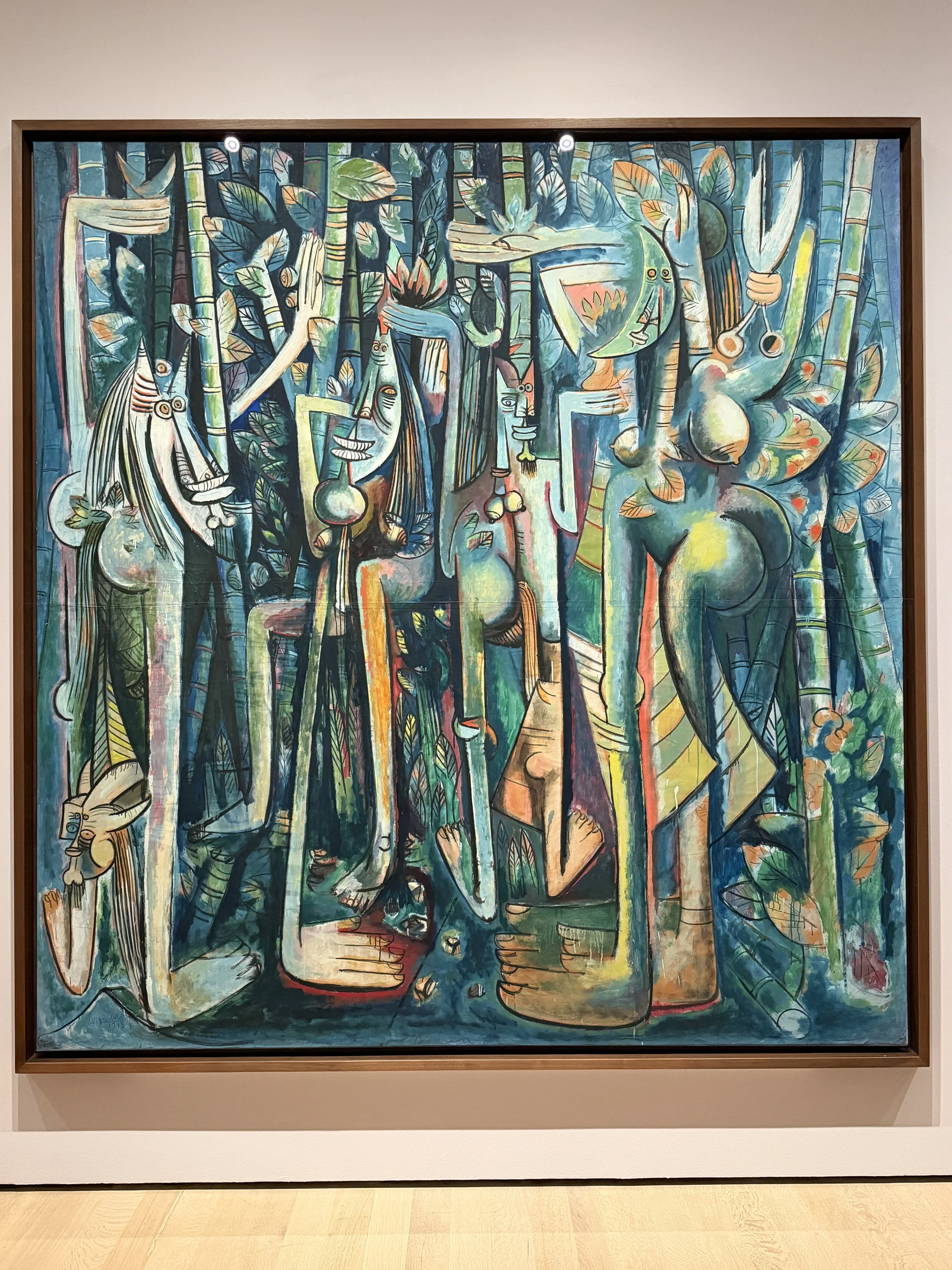
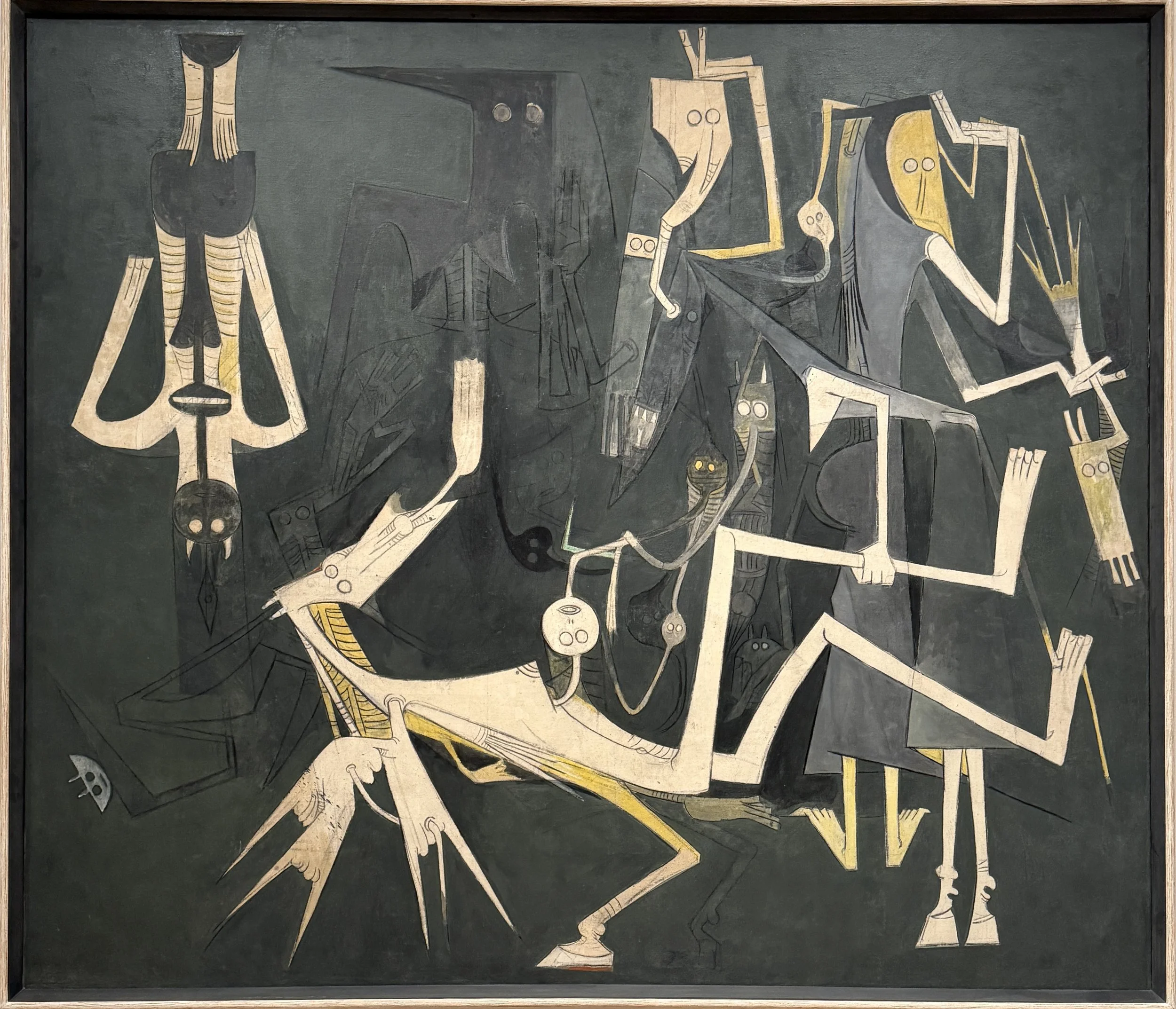
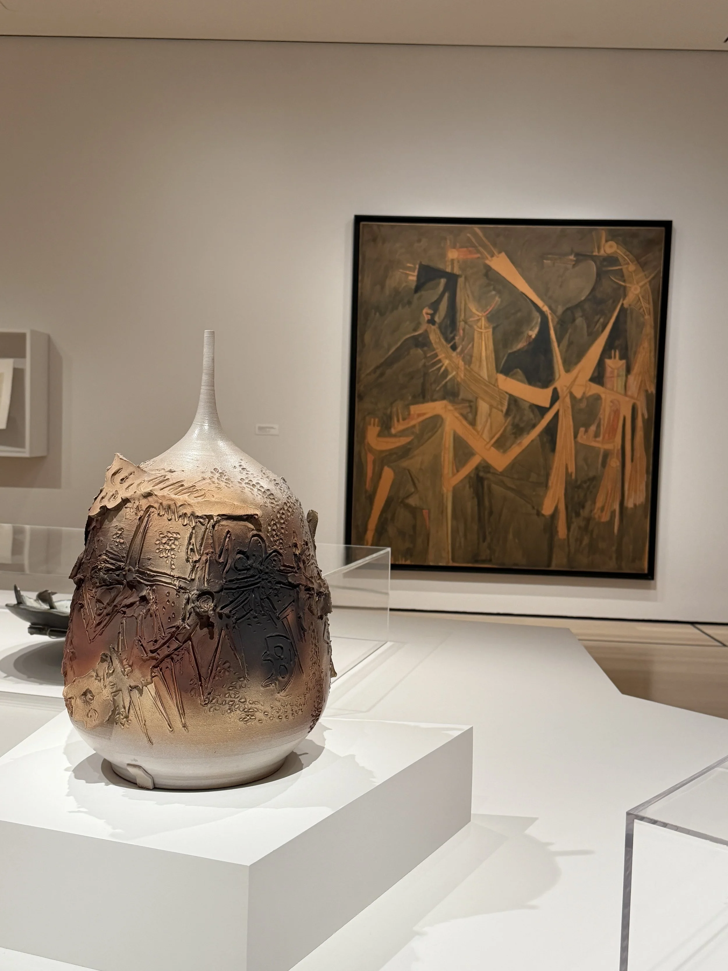
I had a bit of housekeeping to do on my last full day in NYC, so I cleaned up the lovely apartment that a good friend had lent me, had a nice breakfast, packed up as much as I could in advance of my very early flight the next morning, and then took the subway uptown to MoMA. I had been there in December, and saw the Ruth Asawa retrospective, but I had been pressed for time that day, so I missed the Wifredo Lam exhibition, When I Don’t Sleep, I Dream. Lam, who was of Afro-Caribbean and Chinese descent, took the tenants of modernism and combined them with deep cultural associations and imagery. His geographic trajectory was astonishing—he spent time in Europe off and on (becoming good friends with contemporaries like Picasso) but was constantly displaced, exiled, and shuffled about, resulting in a very broad approach to his work. At some points, he was so impoverished that he made large-scale works on craft paper, using highly diluted paint. These works are the most powerful, in my opinion; the techniques that were necessitated by his lack of money seem really fresh, personal, and highly developed. I loved the surfaces of these works much more than those of his oil paintings. He experimented with many different media, and I especially liked his ceramic works. Really terrific show.
I spent a couple more hours at MoMA, then walked uptown to meet my cousin for dinner.
All in all, a great trip, with lots to consider. Thanks for reading.