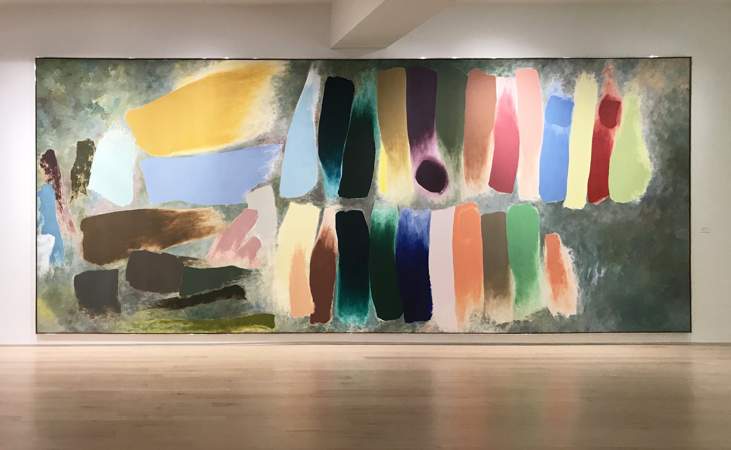
I’m thrilled to announce the installation of Code Garden, my commissioned painting for a new building in Assembly Innovation Park, Somerville, MA. Code Garden is a 20 x 40 foot oil painting on four canvases. Although my public art commissions are very large in scale, Code Garden is the largest work I have ever made in my studio.
In this post, I’ll share a bit about the very challenging process of making this piece.
When I received the commission, it was clear that the painting would have to be made in four sections. After many phone meetings with canvas and panel maker, Lucius Hudson, we decided that the painting would be made up of four 20 x 10 foot panels (with extra canvas for stretching), to be cut and prepared at Lucius Hudson’s facility in Gardena, CA. As the painting neared completion, Lucius Hudson built a configuration of four aluminum stretchers which would be sent, partially assembled, to Somerville, where the canvases would be stretched on site before installation.
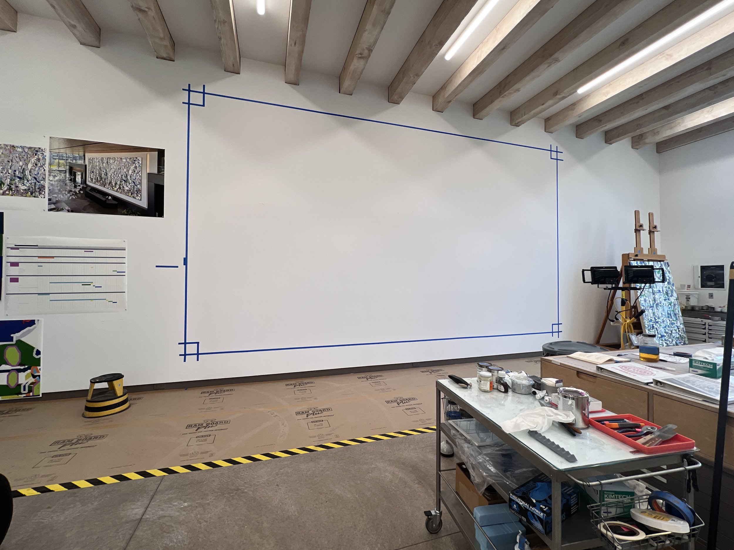
Marking off a big rectangle on the the west wall of my studio
After completing a site visit, there was a lot of lag time before the final design was approved. I used this time to prepare everything I possibly could in advance of production. The first step was to lay out a big rectangle on the west wall of my studio. As the final painting was to be 20 feet high, and my studio ceiling is only 15 feet high, each section of the painting had to be painted on its side.
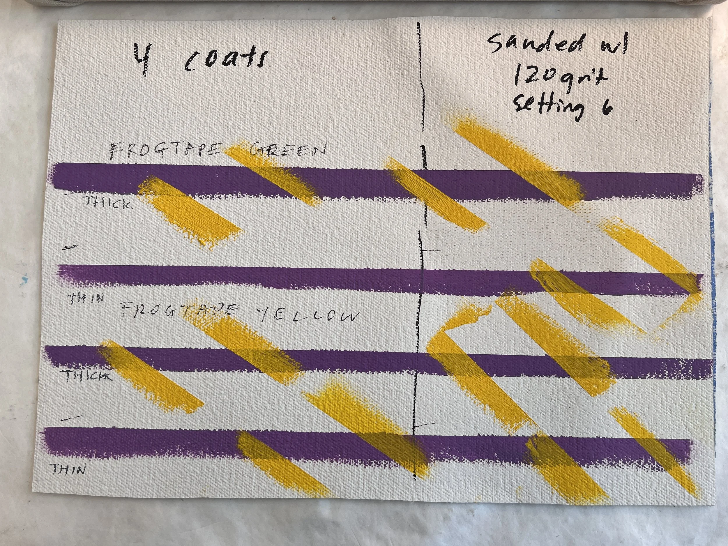
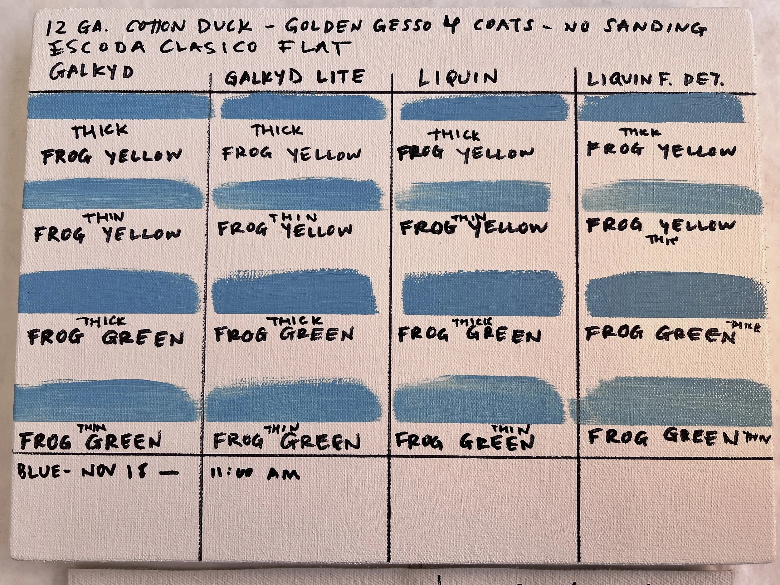
I spent A LOT of time testing materials. Because of the scale, we decided that we would used heavy gauge cotton canvas prepared with Golden acrylic gesso. As a rule, I work on panel stretched with linen and prepped with oil ground, or panel covered in muslin prepped with traditional chalk gesso. Since I would be working in a somewhat unfamiliar way, I tested lots of different brushes, tapes, and oil mediums in advance.
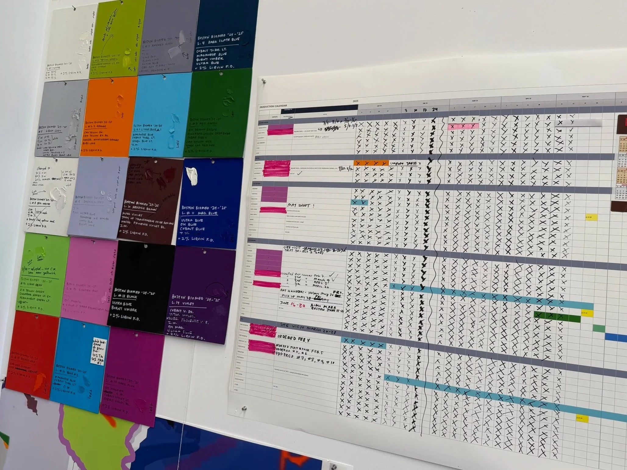
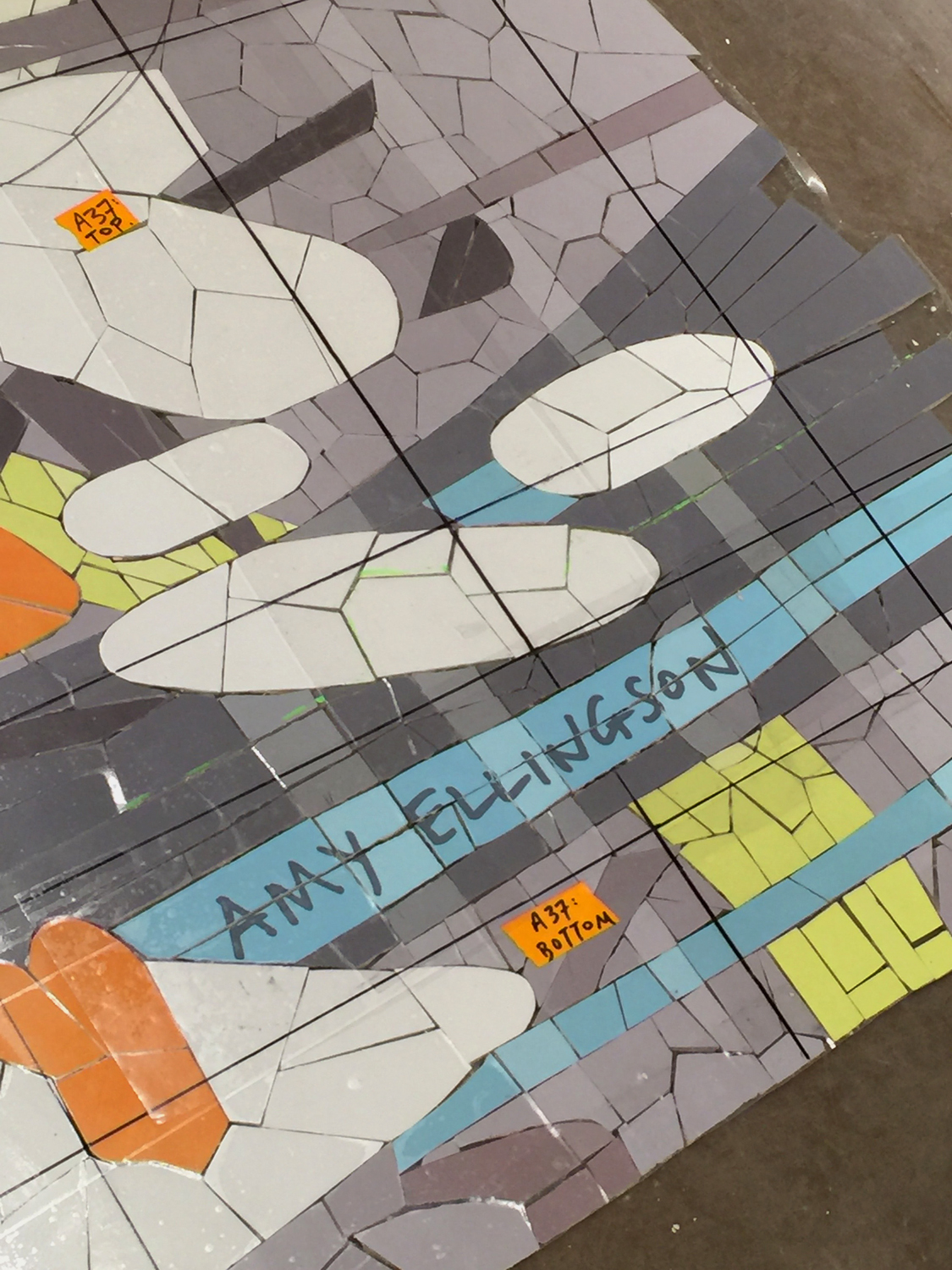
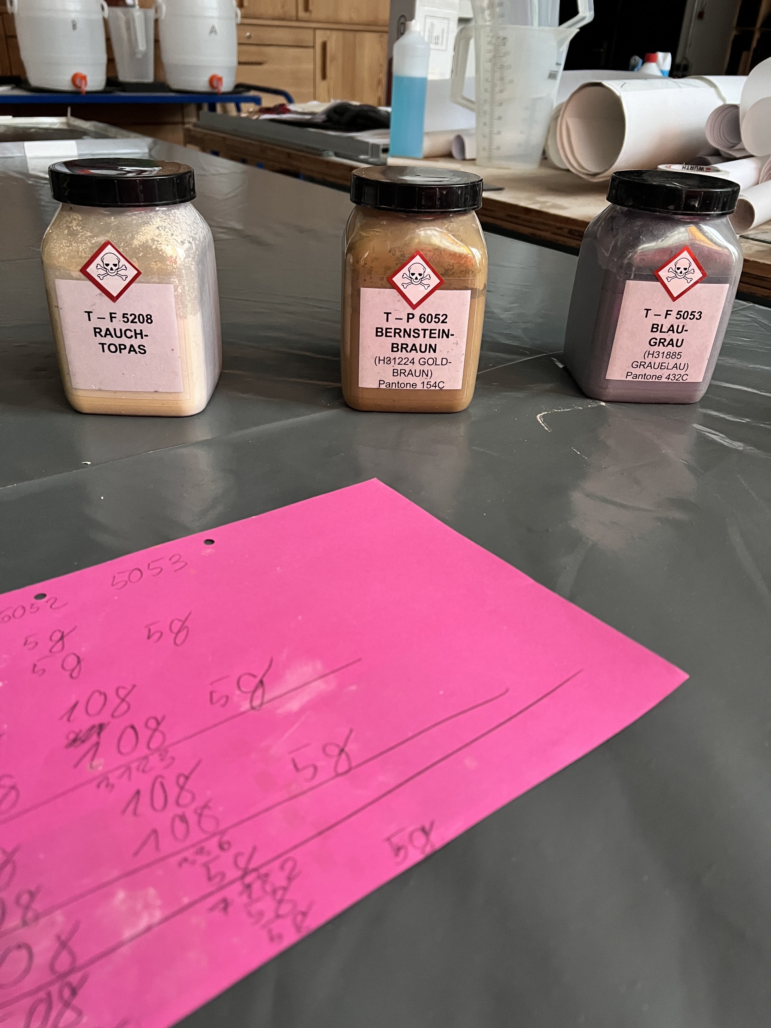
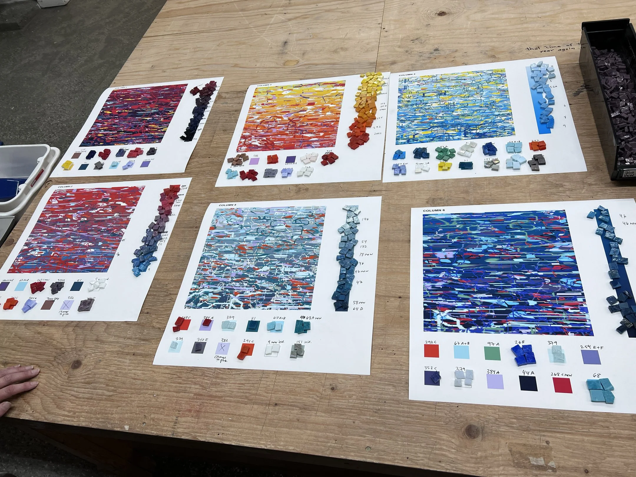
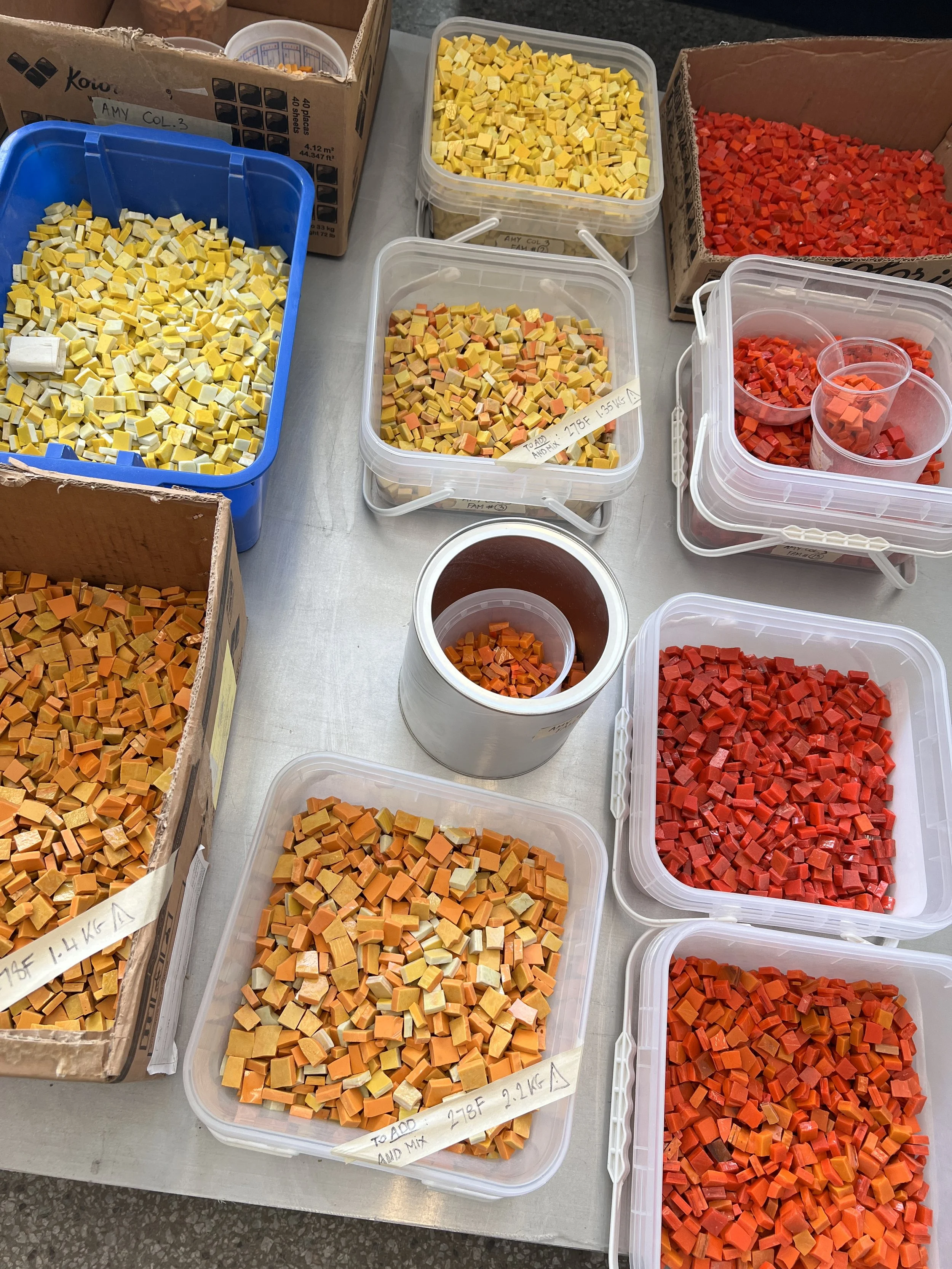
Once the design was approved, I spent a week or two creating the palette and painting large color swatches that could be matched throughout the process. I jotted down the basic recipe for each and pre-mixed and tubed a lot of paint in advance. But, since I have never painted anything this large, and since we were working on a very rough canvas that swallowed up a lot of paint, I had no idea how much paint I would use. I blew through an ungodly quantity of oil colors and hog bristle brushes, using much more than I had anticipated. Even though I had the basic palette laid out in advance, I needed to see everything on the actual canvas. We made a few slight color adjustments on Panel 1, and then matched to the new formula with each round of mixing. However, the recipes were just guidelines— all color was all matched by eye. To the right: a spreadsheet with all other ongoing studio projects laid out.
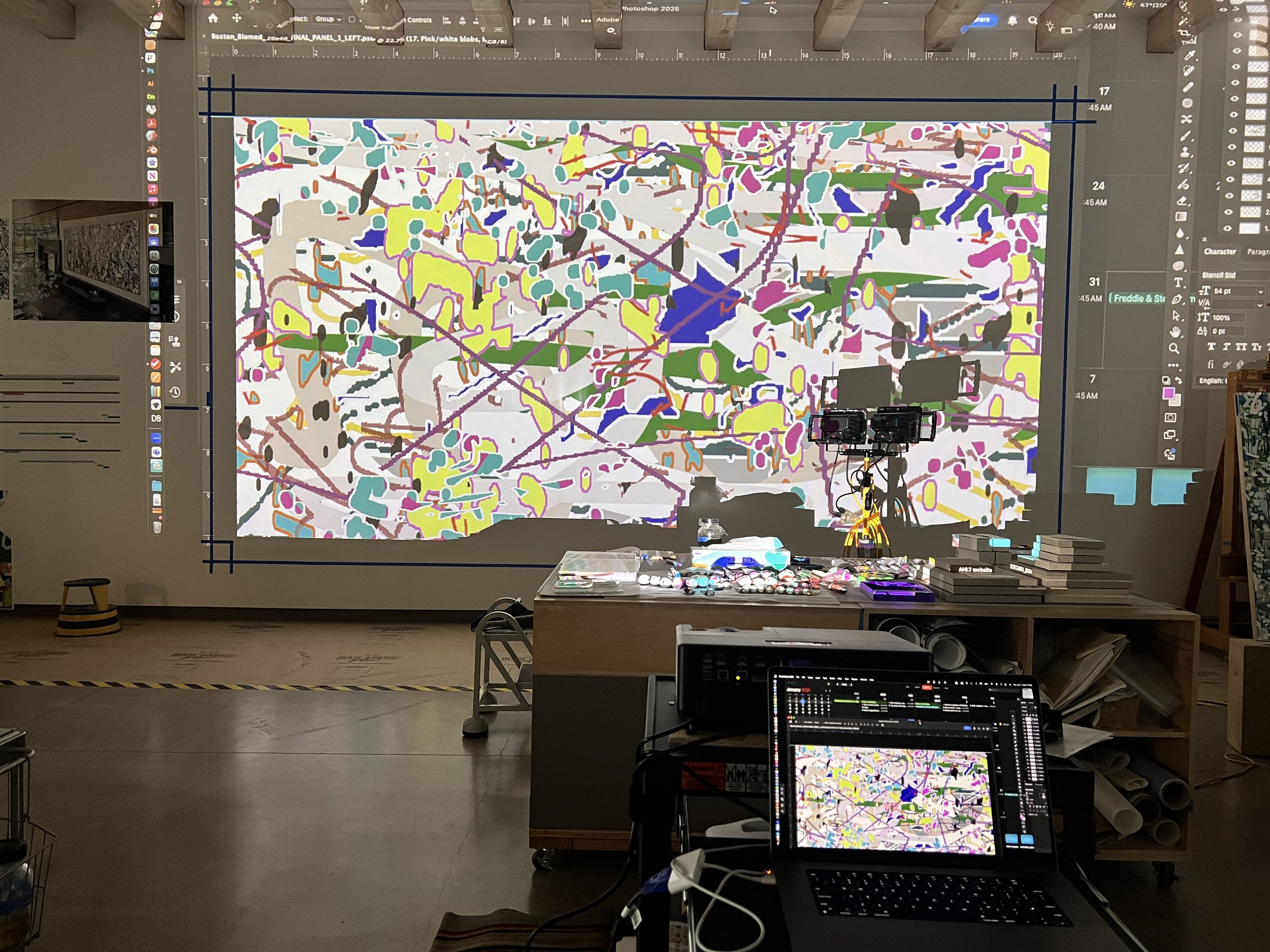
I bought a new high resolution, short-throw projector. Here, I’m projecting Panel 1 imagery. I was very pleased with the resolution and clarity because, as each panel progressed, our close up view of the projected layers became more and more difficult to decipher on top of the density of the painted imagery.
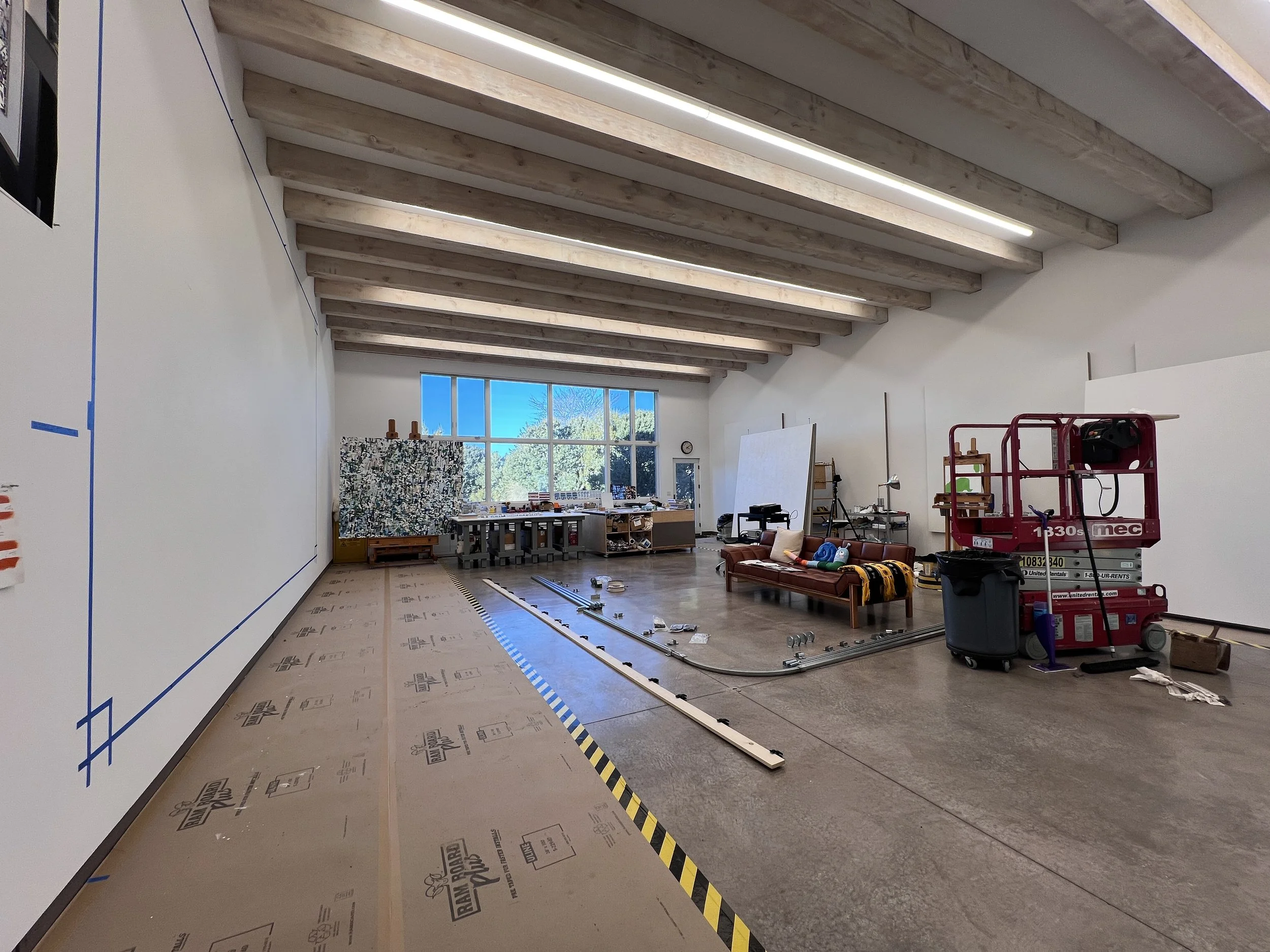
The weeks of preparation time allowed me (with the help of a good friend) to design a hoisting system to raise the heavy canvases to the wall and a ceiling track system to move each of the finished canvases to the south wall of my studio. Here, you can see the ceiling track system laid out on the floor prior to installation.
Finally, we were up and running. Normally, I paint each layer (each distinct color) of a painting separately, slowly building up a surface. But, because this painting is so large, and because of the very short production timeline, I realized that it would be a huge waste of time and materials to paint each layer separately. Instead, we painted groups of layers, beginning with the fist 6 or 7 colors, which essentially covered the entire canvas surface, creating a nice base. Subsequent layers were painted in groups of 2-4 layers. That way, shapes kept their integrity, and we had visual clarity and physical space around shapes as we were working. We tried to avoid wet-into-wet painting as much as possible.
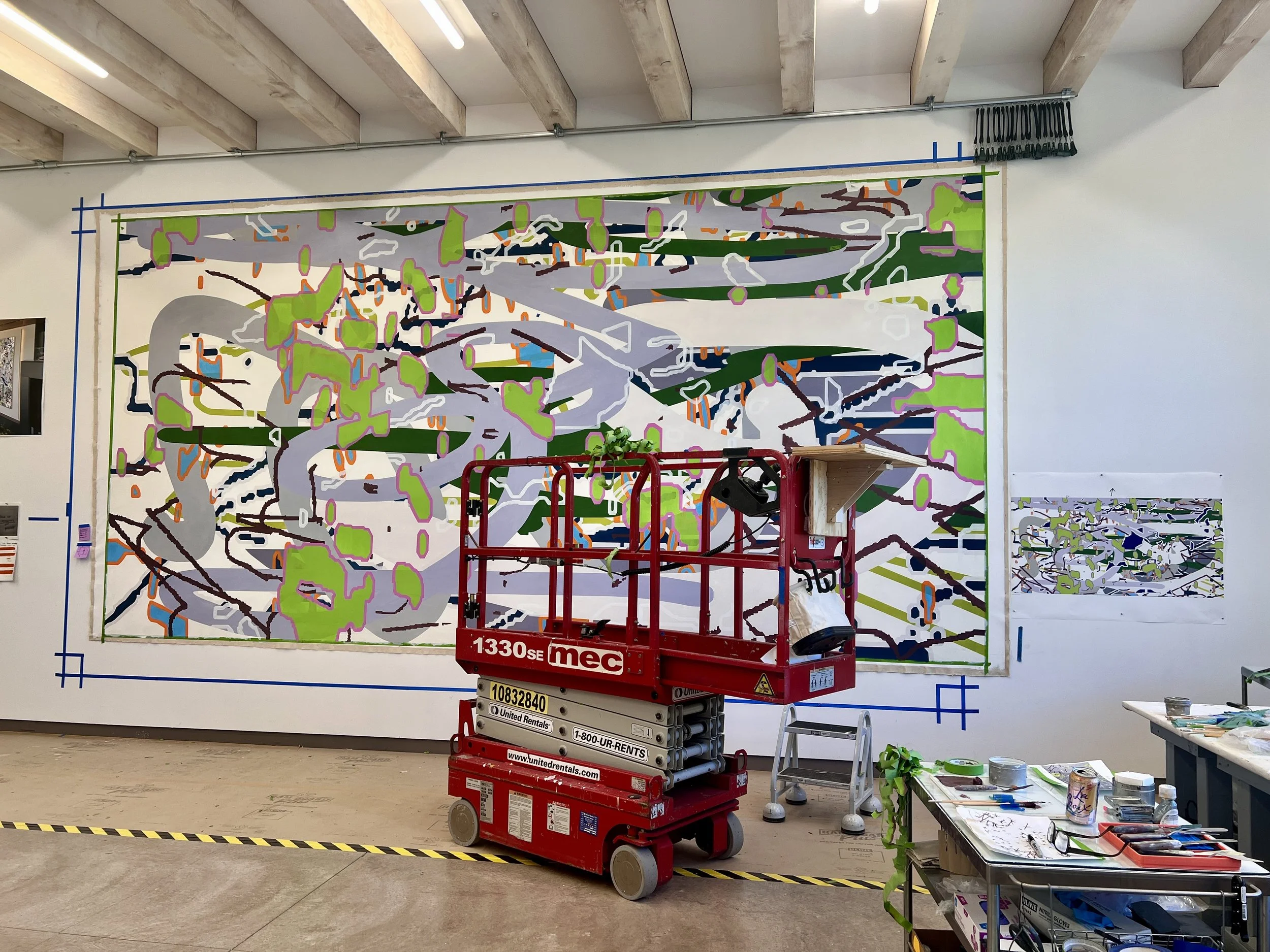
In this shot, Panel 1 is about half finished. We had about 28 days to paint each panel. Because Code Garden is an oil painting, we had to be really mindful of drying time. A lot of people were surprised that I didn’t paint this in acrylic, but I haven’t used acrylic since my undergraduate years. And, because we were switching up so many things— heavy gauge cotton canvas, acrylic gesso, hog bristle brushes, etc.— I wanted to have at least one constant, familiar factor— my favorite brand of oil paint, Old Holland. More importantly, I knew the painting would have a more robust and luminous visual presence with oil color.
On canvas moving days, we were lucky to be joined by a small army of volunteers who, after noshing on pastries and coffee, helped move finished canvases from the west wall to the south wall of my studio. After carefully removing the staples at the bottom and sides of the canvas, we attached the top edge of the canvas to the tarp clips hanging from the straps on the track. Then, we slowly moved the finished canvas to the south wall, where we stapled it into place to dry further.
Hoisting Panel 2 to the west wall with the hoisting board and pulley system. This really worked great. Once the hoisting team pulled the canvas up to the approximate height, two of us drove through on the lift and stapled the top edge, taking care to make sure the canvas was centered and level. Because Lucius Hudson left only the ideal amount of extra canvas on each edge, we had to be REALLY careful to make sure that all margins were even and the same width.
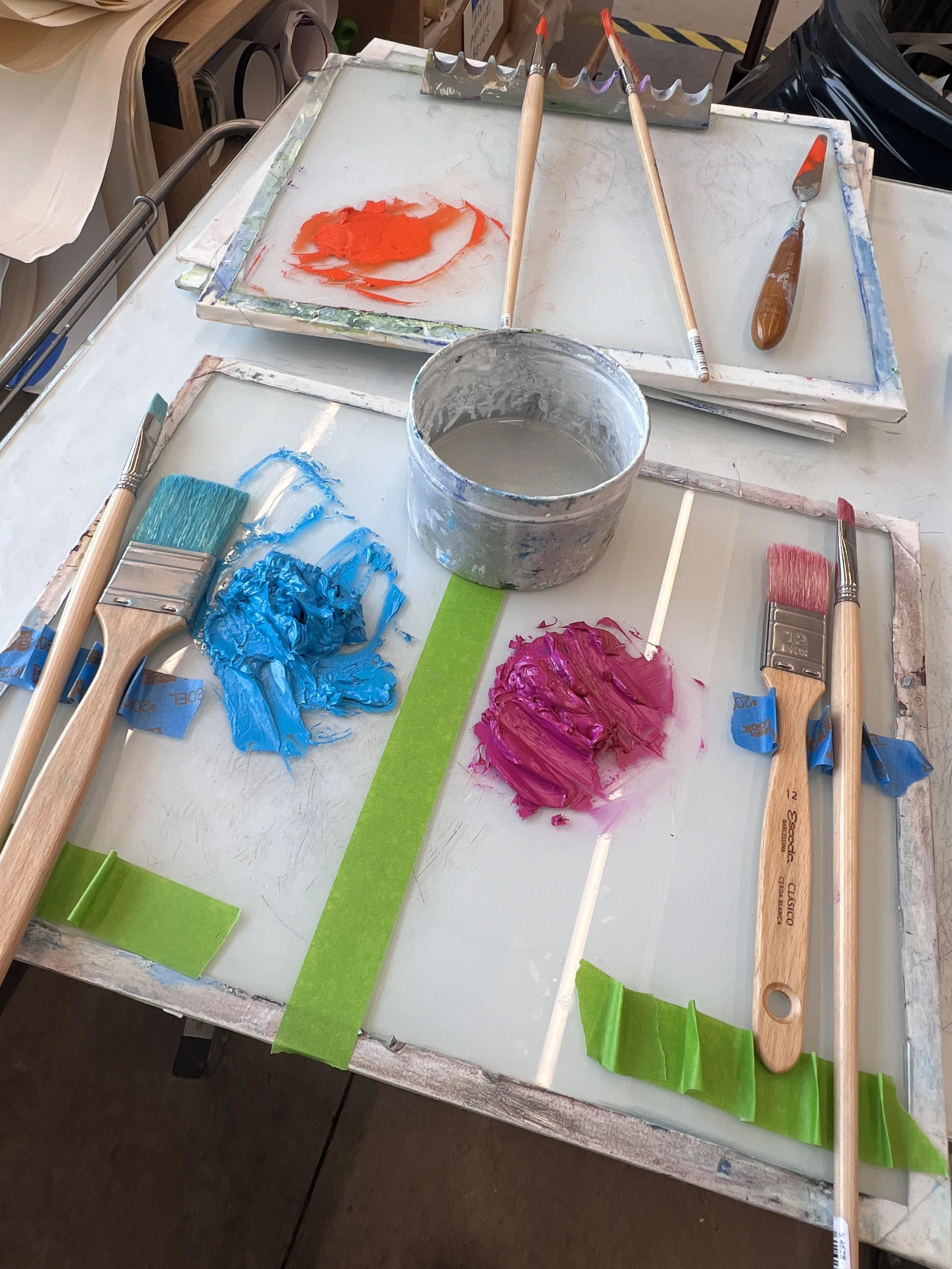
A pretty nice palette setup!
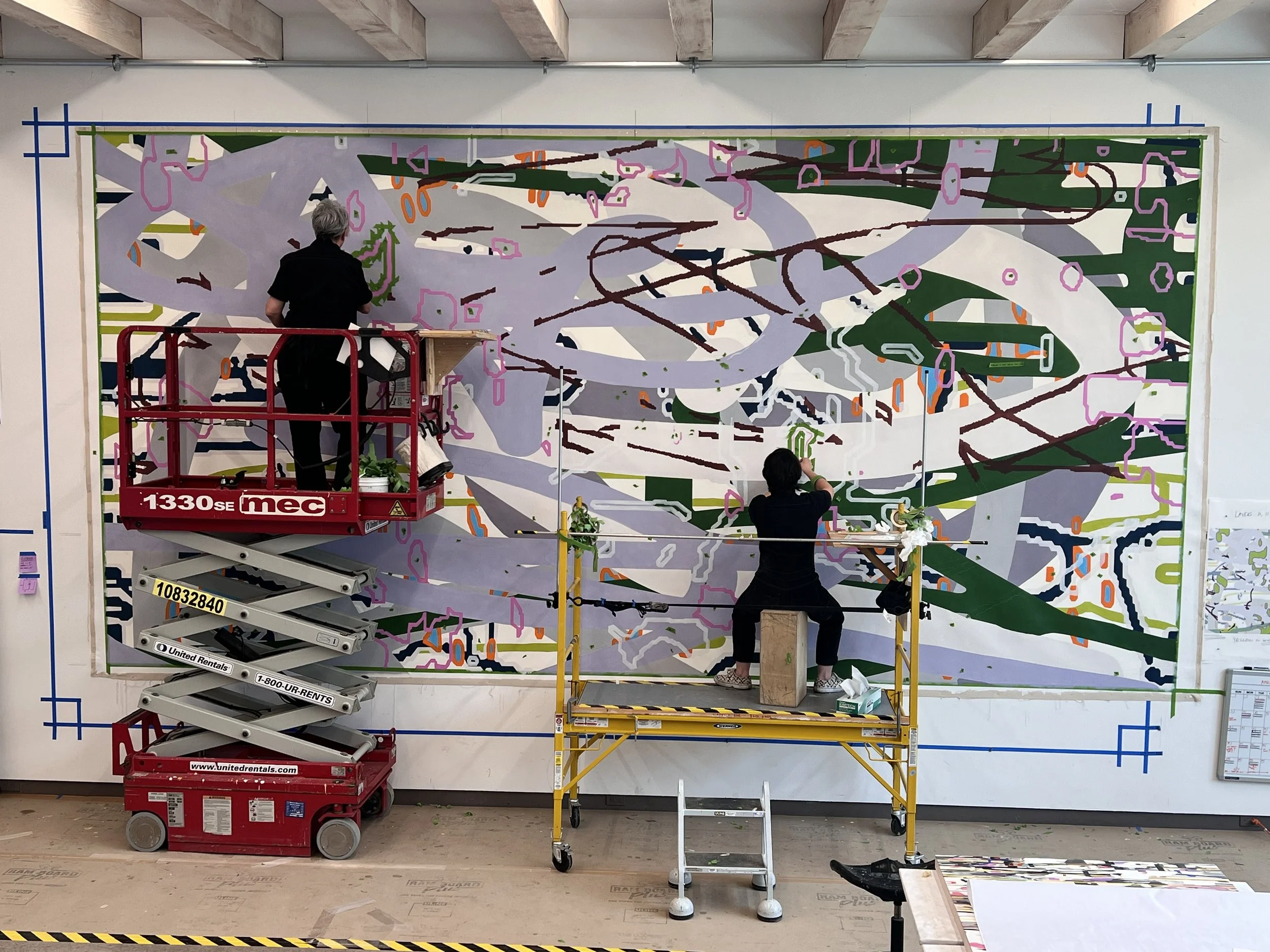
Each day, we had to figure out how two or three people would plot their moves across the canvas. Inevitably, there would be a few awkward moments in which everyone piled up in the same spot. In the end, it seemed most logical for one person to start in an upper corner, and one in the opposite lower corner, each moving across the painting and eventually crossing over each other. It involved a fair bit of choreography.
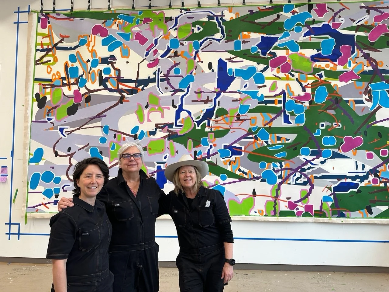
Team photo after the completion of Panel 2. From left: Thibault2, Mara Lonner, moi. Team uniforms were a must!
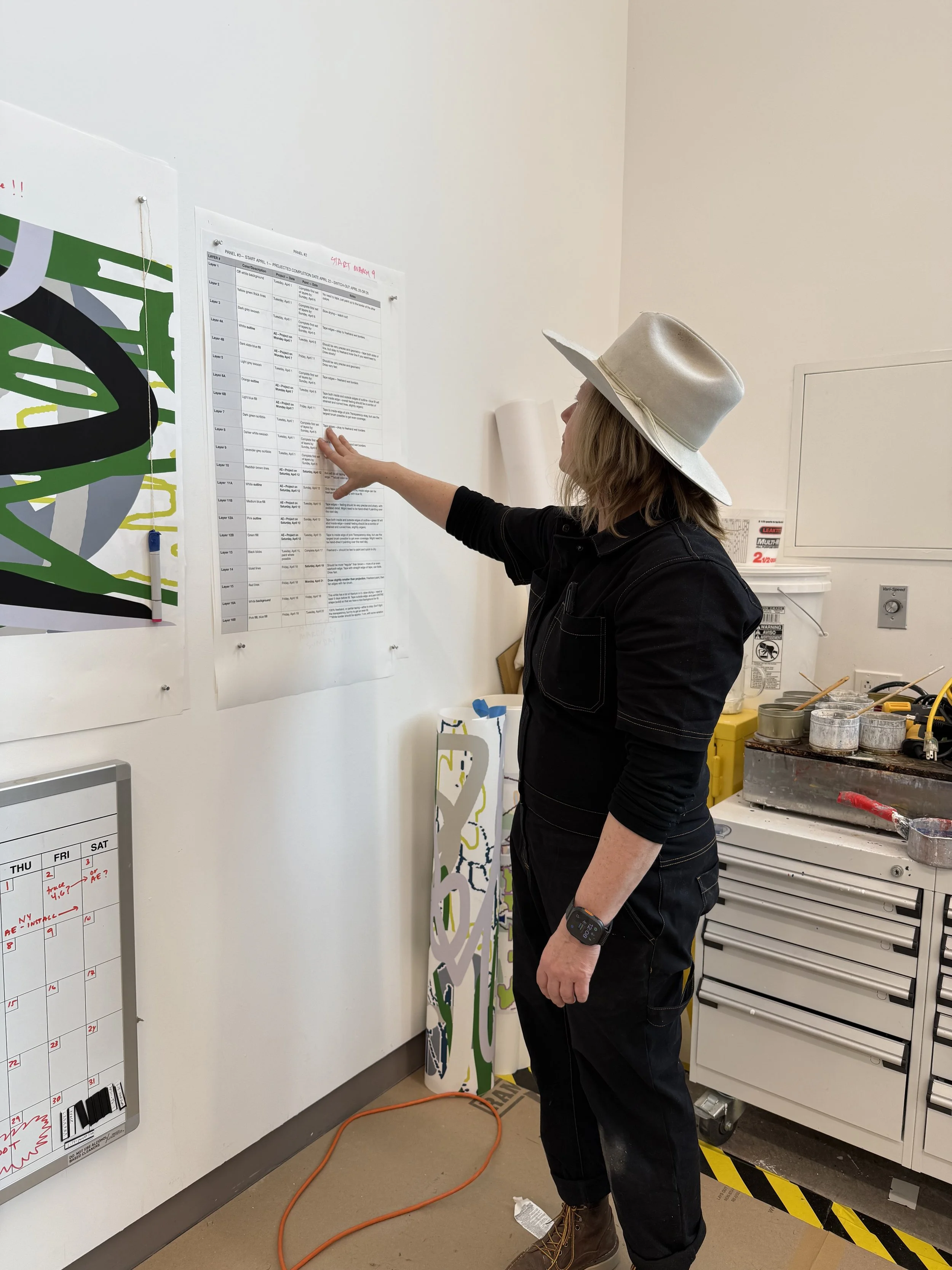
I created a very detailed list of steps for each panel, designating who would be doing what, along with due dates for each step, reminders, and special instructions about painting style, opacity/transparency, etc. For each group of layers, we had a large printout to refer to. I printed daily “maps,” too— each painter would mark what she/he/they had completed, and we’d check it all off on the master printout at the end of the day. The motto was “no going backward” as we had virtually no time for backtracking. All of the planning paid off. The pace was relentless, but our work was very organized.
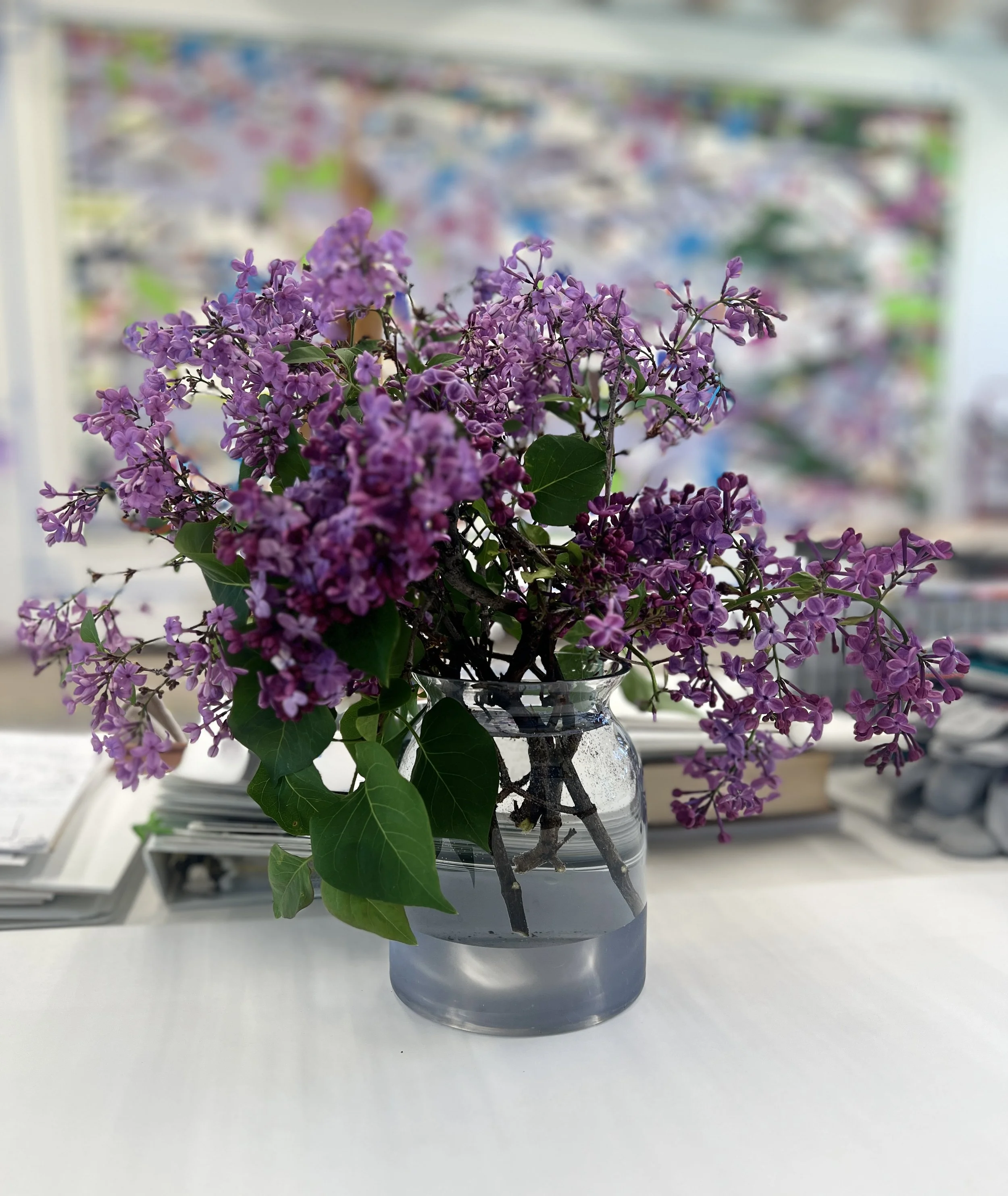
Lilac season came, and went…
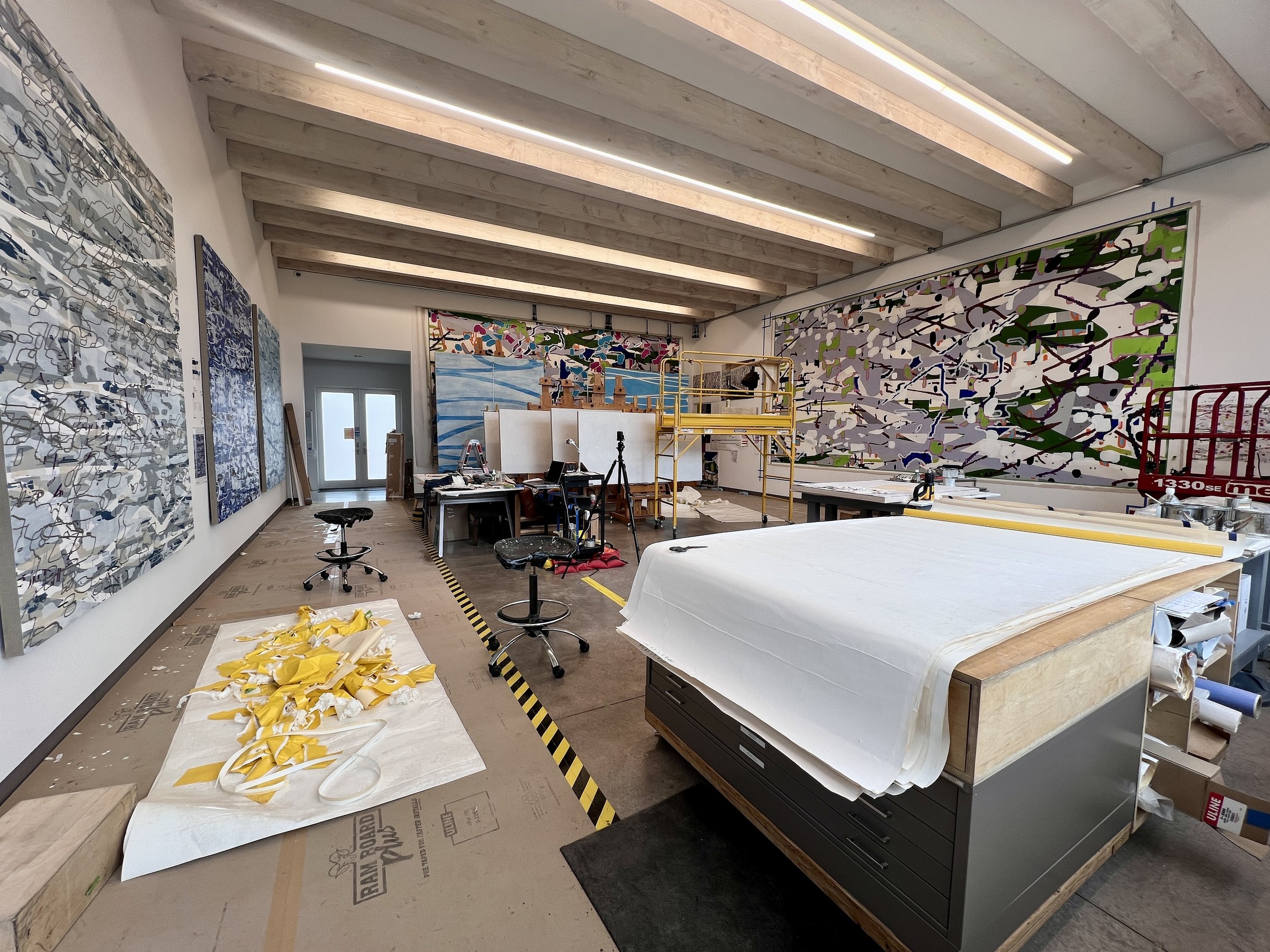
In addition to Code Garden, there were a lot of other projects going on in the studio. It seemed that everything was due at once. Everyone’s safety was top priority, especially since the studio was so crowded. The Ram Board and black and yellow tape designates a safety zone. I really tried to organize the studio so that everyone was safe and comfortable, because chaos = mistakes. Happy to report that everything went smoothly.
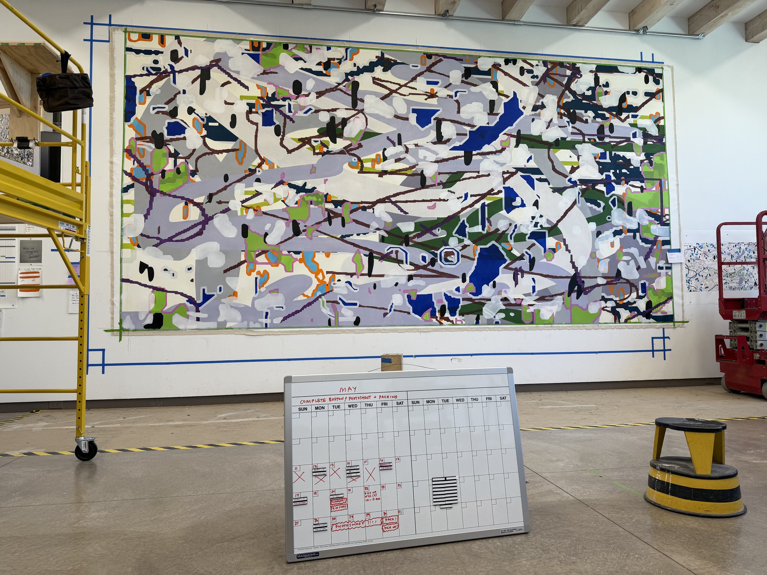
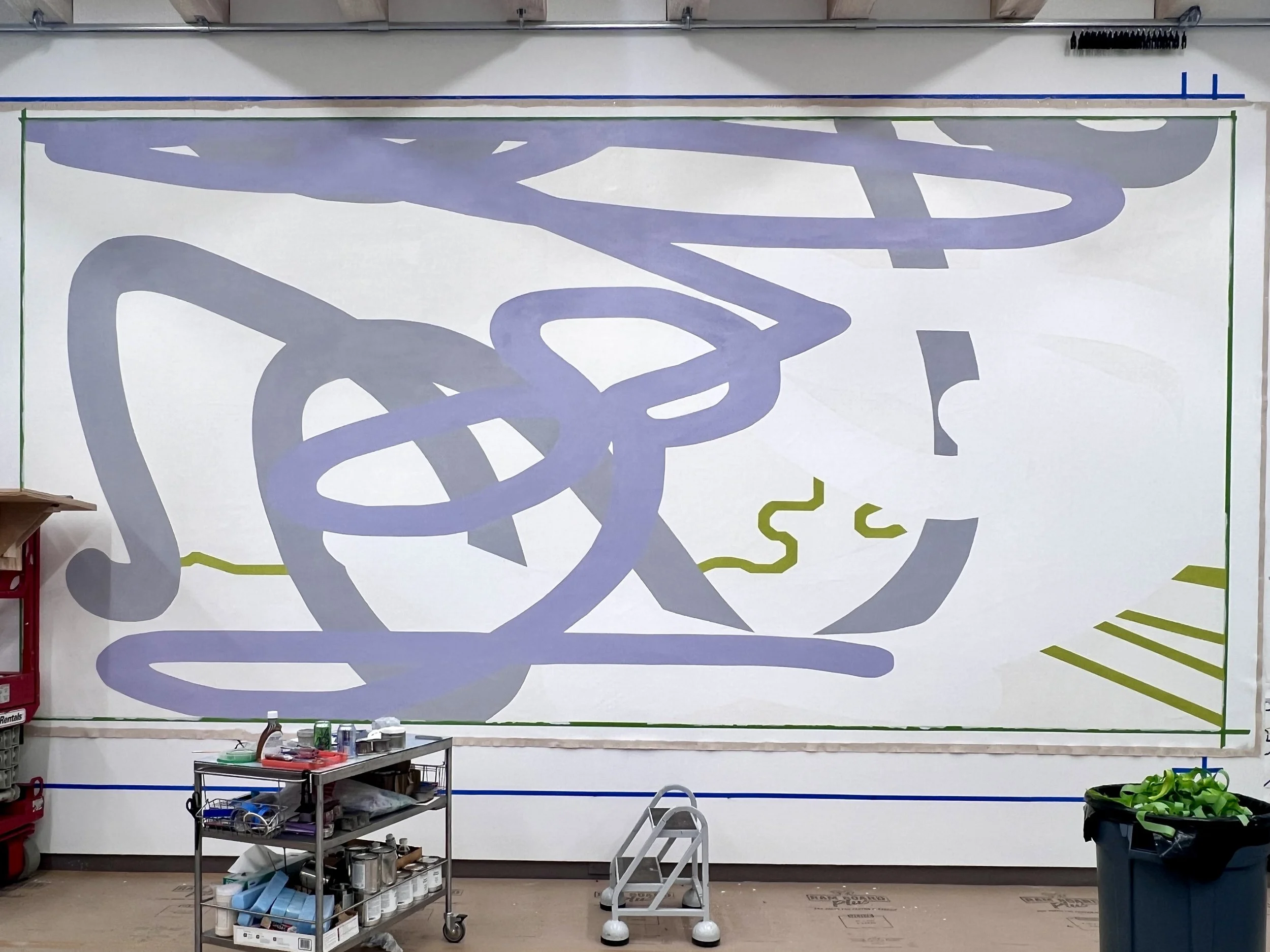
Panel 4, about halfway finished, with our production calendar in the foreground. We somehow finished a couple of days early, which gave us a longer drying window for Panel 4 before packing.
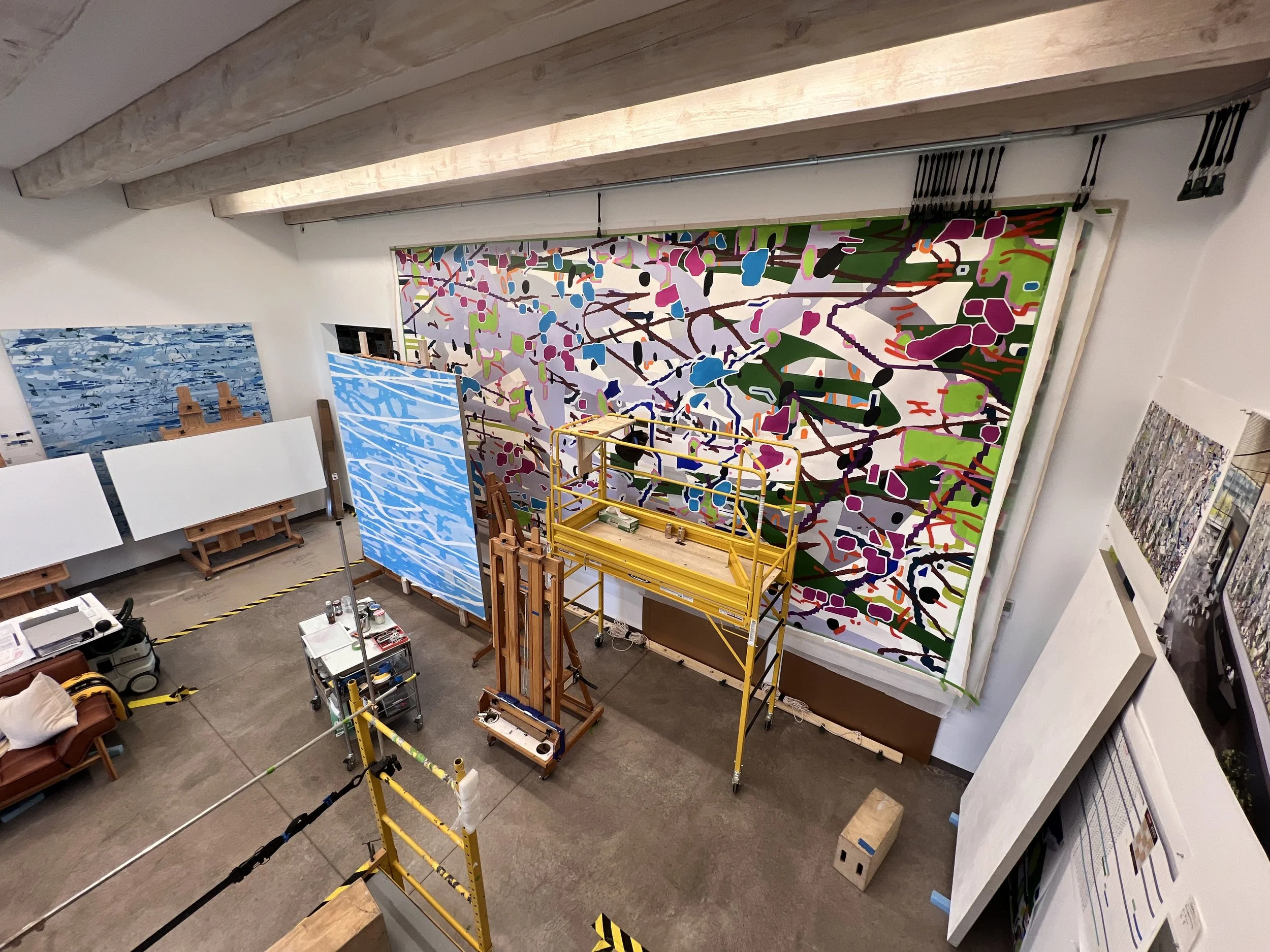
View from the lift, looking toward the south wall.
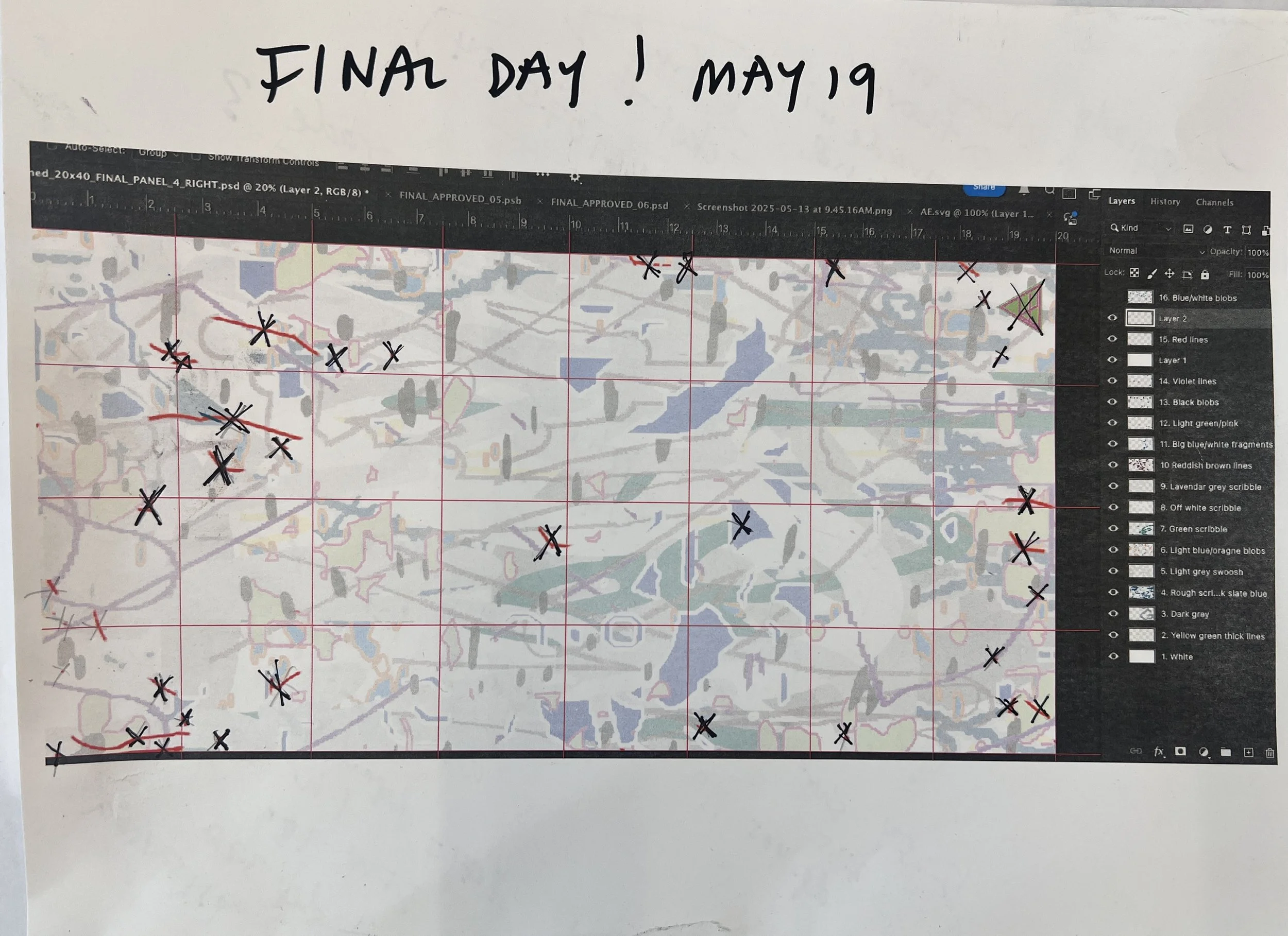
This is our last daily map. Each of us had one of these prints, with previous layers at minimal opacity, and the priorities of the day at full opacity, We each checked off every shape we painted, to make sure that nothing was missed. To the right, the layer palette is visible.
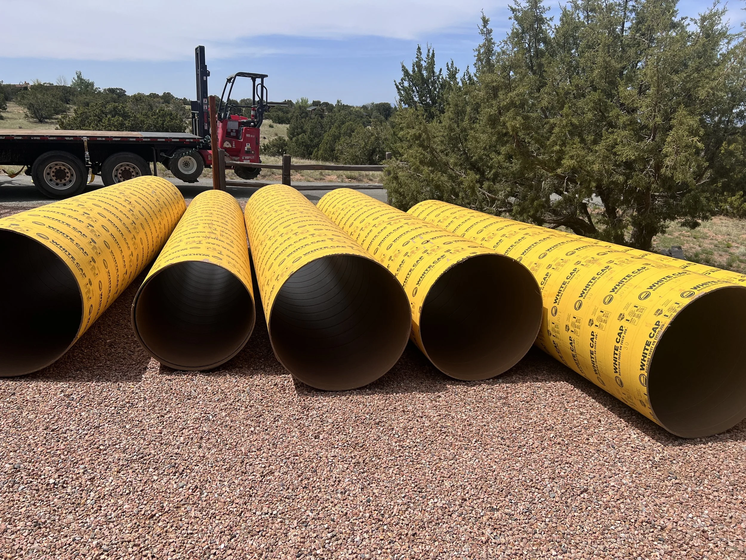
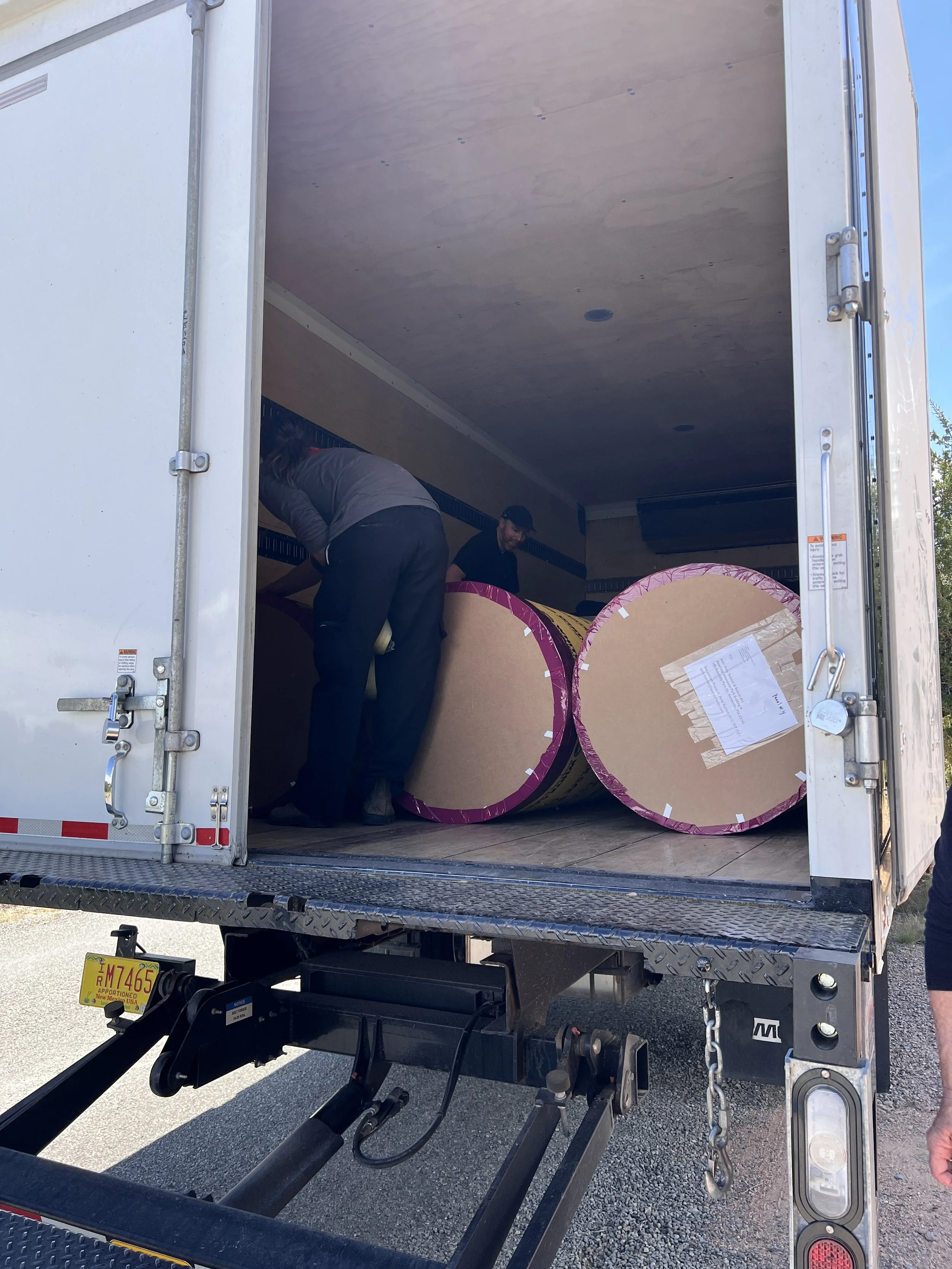
We carefully planned the packing process, consulting with Art Handlers in Santa Fe in advance. Each panel of the painting would be rolled (image side out) around a 24” diameter Sonotube, interleaved with silicone paper. Then, the roll would be tightly bound in plastic sheeting, padded, and inserted, floating, inside a 30” diameter tube. The day the tubes were delivered, we were in the thick of finishing Panel 4. These tubes are 12 feet long and surprisingly heavy— about 100 pounds each.
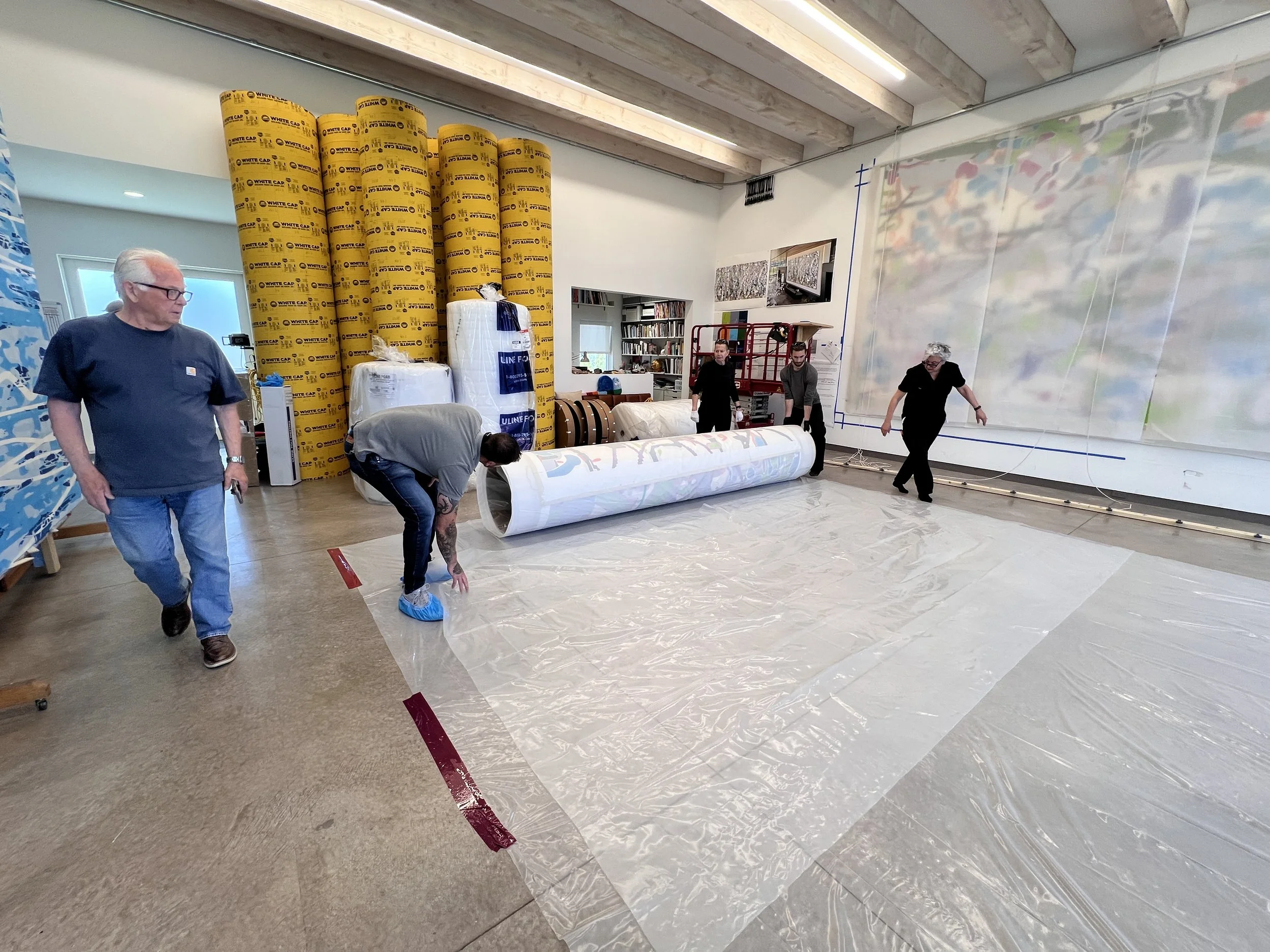
Luckily, we had a big crew for packing: several people from Art Handlers, as well as a number of our regular volunteers, including my Dad! The hardest part was reverse-hoisting the panels so that they were facedown on the floor, on top of the silicone paper. Prior to packing, we had our official photo shoot with John Janca, so we had moved the panels, one by one, back to the big west wall, stacking them on top of each other, which left Panel 1 in front. For packing, we had to take them down, one at a time, maneuver them so that they were flat and facedown, and then carefully roll them onto their Sonotubes. We then rolled them in layers of foam, and created three thick collars of foam in the center and on each end, then inserted them into the larger tubes, where they floated, frictionless.
All tucked in and ready to go to Somerville, MA.
After Code Garden left the studio, I still had huge commission to finish for another client, which required a complete rehanging of the studio.
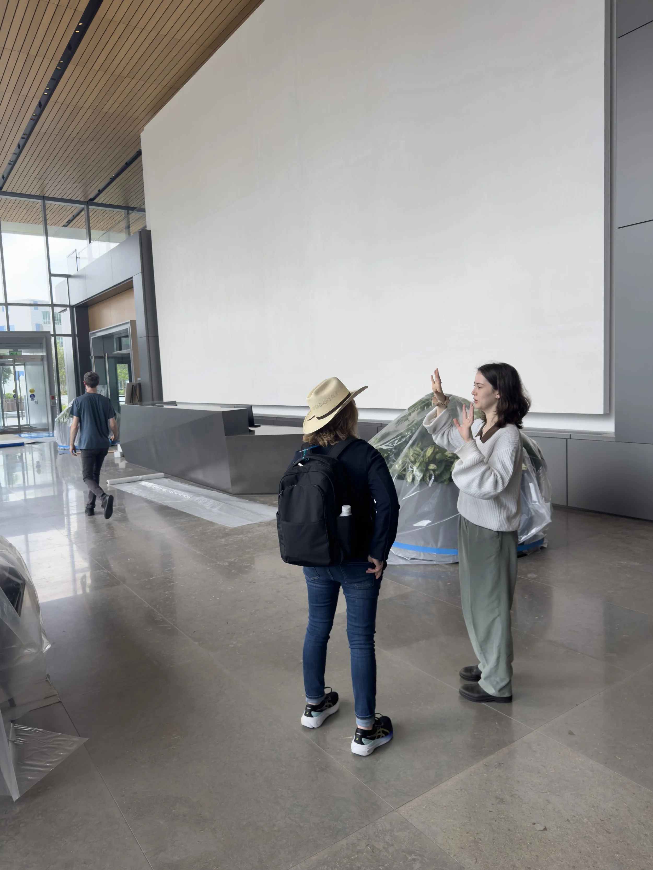
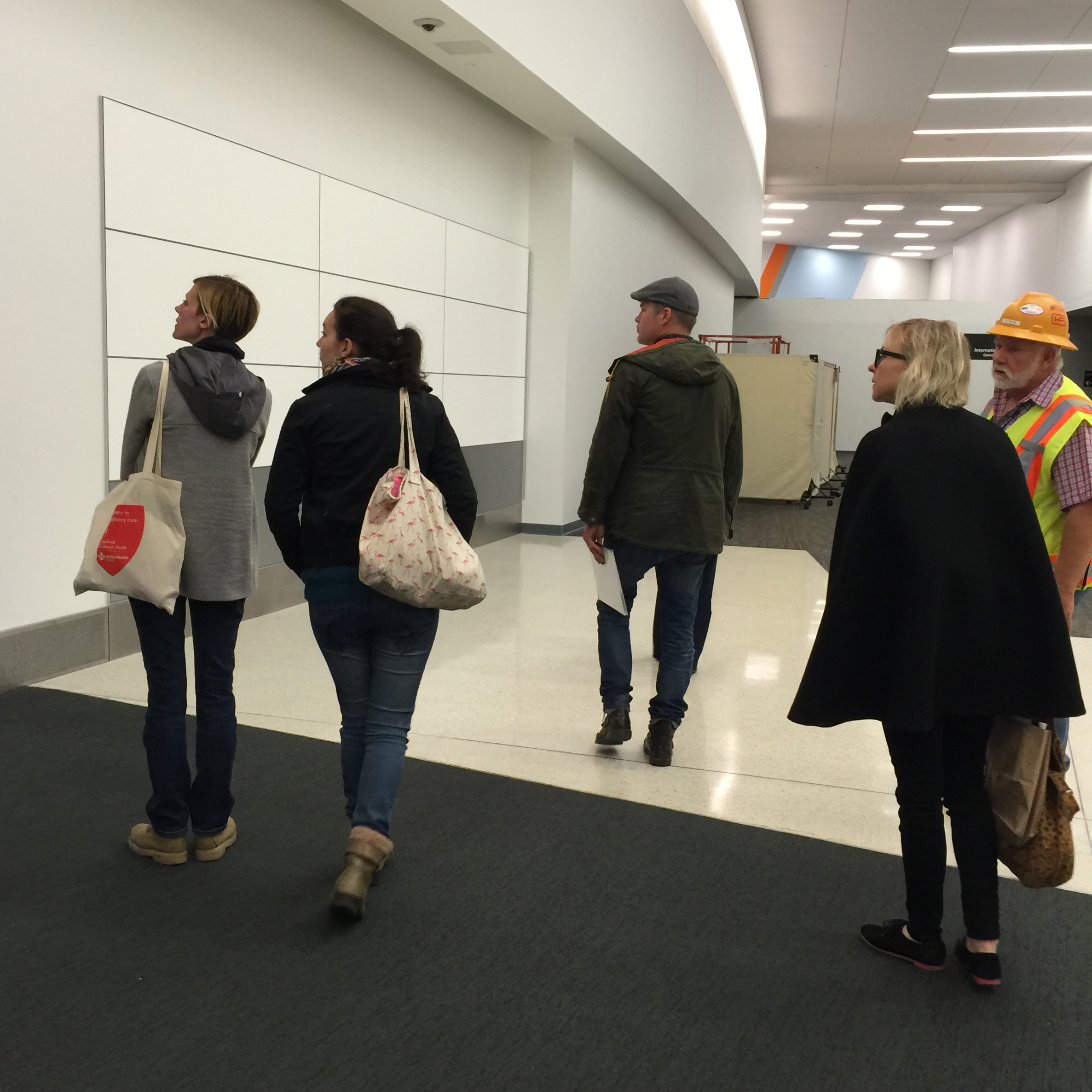
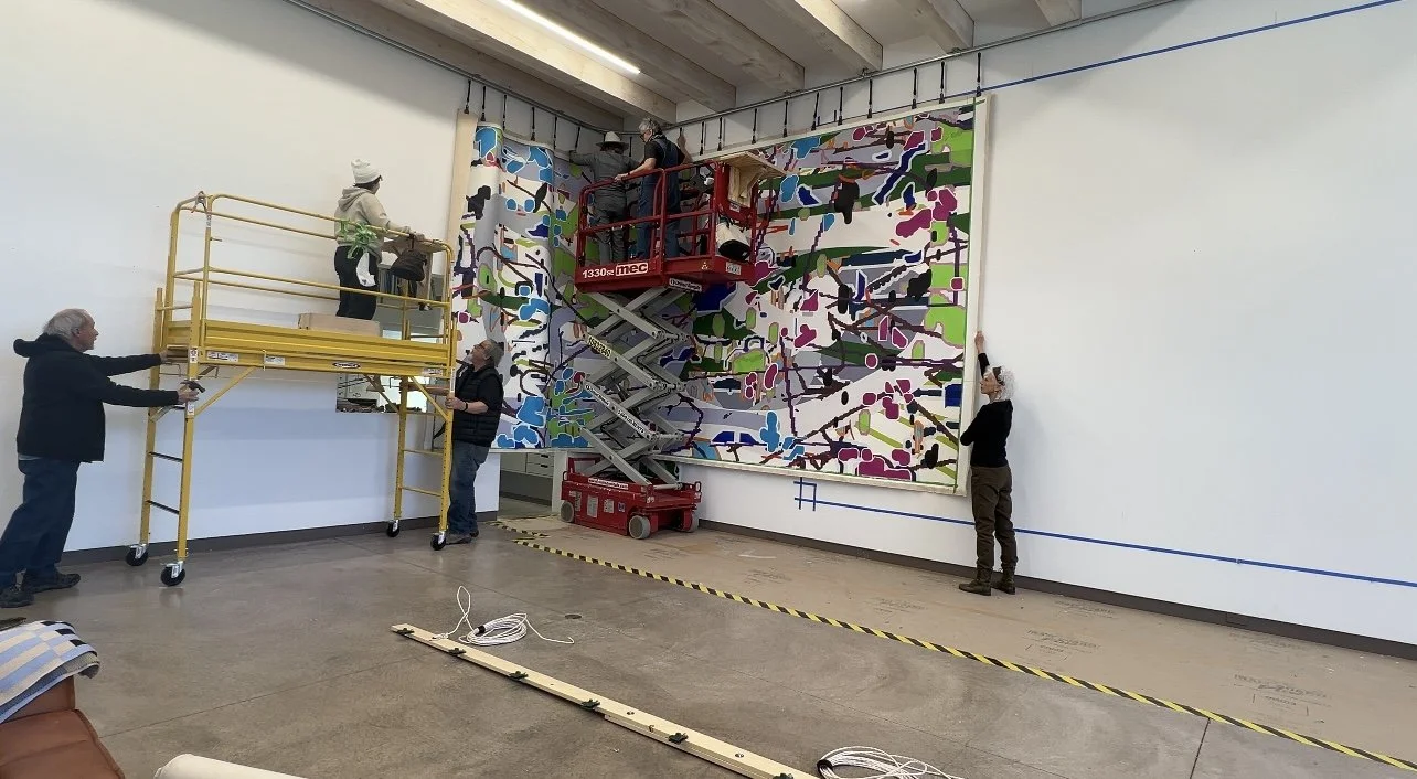
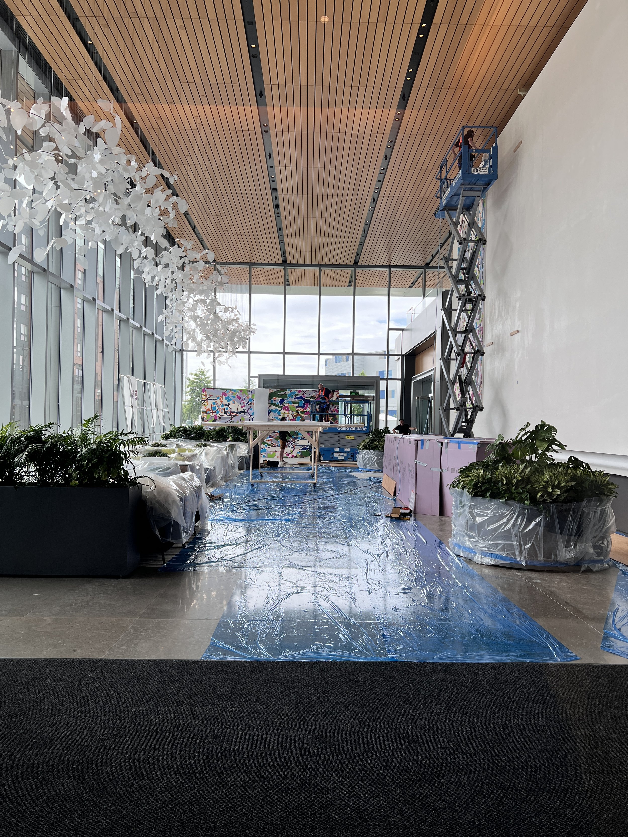
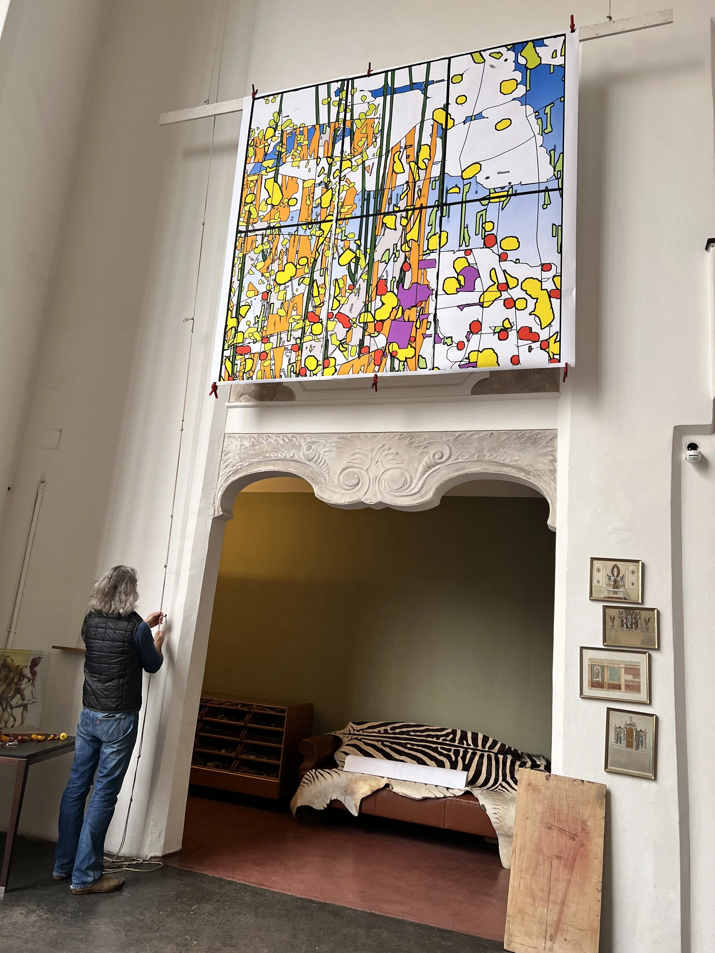
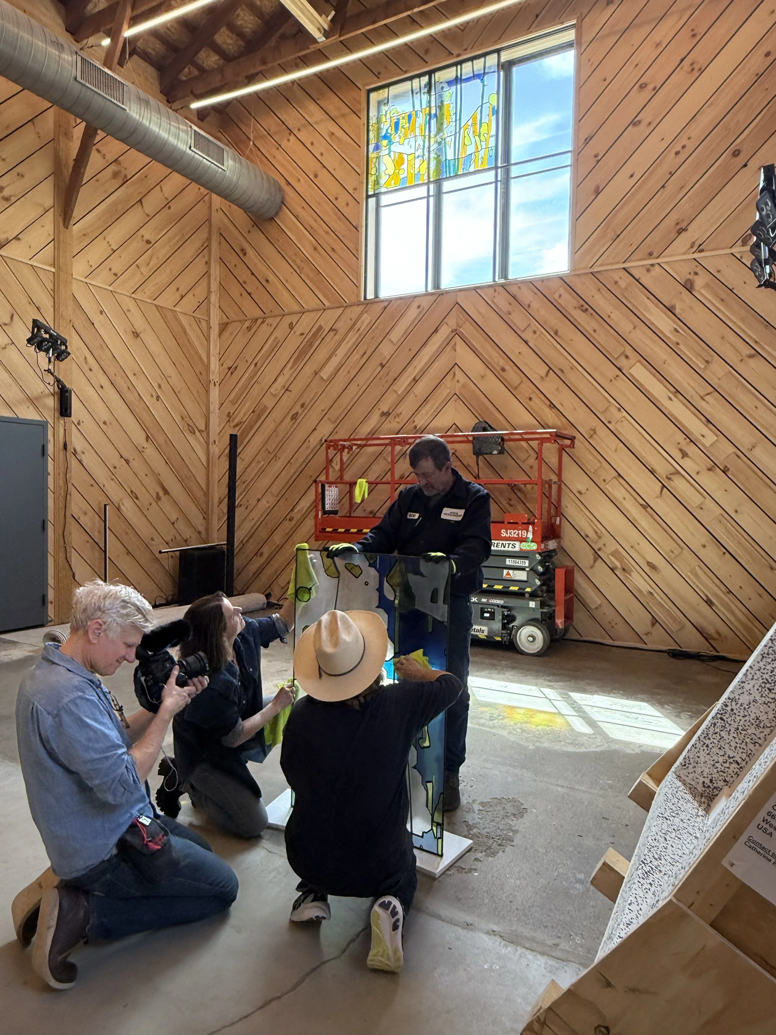
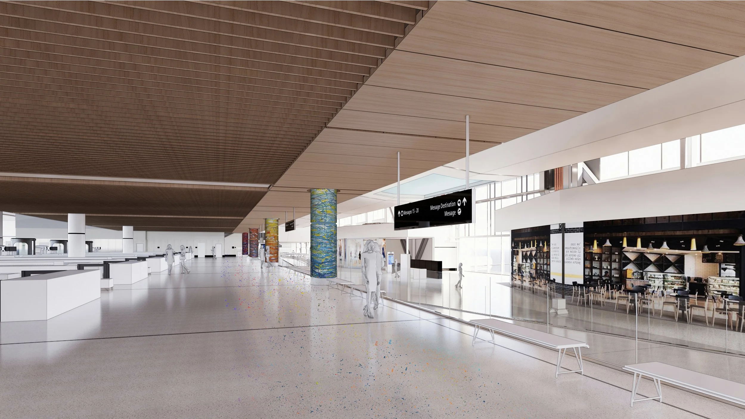
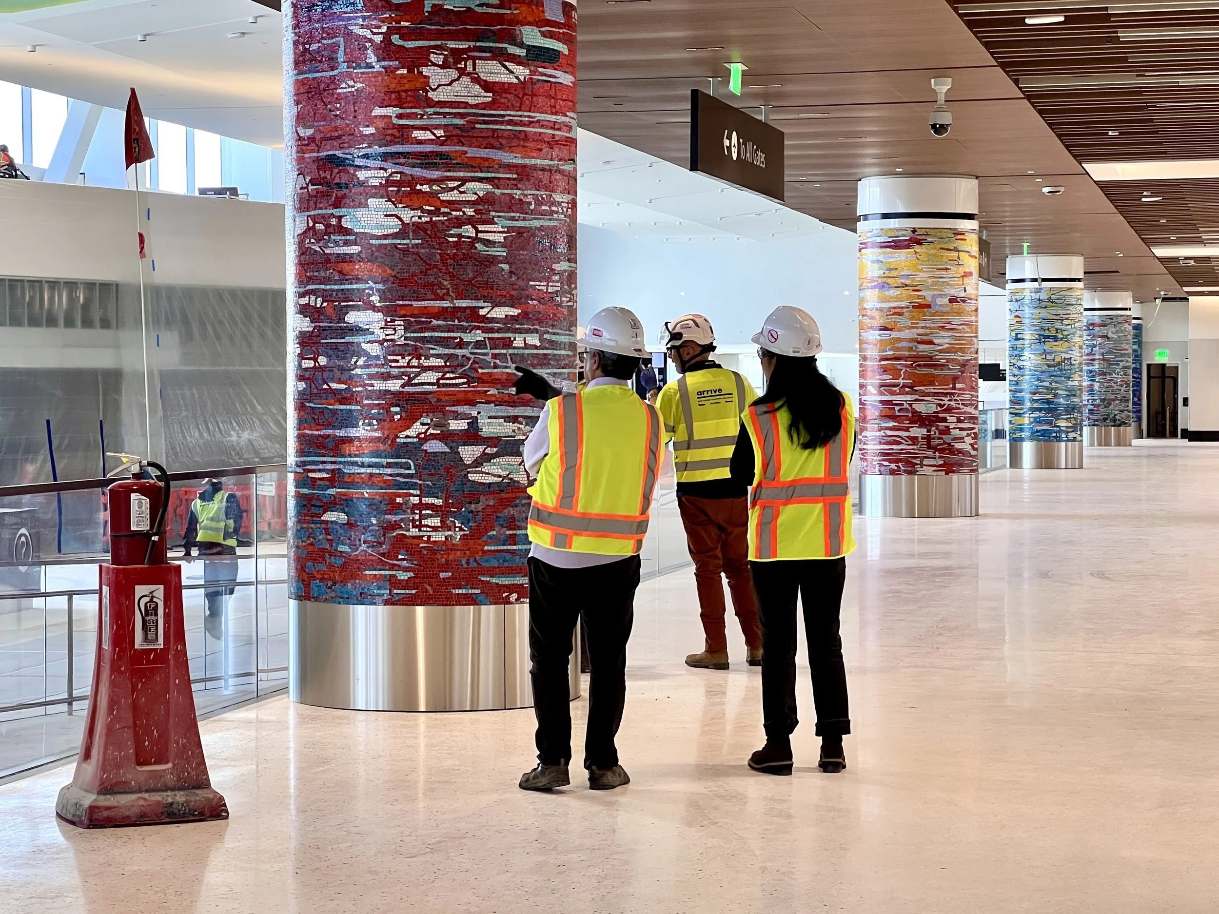
On site in Somerville, discussing installation strategy with Alex Spear of Meridian Art Consulting.
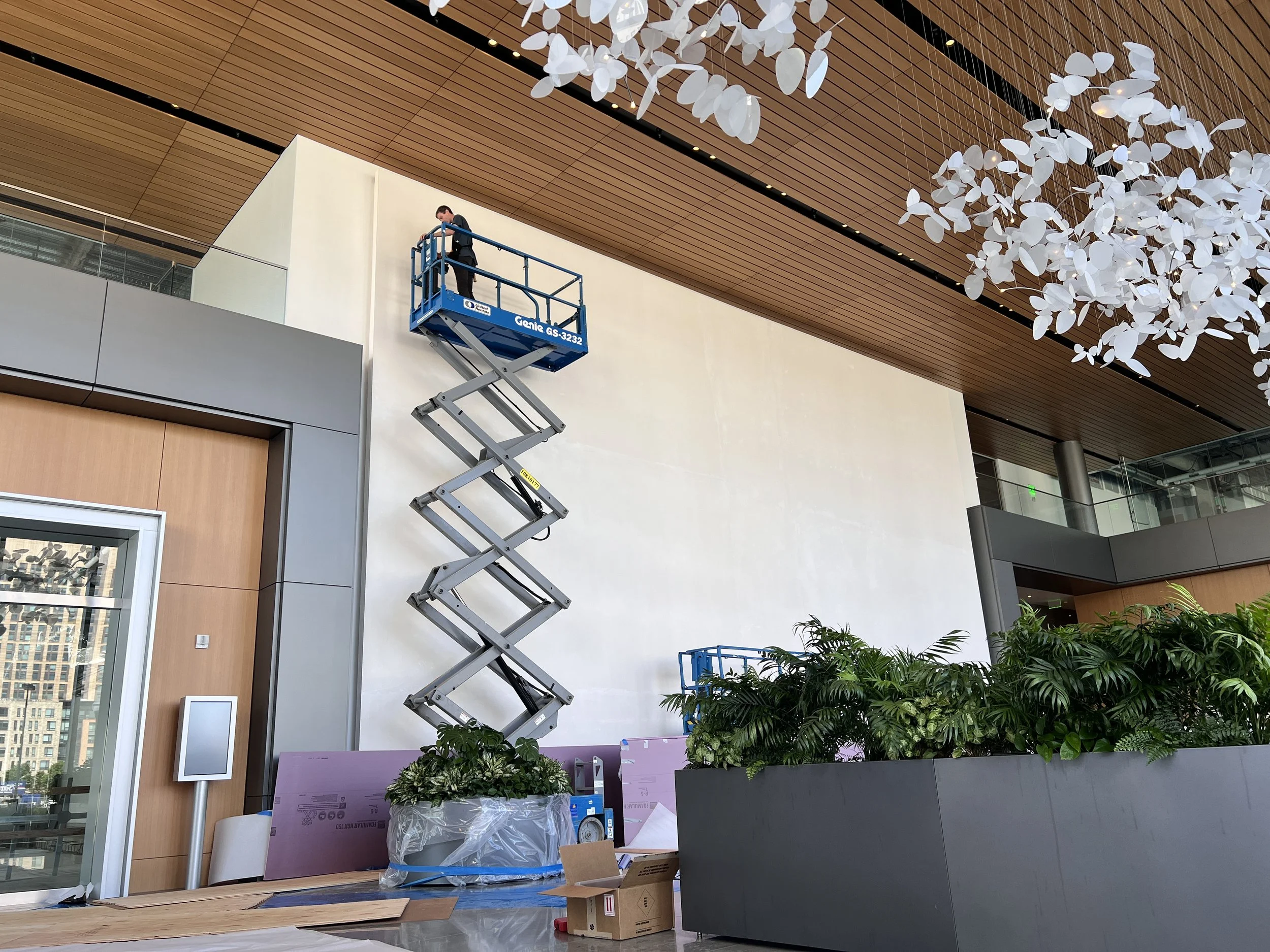
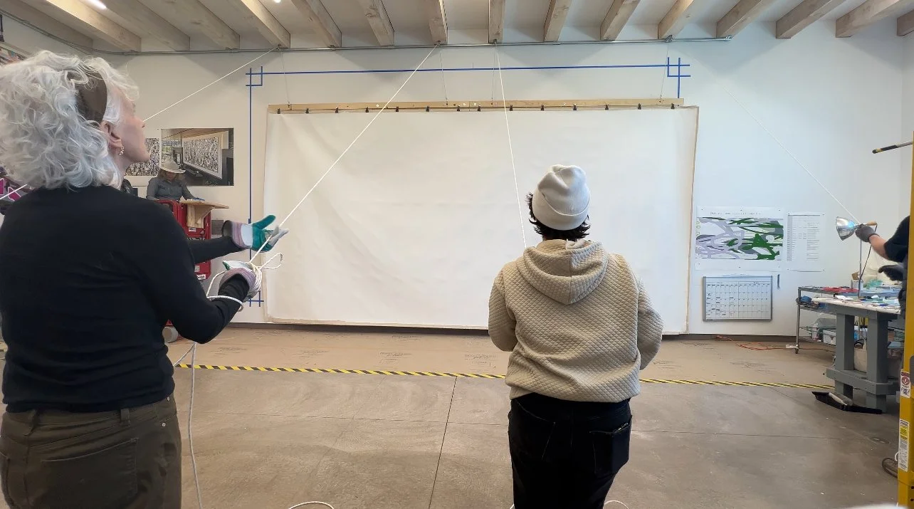
This installation was tricky on every front. The top of the wall is about 30 feet high, and there is an enormous, immovable desk very close to the wall. The installation team spent weeks planning every element of this delicate task.
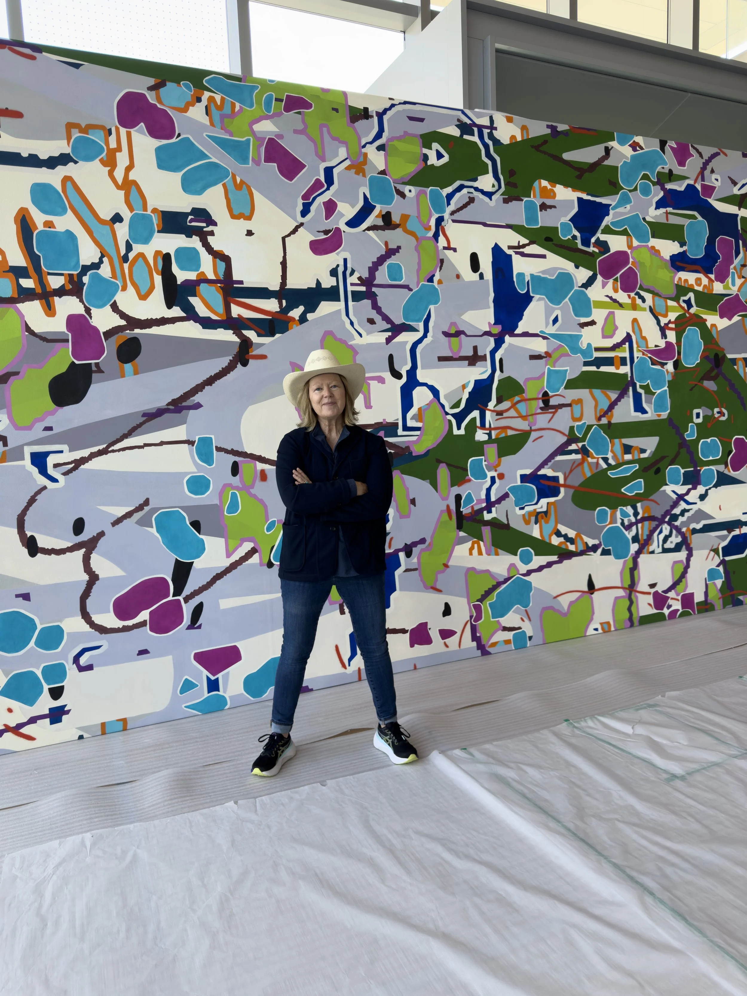
Here I am with Panel 1 stretched and ready for installation.
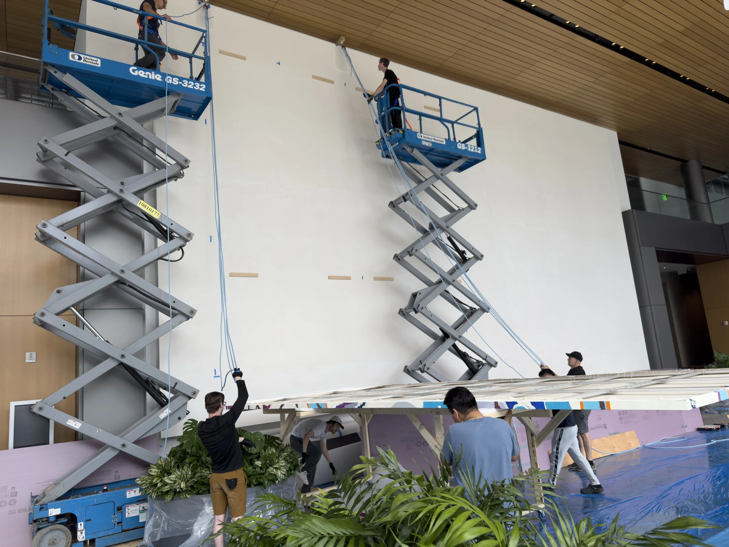
The installation team created a very clever elevated cradle to hold the panels over the desk and get them into position for hoisting, They also installed a very smart rigging system, with a movable anchor at the top of the wall and a pulley system attached to the top of each panel. It was incredibly efficient and elegant.
The scene was like an operating room! All furniture, flooring and walls were perfectly protected. At first, the plants were covered, too, until the plant watering person came by and scolded us.
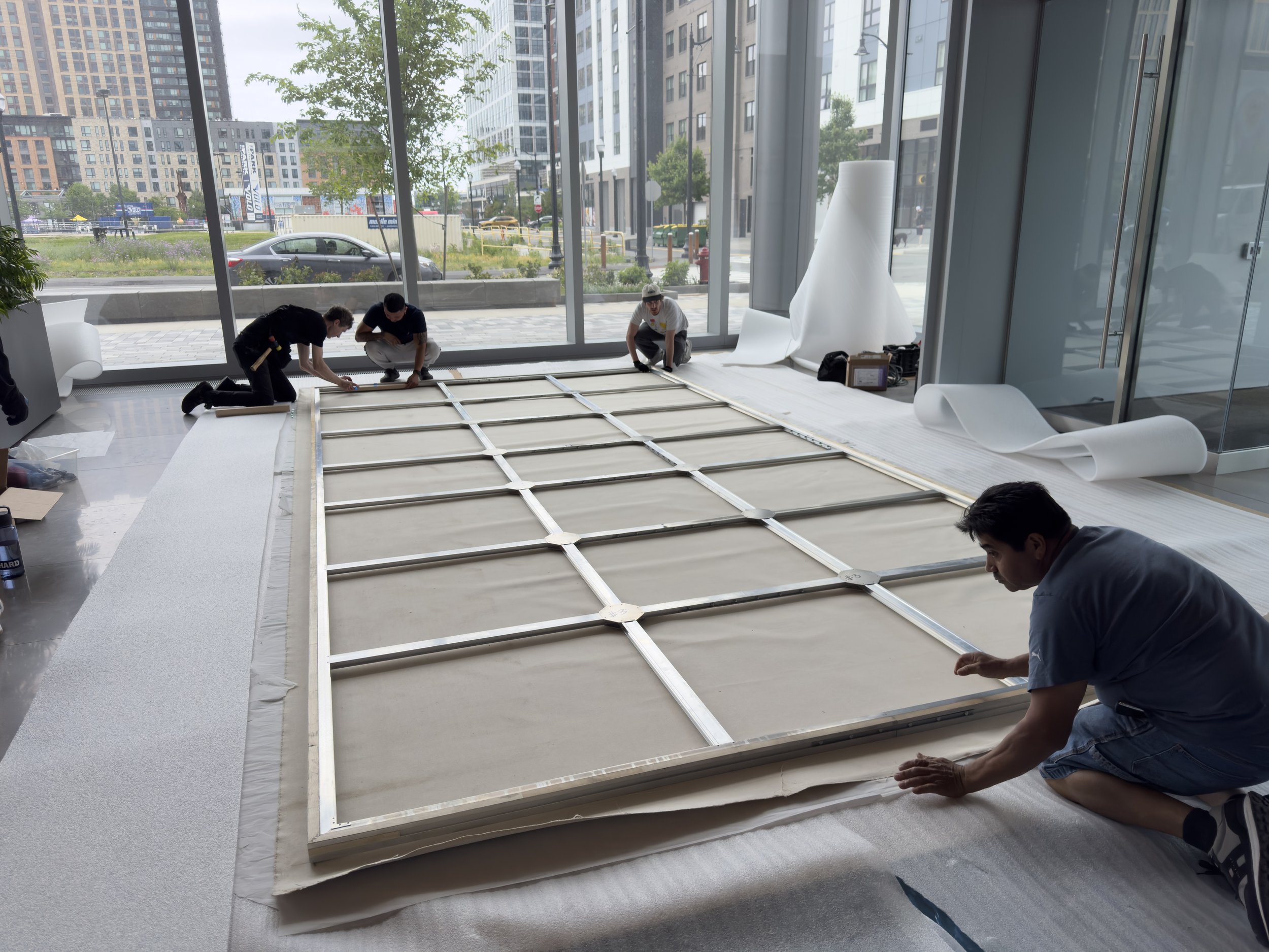
As each panel went up on the wall, the next one was stretched. Gotta say, Lucious Hudson nailed it— the stretchers were perfect, and the stretching team could not have done a better job.
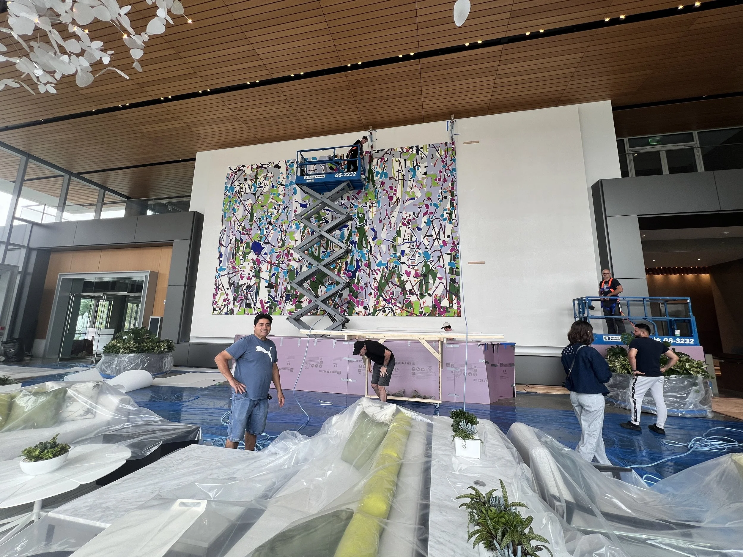
By the end of day 2, we had installed three panels.
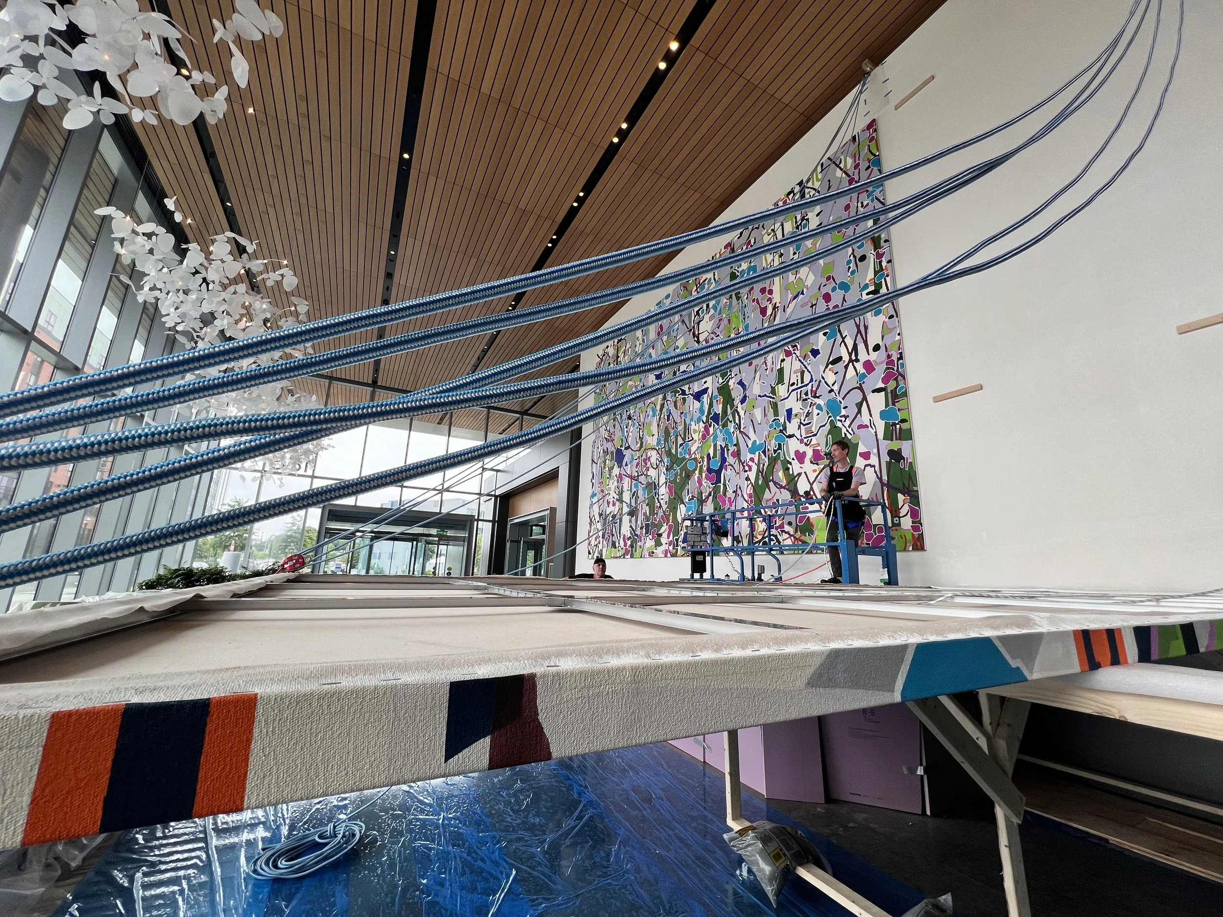
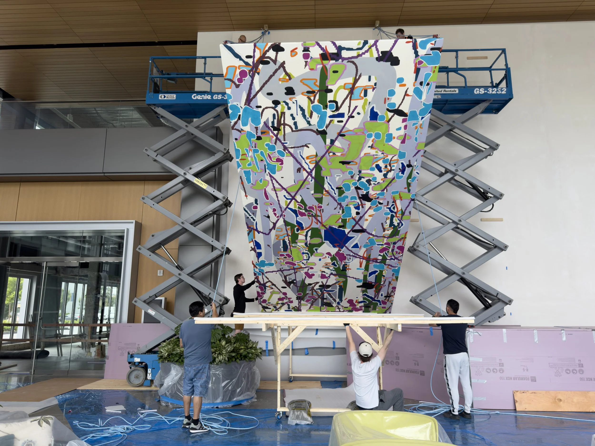
Dramatic shot of Panel 4 about to be hoisted. Enough ropes to climb Half Dome!
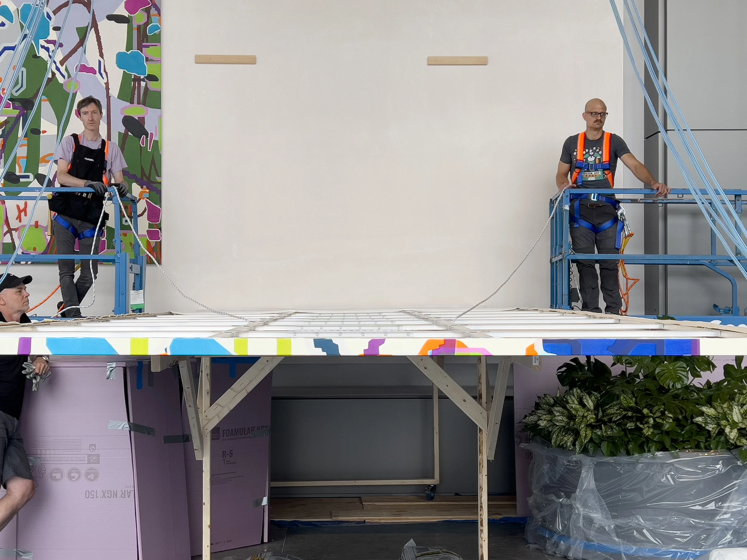
Joe and Matt looking pretty confident before hoisting Panel 4.
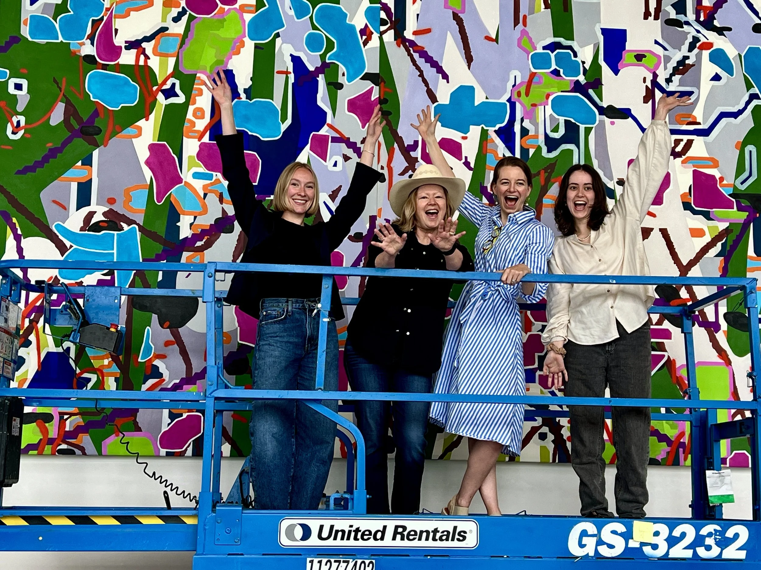
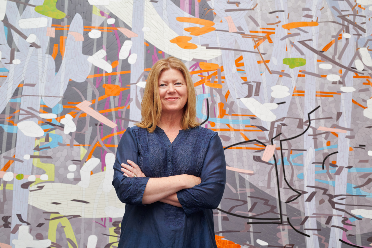
Very happy artist, very happy art consultants! It really takes a lot of faith, hard work, and coordination on all sides to complete a project like this.
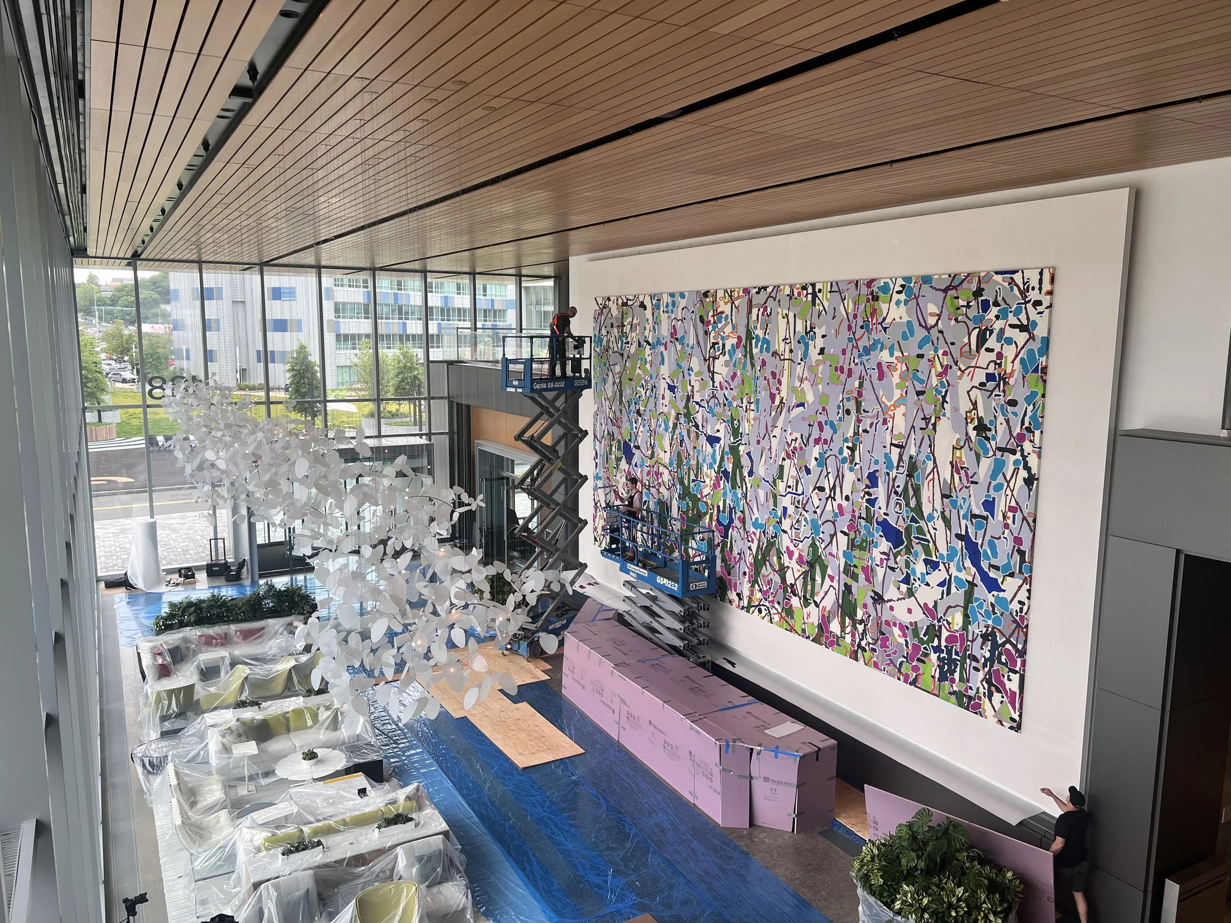
View from the mezzanine. You can see how tight the space is between the wall and the desk. The lifts only had a couple inches of clearance.

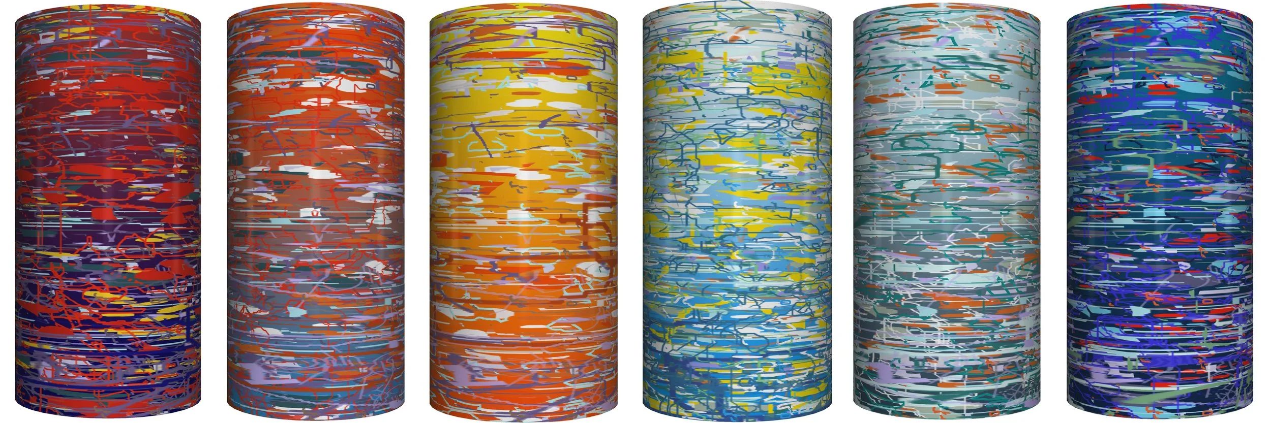
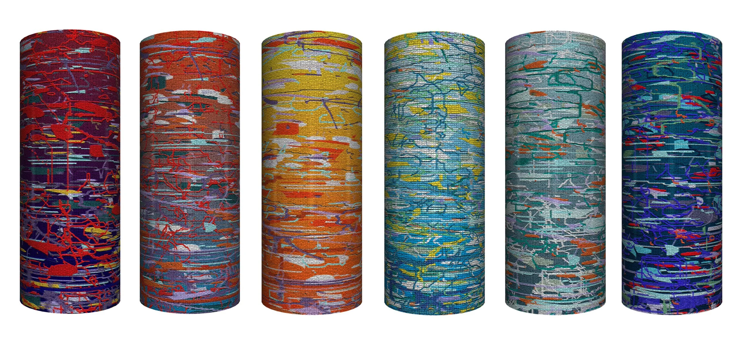
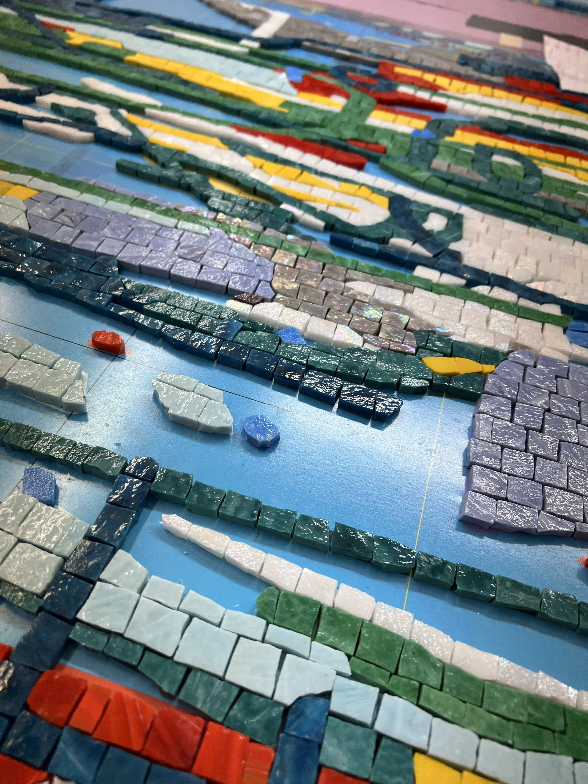
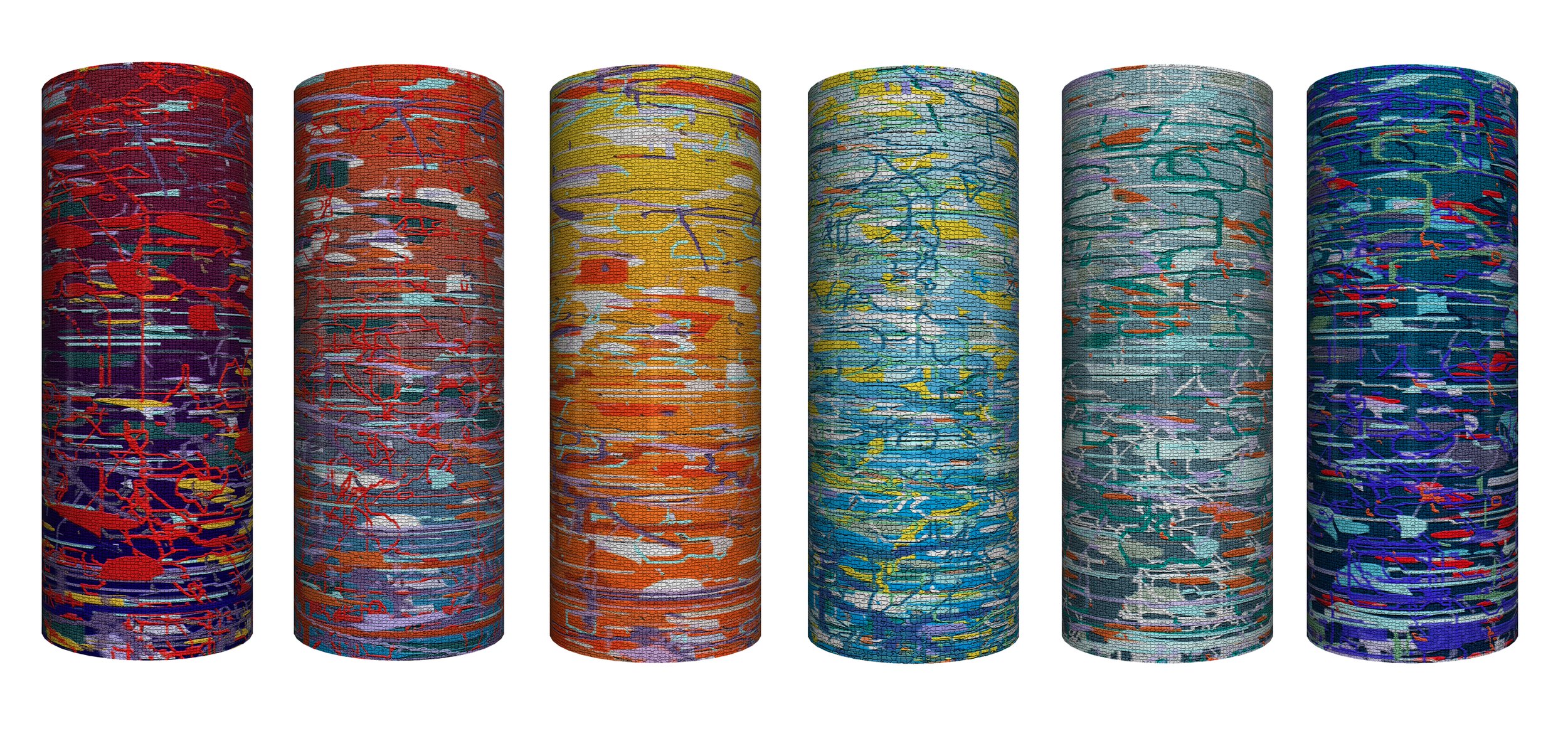
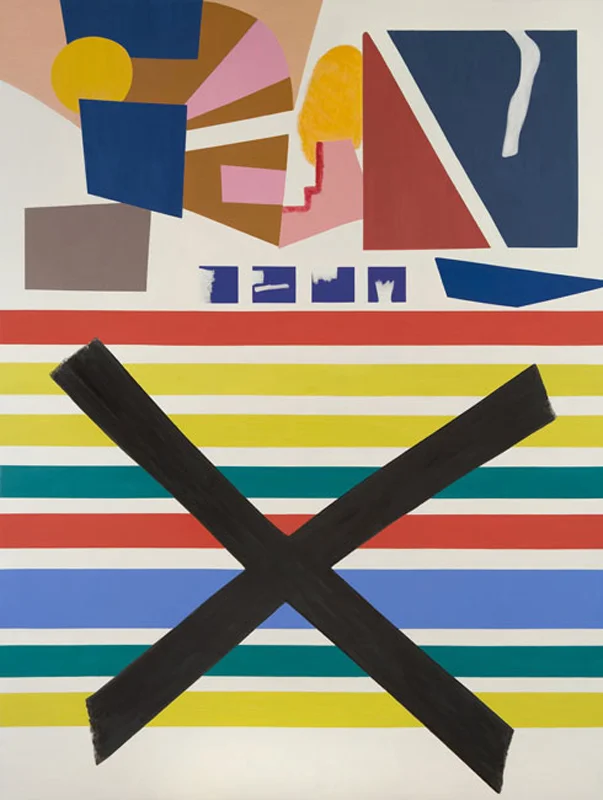
Code Garden, 2025, oil on four stretched canvases, 20 x 40 feet


![[detail] ](https://images.squarespace-cdn.com/content/v1/54c13993e4b0cb3b1482502e/1463096869280-TBUVSM2M47GP1R8U591J/image-asset.jpeg)
![[detail] Silver Square, c. 1950 This piece was painted on the rough side of a piece of Masonite. I love the silver ground and the lively line work. I also enjoyed Pollock's experiments on various papers: Japanese, mulberr…](https://images.squarespace-cdn.com/content/v1/54c13993e4b0cb3b1482502e/1463097059943-9WH7UINCH3MAVESNX1L9/image-asset.jpeg)
![[detail]](https://images.squarespace-cdn.com/content/v1/54c13993e4b0cb3b1482502e/1463160864805-5TKCC9CNMXOOF9J69ORE/26_dekooning_det.jpg)