Late last month, after a short trip to Montreal to work with Mosaika Art & Design on my commission for a new public art project, I took the train to NYC for a couple of meetings and a little bit of gallery hopping. My time in New York was very compressed, and I only had 5 hours available on Saturday, September 28.
When I have an abundance of time, I tend to immerse myself and see as much as possible—the good, the bad and the ugly. My Beloved refers to it as the “Art Death March.” However, with time so short, I prepared a very concise, detailed list that took me to the Upper East Side, the Lower East Side and Chelsea. Of course, I planned my subway trips and my Uber ride in advance, as well as the order of my stops and even my strategy for walking and crossing streets, as I didn’t want to waste a moment. Also, I set a very particular agenda for myself; I wanted to leave New York feeling inspired.
Here’s a summary of what I saw. Many of these shows are still open as of the date of this post. See them if you can!
Alma Thomas: Resurrection, Mnuchin Gallery, through October 19
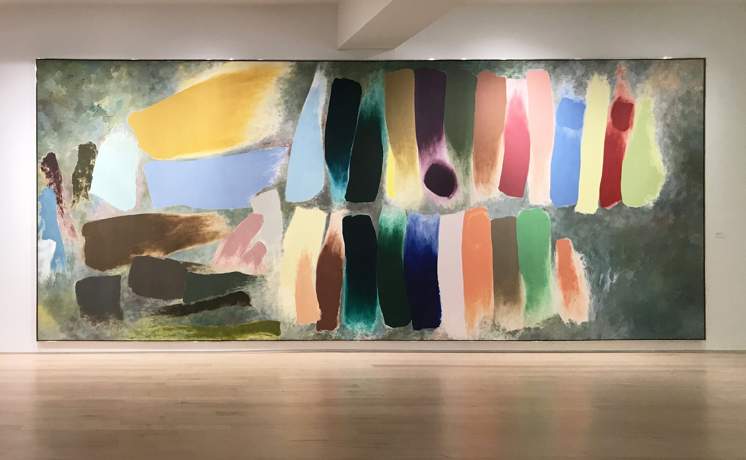
What a place to start! If this had been the only show I’d seen, I would’ve left New York feeling happy and fulfilled. This beautiful exhibition was curated by Sukanya Rajaratnam. It is comprehensive, with major works as well as a good selection of works on paper. Thomas’ energy and pure spirit shines through every piece. Of course, her story is astonishing. She did not paint full time until she was in her 60s, after teaching in Washington DC public schools for thirty-five years, but she more than made up for lost time. Her work is personal and historically resonant, connecting to Abstract Expressionism, Pointillism, Color Field and Minimalism.
Thomas was the first African-American woman to have a solo show at the Whitney Museum of American Art, and she enjoyed success late in life. Since her death in 1978 and, especially, in recent years, her contributions have been reassessed, and she’s finally getting her due.

I love this direct reference to Matisse’s work, The Snail. I wish I knew how and why Thomas took on
this challenge, but I imagine that it is the peculiar puzzle of the sheer stability of the framework with the rotational, destabilizing movement of the multicolored forms.

Matisse, The Snail, 1953.
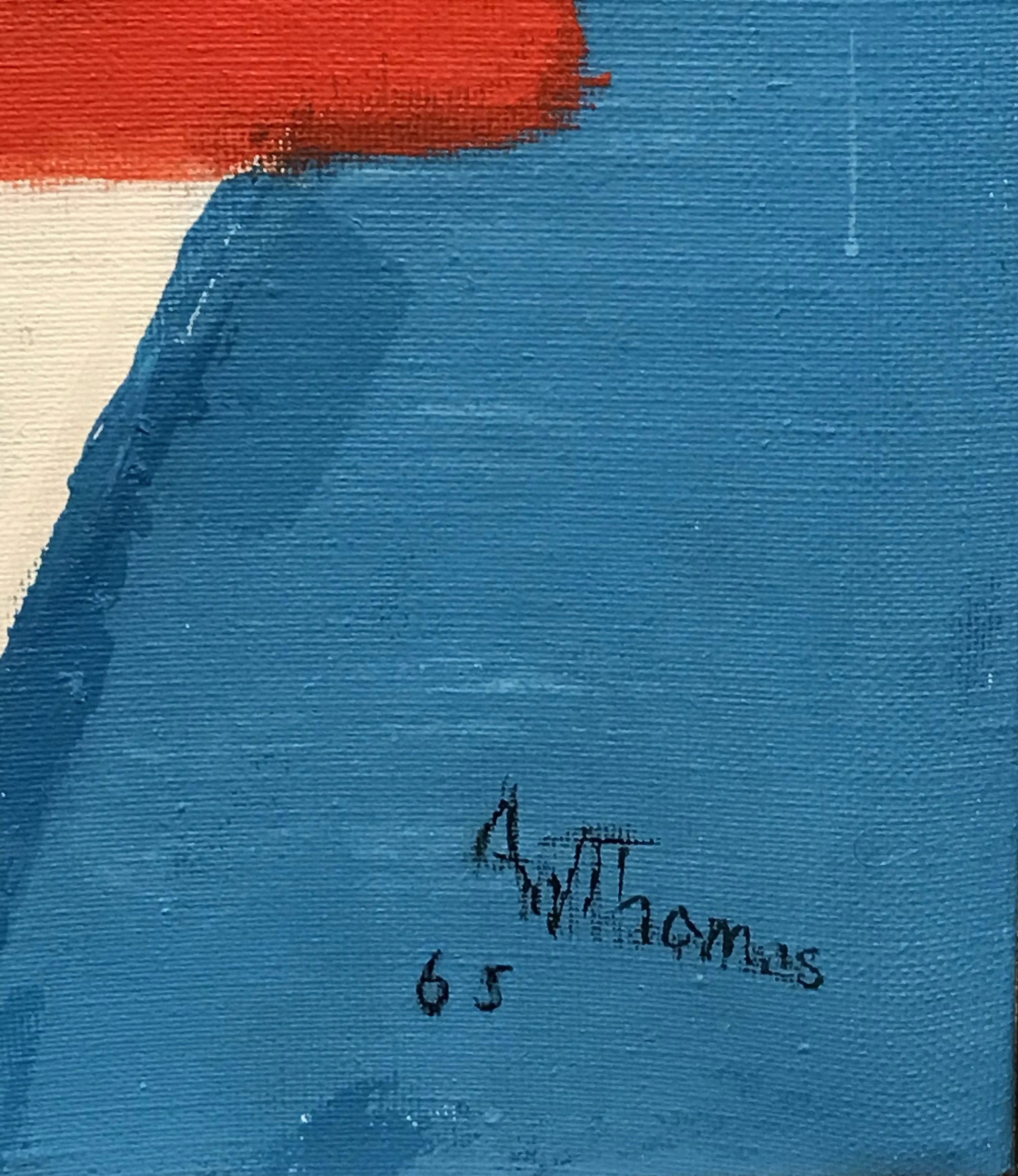
Thomas’ version, from 1965.

This piece is pure eye-sizzle. many of Thomas’ works take advantage of optical tricks that fry one’s eyeballs as much as any good Op Art masterwork.


The exhibition includes a few wall-sized photos of Thomas, along with quotes by the artist.

Gorgeous, full-wall installation of paintings and framed works on paper.

Another photo of the artist on one of the gallery’s curved walls. Thomas died in 1978.
Richard Serra: Triptychs and Diptychs, Gagosian (980 Madison Ave.), though November 2
Serra’s triptychs (47.5 x 93 inches) and the diptychs 47.5 x 62 inches) are nothing more, nothing less than groups of pitch-black squares or rectangles, abutting each other and/or adjacent to each other, with the white space of the paper somehow holding equal importance with the black, scumbly forms. The shapes are thick and tar-like, made with paint stick, etching ink and silica on handmade paper, with a few spatters and speckles of black adorning the otherwise pristine, heavy white paper. Throughout, there is a sense of exquisite balance and materiality. In Serra’s own words:
Weight is a value for me—not that it is any more compelling than lightness, but I simply know more about weight than about lightness and therefore I have more to say about it, more to say about the balancing of weight, the diminishing of weight, the addition and subtraction of weight, the concentration of weight, the rigging of weight, the propping of weight, the placement of weight, the locking of weight, the psychological effects of weight, the disorientation of weight, the disequilibrium of weight, the rotation of weight, the movement of weight, the directionality of weight, the shape of weight.

Zao Wou-Ki, Gagosian (976 Madison Ave.), through October 26
I received a press release email for this exhibition a few weeks ago, and thought it sounded intriguing, My gallery jaunt mostly included artists who were already familiar to me, but I don’t believe I’ve ever seen works by the Chinese-born, French painter Zao Wou-Ki till now. The works, produced from 1979-2006, serve as a missing link between traditional Chinese painting and Abstract Expressionism. Like Pollock, Zao Wou-Ki worked on the floor, painting with ink on paper (later mounted to canvas). The marks are soft and subtle. Even the darkest, blackest marks are somehow elusive and fleeting. I kept thinking of spurts of squid ink in the deep ocean, flowing, billowing and dissipating. The largest works are about nine feet tall. The soft, matte surface of the paper, with the ink held in rather than on the fibers of the substrate, is so absorbent that your gaze, too, falls into it, rather than skipping over the surface.


John Chamberlain: Baby Tycoons, Hauser & Wirth (69th St.), through October 19
Chamberlain is rather hit or miss for me. He lost me after his early, iconic works. At a certain point, his forms became less dynamic (more vertical, static and monolithic) and his color application seemed more arbitrary (more decorative). At the same time, the sculptures felt overly complicated, with narrower strips of metal that felt superfluous or overly fussed over. However, after seeing a few images of the Baby Tycoons, I thought the exhibition would be worth a visit. First, the title: it all but screams, “Baby Tycoons, here’s something you can afford! Cute little tabletop versions of my big sculptures!” Ah, but I sound cynical (which I am not). Anyway, these little guys pack a real punch. They morph from every angle, they hum with every aspect and shift of color, edge, angle, interior and exterior. They sit like little creatures on their pedestals, full of vim and vigor. As Chamberlain said,
If the scale is dealt with then the size has nothing to do with it.


Forms Larger and Bolder: Eva Hesse Drawings from the Allen Memorial Art Museum at Oberlin College, Hauser & Wirth (69th St.), through October 19
This comprehensive exhibition of approximately 70 works on paper from the 1960s includes Hesse’s very early student work (figure studies, still life drawings) as well as more experimental abstract works from 1964, which she described as “wild space” in a letter to Sol LeWitt, and a good number of working sketches and studies for sculptural works. This show is geared toward Hesse wonks, providing a terrific sense of Hesse’s early trajectory, working methods and thought processes. Individual works are not necessarily mind-blowing but, as a whole, the exhibition lays foundation for Hesse’s more widely known and appreciated sculptures.

One of Hesse’s “wild space” works from 1964.
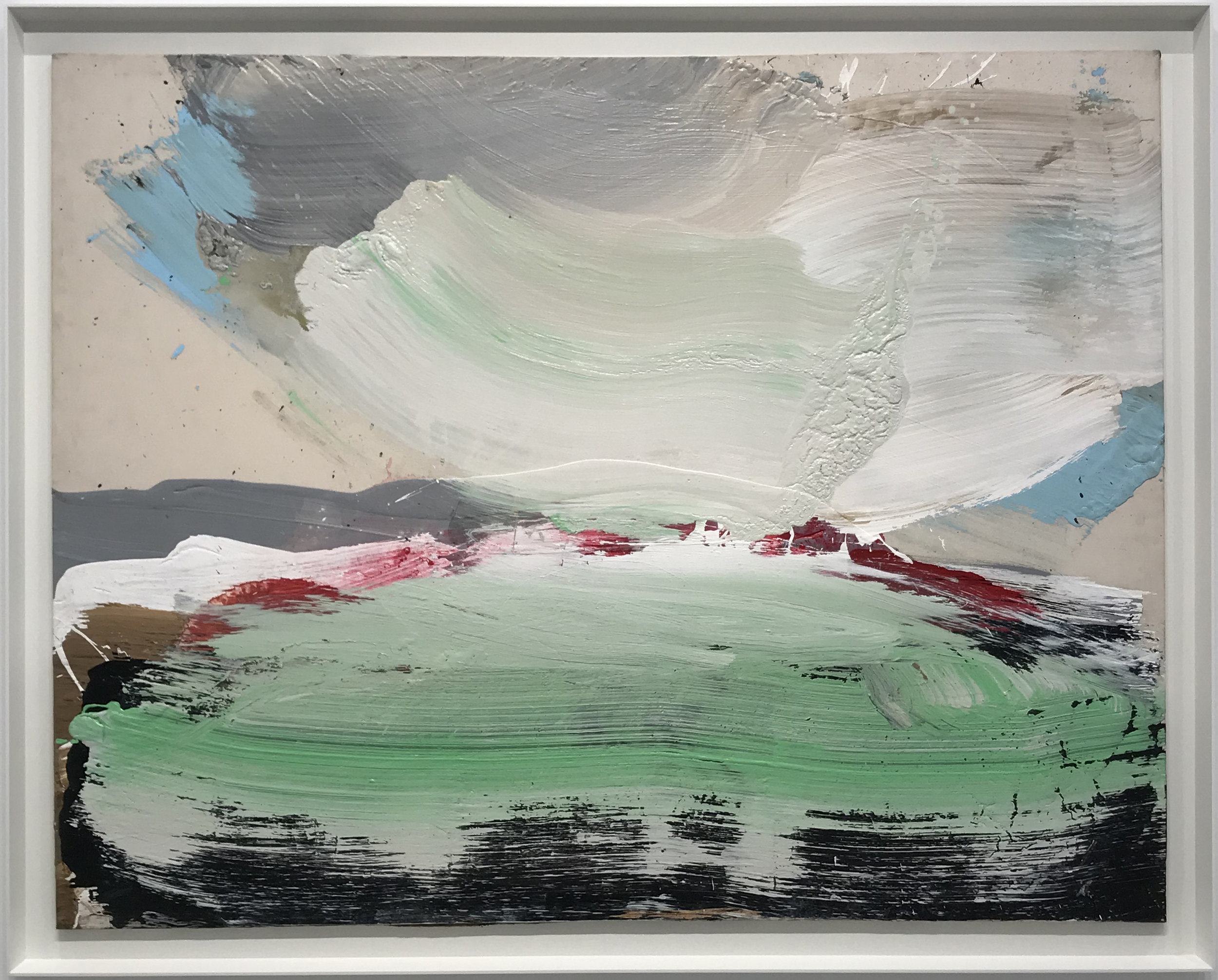
Ron Gorchov: at the cusp of the 80s, paintings 1979-1983, Cheim & Read, through November 15
This was my first visit to Cheim & Read’s new Uptown digs. It’s a lovely space, though so much smaller and more intimate than the old space in Chelsea. It feels a bit too small for Gorchov’s powerful, aggressive paintings. Much has been written about the structure of his shaped canvases. Yes, they resemble shields and masks. However, on this visit, another analogy struck me: the reference to saddles, thus making the primal associations more even complete, more fulfilled. These works are meant to do battle, to seize, to conquer! They will not lay down arms before any friend or foe! In the confines of Cheim & Read’s new space, they were a band of warriors, poised for attack.


Friedel Dzubas: Affective Color, Yares Art, through November 2
I’m a big fan of Yares Art’s Santa Fe outpost. In New York, the gallery occupies McKee Gallery’s as well as Mary Boone Gallery’s old spaces on Fifth Avenue. The gallery specializes in Color Field painting, so of course it was a necessary stop, even though I was unfamiliar with the artist featured in the current exhibition. I loved the Dzubas exhibition and left with a beautiful exhibition catalogue. Dzubas was championed by Greenberg, was acquainted with Pollock, de Kooning, Kline, et al., and was a member of The Club. He even shared a studio with Frankenthaler at one point. So, why haven’t I heard of him till now? I’m sure I’ve read about him, but for some reason, the name didn’t stick. In any case, I was glad to experience this exhibition, full of large-scale works with stacks and patches of acrylic color, each with a fuzzy, hazy edge that at once distinguished it and associated it with its neighbor. Turns out that that Dzubas was primarily influenced by Tiepolo’s frescoes. I found the use of color oddly idiosyncratic and full of juxtapositions of high color and rather muddy, earthy tones. My favorite piece was the epic Procession, from 1975. This work spans nearly 300 inches and is a true tour de force.
Dzubas made small studies for these works, which seem at odds with the grand presence of the paintings, which feel very spontaneous and in the moment. In fact, most of the large works in the exhibition were accompanied by their studies. I’m not sure if it helps or hurts the overall experience of viewing this show. Rather than studies, they almost feel like after-the-fact miniatures of these epic paintings.
Procession, 1975, Magna on canvas, 116 x 294 inches


Gotta love the Dymo label on the side of the frame!

In a Yares Art side gallery, I encountered this lovely Kenneth Noland painting, Spring Call, 1961, as well as Morris Louis’ Number 9, also from 1961.
After leaving Yares Art, I had a quick bite and then took the subway down to the Lower East Side.
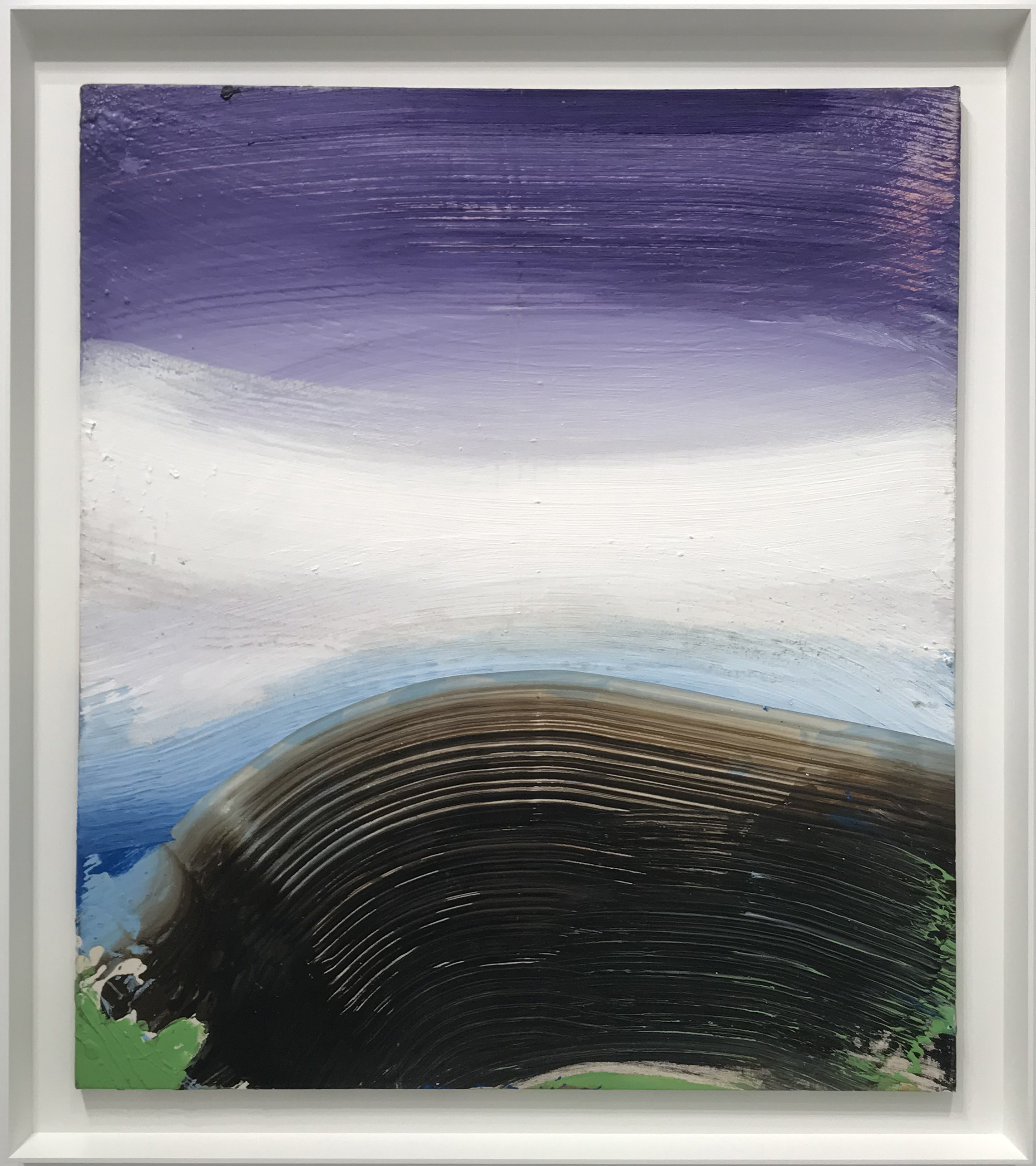
John Zurier: North from Here, Peter Blum Gallery, through November 9
Of course, I know John Zurier from my old life in San Francisco. I greatly enjoyed John’s exhibition, full of wonderful color, subtle brushwork and the introduction (or perhaps just a bit more emphasis on) edges and structure within the fields of color. I’m always interested in observing John’s choice of canvas/linen, which varies from work to work. Sometimes he uses a fine, tight weave, while other times he employs a very nubbly, almost burlap-like weave. These works really honor the edge of the plane, and seem to take compositional cues from the underlying structure of the stretcher bars.


My favorite piece in the exhibition: Hundasúra, 2019, oil on linen 18 x 22 inches.
I wanted to see more galleries on the LES, but I still had a lot on my list, so I Ubered over to Chelsea.
Ed Clark: Paintings 2000-2103, Hauser & Wirth (Chelsea), through October 26
Ed Clark’s paintings remind me a bit of super-sized Howard Hodgkins, albeit with a completely different palette. These works are made using a technique that Clark refers to as “the big sweep”— literally, using a push broom to apply paint to canvas. The scale of the “brushwork” (okay, let’s call it “broomwork”) is epic. There’s no other way one could make these marks and gestures. Clark, a native of New Orleans, spent many years in Paris, hanging out with American expat painters such Joan Mitchell and Sam Francis, as well as a generation of important African-American artists who’d fled racial discrimination in the U.S.
Amy Sherald: the heart of the matter, Hauser & Wirth (Chelsea), through October 26
Amy Sherald’s exhibition was all but mobbed. She’s enjoying a moment, deservedly, after acing the Michelle Obama portrait commission. However, I feel something is missing in the discourse around her work. While issues of race and representation are at the forefront—as they are in the broader culture—they are not what make these paintings successful works of art. What makes these paintings successful is her subject matter combined, crucially, with they way they are painted. Sherald’s achievement is not merely her contribution to our contemporary discourse about race. It’s her contribution to painting, in terms of stylistic leanings and formal decision-making.
In preparation for this writing, I ran across a conversation between Sherald and Osman Can Yerebakan. They covered many topics, including tidbits about Sherald’s partner, her dog, her move from Baltimore to New Jersey, single-hood, romance, her Southern identity…in essence, just about everything but painting, which I found quite curious. However, there were two little factoids to savor: 1) Sherald studied with Odd Nerdrum in Norway, and 2) She buys clothes with which to style her models. The former is so, well, odd, that I don’t even know what to make of it. The latter really piqued my interest, because one of the things I admire so much about Sherald’s works is the way that she uses clothing to construct her compositions, and to signify other value systems that may not be so readily apparent. For example, when I look at the Obama portrait, in addition to Sherald’s stated references to Mondrian and Gee’s Bend quilters, I am reminded of Michelangelo’s Pieta and it’s pyramidal structure, so typical of Renaissance art.


I’m eager to see how Sherald will continue to push the boundaries. This exhibition includes two very large works, one with four figures. However, this is the one that sticks with me. Sherald has a knack for posing her subjects’ limbs in a way that is rather uncanny and strange. It might be my imagination, but I’ve always thought that Michelle Obama’s left arm is rendered in a way that makes it appear bit long. If so, it’s a mannerist tweak that adds yet another layer of art historical references and compositional interest. Similarly, the subject in the portrait below has a strange left arm, with the hand not visibly in a pocket, but awkwardly held behind her back at a strange angle. This lends a bit of tension to the otherwise straightforward, frontal composition. I love this detail, as well as the patterned dress, which harks back to Pop Art (references to Wonder Bread, and/or the game Twister) and also to Op Art strategies.
Luckily I had the forethought to pick up the heavy card for this show at H&W’s Uptown space. In the Chelsea gallery, viewers were frantically trying to grab keepsakes.

Sarah Sze, Tanya Bonakdar Gallery, through October 19
Once again, Sarah Sze creates an exhibition out of anything and everything at hand. The centerpiece of this show, a fragile, scaffold-like structure with scraps of paper and even containers of water serving as screens for tiny video projections, was very similar to an installation I saw in Munich a couple of years ago, In this case, though, Sze uses every inch of the gallery as a studio, laboratory and exhibition space, including the front of the building and various administrative spaces. A backroom serves as a studio space in chaotic disarray, as if the artist had just stepped out for a coffee. Upstairs, there are several paintings that function like accurate 2-D depictions of Sze’s layered, hyper-speed, ad hoc installations. They make sense in a way, and are fully in keeping with Sze’s oeuvre, but I was distracted by their fragile surfaces, with bits of collaged paper tacked on. Although the press release states that Sze was “originally trained as a painter,” let’s face it: that was a lifetime ago. Sze has consistently invested her energy elsewhere, and this exhibition made me think that she has overstretched a bit. To me, the installations incorporating light, video, sound, structure and detritus are still the most interesting and compelling works Sze has created thus far.


Anni Albers, David Zwirner (Chelsea), through October 19
What can I say? This show is both ravishing and rational. It’s logically and materially satisfying, and optically and tactilely engaging. Some of the works show signs of wear and tear, which only serves to make them appear more precious and appealing. I could’ve spent hours here, were it not for all of the mid-century-modern-loving hipsters parading around.

Gorgeous large-scale piece, Camino Real, 1968.
A little threadbare in spots, but very commanding.
Paul Klee: 1939, David Zwirner (Chelsea), though October 26
This exhibition is truly spectacular. The title says it all: 1939. According to the press release:
“The exhibition focuses on Klee’s art from 1939, the year before he passed away, which marked one of the artist’s most prolific periods.
Toward the end of 1933, in response to the suppression of avant-garde art practices by the newly empowered Nazi party, Klee left Germany, where he had primarily lived since 1906, and returned to his native city of Bern, Switzerland, residing there for the remainder of his life. From 1935 until he passed away, in 1940, Klee continually struggled with illness, which at times impacted his ability to work. Yet, in 1939, against the backdrop of immense sociopolitical turmoil and the outbreak of war, Klee worked with a vigor and inventiveness that rivaled even the most productive periods from his youth. The works on view illustrate how Klee responded to his personal difficulties and the broader social realities of the time through imagery that is at turns political, solemn, playful, humorous, and poetic. Ranging in subject matter, the works all testify to Klee’s restless drive to experiment with his forms and materials, which include adhesive, grease, oil, chalk, and watercolor, among others, resulting in surfaces that are not only visually striking, but also highly tactile and original. The novelty and ingenuity of Klee’s late works informed the art of the generation of artists that emerged after World War II, and they continue to hold relevance and allure for artists and viewers alike today.”
The works on view, most very intimate in scale, are by turns delightful and ominous. I was obsessed with Klee when I was a teenager, but lost interest somewhere along the way. Well, I once again count myself among Klee worshippers.

Monsters in Readiness
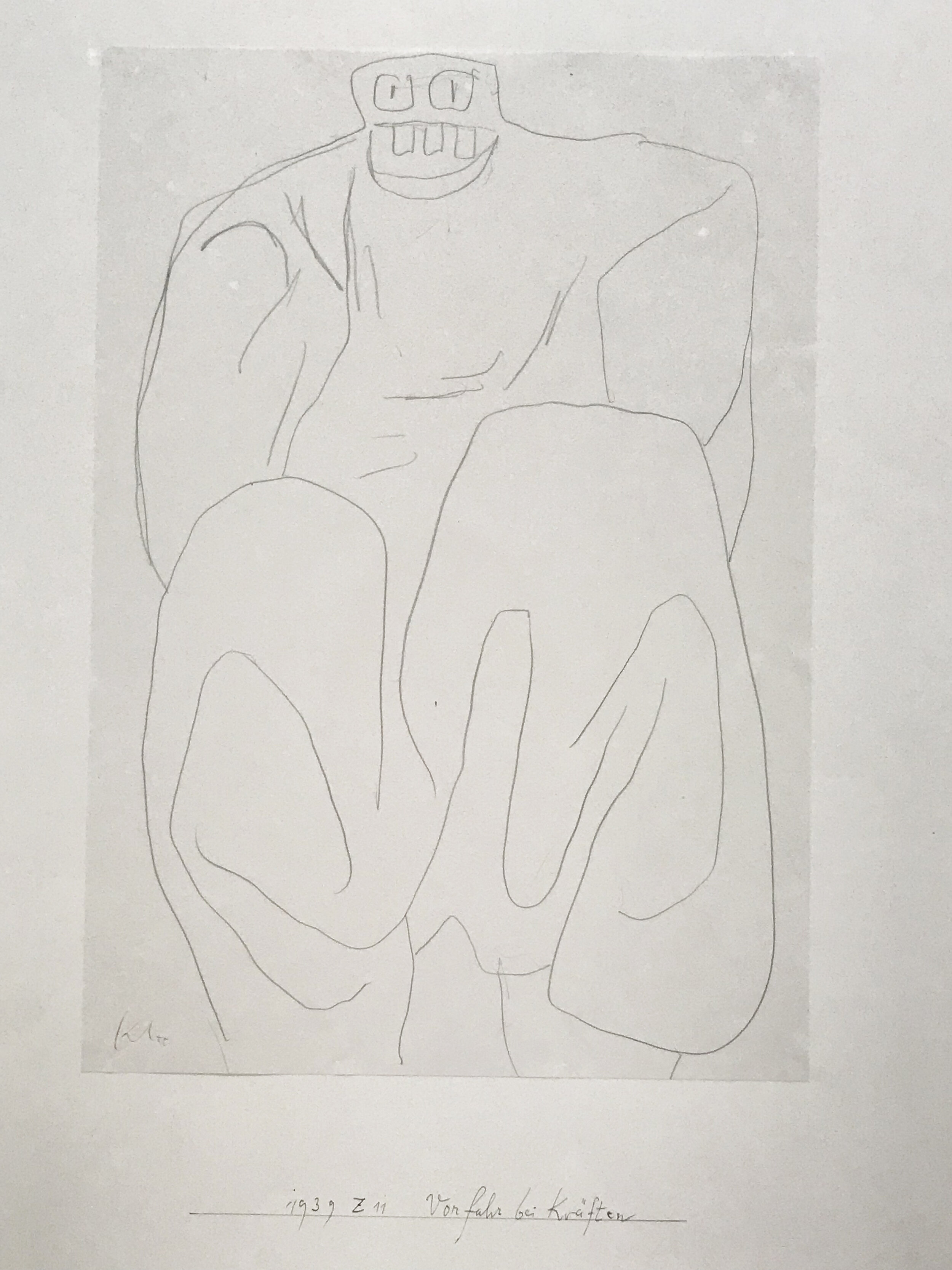
Ancestor in full vigor
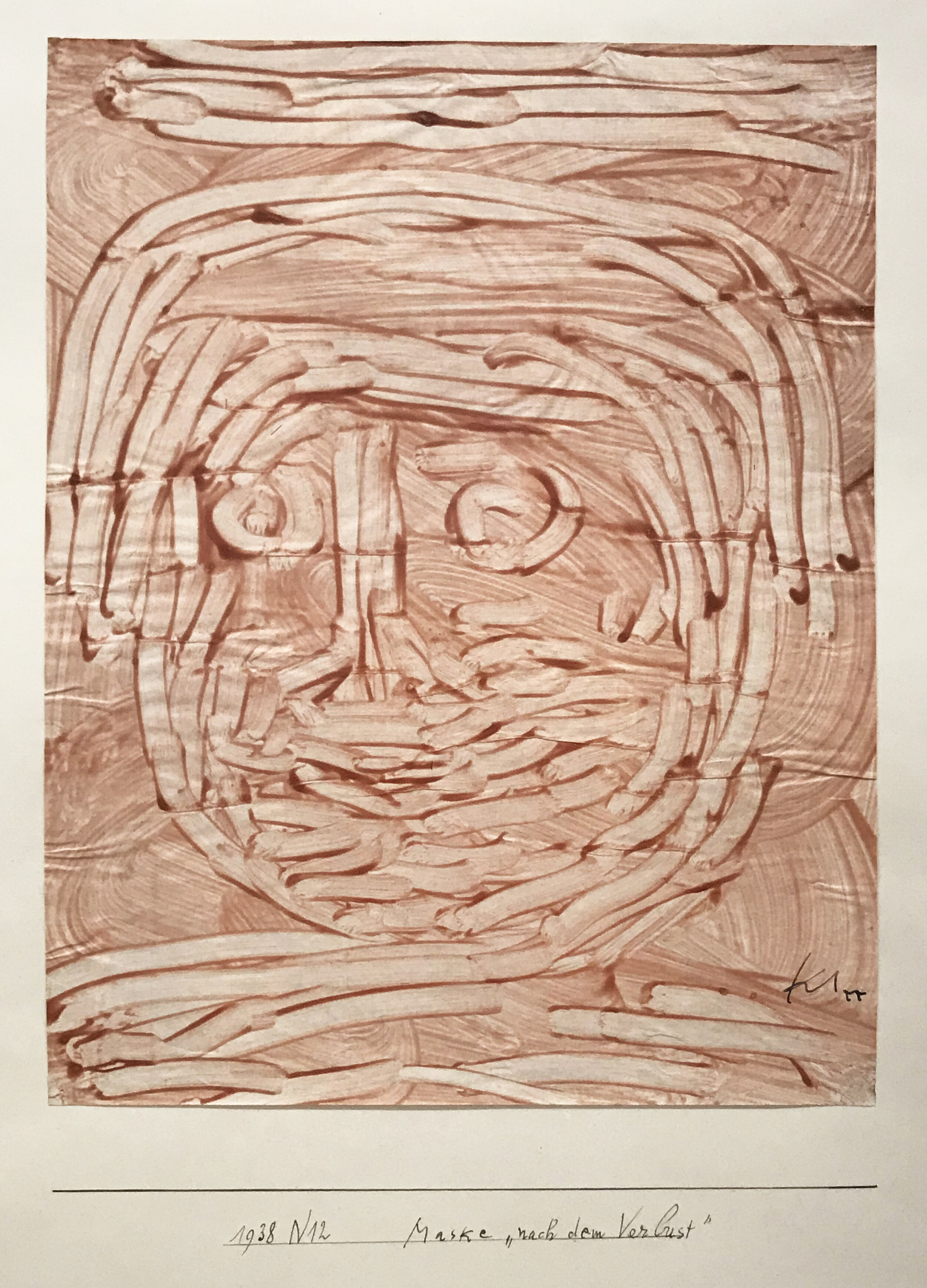
Mask “after the loss”

Nordic artist
Ray Parker: Simple Paintings c. 1960, Washburn Gallery, through November 2
This was my first visit to Washburn’s new space in Chelsea. Washburn, Peter Blum Gallery and a few others were displaced from their Uptown digs in 2017. After 25 years at three locations on 57th Street, the gallery now occupies a modest, street-level gallery in Chelsea. It felt a bit odd to duck in, fresh off the sidewalk, but the minute I opened the door, Ray Parker’s paintings walloped me. What a delight, after the relatively somber (and extensive) Albers and Klee exhibitions. These paintings, with their large, soft-edged, blobby forms (mostly in pairs or trios) occupy the odd space between Abstract Expressionism (Motherwell, Gottlieb) and the crisper geometries and higher color of Color Field painting. The forms have a bodily presence, almost like brightly colored sleeping bags on a neutral ground.


Bernard Piffaretti, Lisson Gallery (Chelsea), through October 19
Last but not least, I straggled over to Lisson Gallery. I loved this super fun, fresh exhibition. Piffaretti has employed his technique of dividing the painting surface and doubling his images for over 30 years, highlighting sameness and difference and questioning notions of originality. He does not exactly “copy” the left side of the painting; rather, he recreates and re-executes the same colors and movements of his hand and brush. Perfect Po-Mo paintings.


Finally, parched and tired, I stumbled back onto the sunny street and hoofed it back to my hotel, before heading Uptown for dinner.