A few years ago, I created a Stickies app list of artists' names on my laptop computer. At first, I thought of it as an imaginary exhibition, but I soon realized that it's actually a wishlist of artists whose work I would love to collect. I know many artists who own art. A few are successful enough to buy it outright, but most collect the work of artist friends, acquired through trade or received as gifts.
If you've been in my home, you know that it's incredibly compact. Nearly every wall is occupied by a window, door, appliance or piece of built-in furniture. We have one, and only one, wall that is large enough for a substantial work of art. What hangs on that wall? A large 1960s tapestry that once belonged to My Beloved's grandmother. She lived to be 106 years old, give or take a few years (she was coy about her age). I always loved the tapestry. It was made by Los Angeles artist John Smith and has the initials JS woven into the bottom edge. I don't know much about Smith, but he made large tapestries for Los Angeles banks and public buildings throughout the 60s. The tapestry hung for many years in Grandmother's Westwood apartment. When she moved into an assisted living facility, she gave the tapestry to me, much to the amusement of the rest of the family. In her old apartment, the piece was under-lit and a little shabby looking. The artist had stretched it over a folding stretcher bar frame. When I took possession of it, it was easy to remove a few screws, fold it in half, wrap it in plastic sheeting and tie it down in the bed of my old Ford pickup. As I recall, we did this on a hot summer day, and the tapestry "sweated" quite a bit in its plastic wrapping on the drive up Interstate 5 back to San Francisco. Of course, I had measured our wall, and was certain that the piece would fit, but when we got it up the stairs and into our flat, it seemed impossibly huge. However, my measurements were correct and it fit perfectly. It's held its place in our dining room for perhaps 12 years or so. I love it just as much as ever, mostly for the nostalgic associations that it evokes: mid-century California design; my undergraduate days at Scripps College, where such idealized imagery would not be entirely out of place amongst the early 20th century frescoes and mosaics found around campus; and the proto-feminist novel Herland, if perhaps it had been set in the 1960s or early 70s. I also love that it was a generous gift that made me feel like a real member of My Beloved's family.

Inevitably, when we have friends over for dinner, someone will ask, "Why don't you have one of your paintings there, instead of that?" Fair question. The answer: I live with my work, all day, everyday. If it is not in physical proximity, it is in my head, banging around, day and night. I really don't need to have it in front of me at all times. In fact, it is good and necessary to be away from it for a few hours a day.
Which brings me back to the subject of my imaginary art collection. What would I love to live with if I had more space to show art and a goodly sum of money to spend? You may have noticed that my imaginary budget is one million dollars. Sounds like a lot, right? Maybe, to some of you, it sounds like very little. If I had a smaller budget, I would probably buy the work of promising emerging artists. Of course, if I had a billion dollars and could buy anything I wanted, my list would be different, or at least more extensive. I would throw tens of millions at Roman antiquities, Picasso and Matisse, first- and second-generation Abstract Expressionism, German Expressionism, Allan McCollum, Jonathan Lasker, Sol Lewitt... ahh...fun to think about.
But, let's say I had a million dollars to spend, and I wanted to buy ten works of art. I am not an expert on prices or the market or the auctions. In writing this piece, I discovered that it is actually pretty difficult to find auction prices, unless you pay to view them. But there have been instances when I have seen price lists at galleries or art fairs and have been greatly surprised by the affordability of certain works by artists that I love, some of whom are on this list. Before I begin, a few things: 1) I do not know exact current values for each of these artists. Some of them have died in the last few years, so their prices may have risen or fallen; 2) my imaginary collection is comprised of things that I love and would love to live with. I have been thinking of most of these works for years--in some cases, nearly a decade; 3) these works are by artists who are well known, with solid careers, but I believe that most of them are somewhat undervalued.
Here they are, in no particular order.
1. Jay DeFeo, works on paper, particularly from the 1980s

Jay DeFeo, Untitled (Eternal Triangle series), 1980
On two separate trips to Santa Fe, NM in the last decade or so, I was lucky to see a pair of absolutely gorgeous Jay DeFeo exhibitions at Dwight Hackett Projects. DHP (now closed) was a fantastic venue, off the beaten track and away from the (mostly) schmaltzy offerings on Canyon Road. The first encounter was on the occasion of Jay DeFeo: No End: Works on Paper from the 1980s in 2006. We walked out of the blazing sun and into the cool garage-like space to find a gallery full of tightly-wound, gripping works on paper, along with a series of photographs, also by DeFeo. I was interested in the former, some of which were from the Eternal Triangle series. At the time, I wasn't familiar with DeFeo's works on paper. These works have a muscular, torqued quality about them. DeFeo was a master of form, and here she has taken the simple, primal form of a triangle and turned it up, down and inside out, revealing every edge, plane and the entirety of volume at once. There is a compressed, animated quality to these drawings, as if she has forced a several dozen animation cells to exist in a single frame. Some edges are jittery, some are succinctly incised. Some elements are transparent, while others are seemingly solid, all of them in a state of material flux that I find quite mesmerizing. As it turns out, the humble subject of these strong works is a simple, worn, kneaded eraser. According to Dana Miller's exhibition catalogue essay:
"In the early 1980s DeFeo used that collection of worn erasers as the basis for a series of drawings that she initially referred to as “the eraser series” and later titled the Eternal Triangle series, including two untitled works in this exhibition. DeFeo photographed her old erasers, collapsing one stretched-out, kneaded eraser in upon itself to create a sculptural form of triangular folds not unlike a fortune cookie. For an artist who often chose to work with a grisaille palette, the black-and-white photographs presented certain advantages as models. DeFeo could manipulate her photographs to alter tonalities, emphasize contrast, and heighten shadows. These elements could then be employed as a means for guiding both the tonal and perspectival aspects of her drawings and paintings. The eraser photographs also possess a sense of ambiguous, artificially compressed space, an aspect of her paintings and drawings of this time."
Jay DeFeo, Untitled (Eternal Triangle series), 1980

Untitled (Eternal Triangle series), 1980

Summer Landscape, 1982
In the early 2000s, the prices for these were around $30,000. They may have increased quite a bit since then, particularly since DeFeo's 2012 retrospective. Let's face it: I would love to own anything by DeFeo, but these works have really stayed with me for over a decade, so it's safe to say that I would probably enjoy living with one them for the rest of my life. I will close this section with a quote from the late Bill Berkson, who wrote extensively about DeFeo:
“Fittingly, the lead sentence of DeFeo’s statement for the “Sixteen Americans” catalogue read: ‘Only by chancing the ridiculous can I hope for the sublime.’ Sublimity was built into the tremendous body language—‘organic’ and full of ‘growth forms’ in the parlance of the time but with supra-organic, and dashingly clear, cosmological overtones—that characterizes the paintings, outsized drawings, collages and other mixed medium constructions DeFeo made from about 1954 on. The ridiculous too was ever at hand. At her most obsessive, DeFeo was gifted with a sprightly sense of play that allowed her to follow her intuitions and yearnings without hammering them into theses. A early as her student years, she later told [Paul] Karlstrom, she had conceived of making an image ‘about being on an edge…I wanted to create a work that was just so precariously balanced between going this way or that way that it maintained itself.’”
2. Nell Blaine, early works from the late 1940s
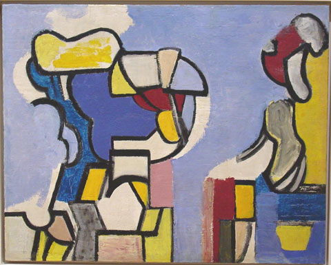
Nell Blaine, Abstraction, 1948-49
Like DeFeo, Nell Blaine possessed a deep understanding of form vis a vis the plasticity of paint. I first saw her work at Valerie Carberry Gallery's booth at an art fair in San Francisco in the early 2000s. I can't remember which fair or what year it was, but I clearly remember VCG's spectacular booth, and thinking who IS this? as my heart began to race. I was bowled over by these works, with their compact, muscular, confident forms. Valerie was so kind to me that day. She gave me two Nell Blaine exhibition catalogues that I often refer to. Blaine was a student of Hans Hofmann and at one time, at the age of twenty, the youngest member of the American Abstract Artists group. She worked in abstraction throughout the late 1940s but then retreated back to figuration, inspired by a trip to Paris with Larry Rivers in 1950, where she was impressed by the work of Vuillard and Bonnard. The abstract works are relatively few, but they hold up exceedingly well. I'm not as keen on the late work, but I would gladly live with anything Nell Blaine made between 1944 and 1949.

Nell Blaine, Peaks, 1948

Nell Blaine, Bones, 1946

Nell Blaine, Abstraction, 1948
Here's a bit of what Roberta Smith had to say about Blaine's early works, in a New York Times review from 2001:
"This terrific show puts on view for the first time in 50 years the astoundingly accomplished abstract paintings that Nell Blaine made in New York in the mid 1940's, when she was barely 20 and fresh off the train from Richmond, Va. With thick black lines and quirky biomorphic shapes submerged in wonderfully forward white backgrounds, they tell a complex story of precocious talent and determination fed by study with Hans Hofmann, devotion to jazz and admiration for Mondrian, Léger and, one supposes, Stuart Davis."
Blaine's early work has become scarce in recent years. An Art News article from a decade ago put her work in the $20,000-$100,000 range, so hopefully she's still within reach. I have been drooling over these paintings and works on paper for nearly 15 years.
3. Roy Newell
Roy Newell, Untitled, 2000
Roy Newell created a group of fifty or so paintings in his fifty-year career that he painted over and over again, sometimes returning to them for decades. It was not uncommon for him to rework paintings for more than thirty years. Each of these little gems exists as a relic of time, attention and material engagement. At the same time, each was an eternal work in progress. Newell worked in isolation, shunned his friends and acquaintances and consistently refused to sell his work. He was friends with de Kooning and Kline, hung out at the Artist's Club and the Cedar Tavern and was just as hell-bent on self-destruction as Jackson Pollock, who he punched out one night after a round of drinks. He was a severe alcoholic and his wife financially supported him throughout his career. Most of the works are diminutive. In reproduction, it is difficult to ascertain the scale of these paintings. In 2010, I saw the exhibition Roy Newell: The Private Myth, curated by Richard Dupont, at Carolina Nitsch Project Room in New York. Together, the works present an amazingly consistent vision. The surfaces are strange, soft-looking and almost felt-like in texture. Newell went against the grain and suffered for it. He was out of step with late AbEx, Pop and Minimalism. Here's a snippet from the exhibition catalogue:
"In a 1986 half page New York Times Review titled “When a Period Lasts a Lifetime”, the art critic Helen Harrison wrote, “The long-term, single minded pursuit of a narrow, self imposed esthetic discipline is rare among visual artists, most of whom undergo the periodic changes in style or viewpoint that we associate with a developing career. Those uncommon few who commit themselves to an approach at once so clearly defined and so personal that it seems to exist outside of time exert a special fascination, especially on the imaginations of their fellow artists. As Morandi represents the ideal “painter’s painter” for the gestural realists, so we might think of Roy Newell as a paragon for the geometric abstractionists.”"
Roy Newell, Untitled, 1959-87
Roy Newell, Silents, 1988, 1966, 1998
According to Newell's New York Times obituary, his total output, over 70 years, was around 100 paintings. I keep coming back to his paintings because of their compositional intensity. Some have a near-symmetry, while others are strikingly off-kilter. The forms seem as if they are woven together and then tightened--ratcheted down-- with excessive force. It's as if color-saturated, dense scraps of felt have been composed and petrified, resulting in very powerful little paintings. I have no idea what the current prices are for Newell's work.
4. Channa Horwitz

Channa Horwitz, Sonakinatography I Composition XXII, 1991
Truth be told, I have never seen Channa Horwitz' work in person. So, although I need to experience her work in person, I am pretty certain that my appreciation of her work will only increase. I'm glad that she received increased institutional attention and support at the end of her career, before her passing in 2013. One wonders whether she would have received more attention in her lifetime had she been a man. Her work involves grids, systems and numeric permutations. It is logic- and rule-based work that references music and spatial coordinates. In contrast to someone like Sol Lewitt, Horwitz' work has an otherworldly quality to it. The logic seems alien somehow even though it is rather straightforward once one understands Horwitz' systems. When I look at her work, I think of the 1970 film Chariots of the Gods which posited that the technologies and religions of ancient civilizations were given to humans by extraterrestrials who were welcomed on earth as gods. I find these works utterly captivating and I can't wait until the day that a major museum devotes some real time and space to Channa Horwitz.
Channa Horwitz, Language: Series Three, 1964.

Channa Horwitz, 8th Level Discovered, 1982
Here's a snippet from Jennifer S. Li's Art in America review of Channa Horwitz' 2016 exhibition at at François Ghebaly, Los Angeles:
"As a student at the California Institute of the Arts, Valencia, in the late 1960s, Channa Horwitz (1932–2013) developed a graphing system that she would use for over four decades, producing some fifteen hundred pieces of ephemera and finished works (with more waiting to be organized and archived). In a 1974 interview, she told the Los Angeles Institute of Contemporary Art Journal: “I am interested in simplifying my tools in order to maximize the potential of the work.”
.............
Most of Horwitz’s work is strictly two-dimensional, but she had a fascination with physical space and with integrating art, music, and language. She staged multiple performances during her time at CalArts, including a Happening with instructor Allan Kaprow. She also developed “Sonakinatography” (sound-motion-notation), a system for organizing graphic and nongraphic elements through the use of color-coded symbols, which allowed her to generate scores that could be performed."
5. Shirley Jaffe
Shirley Jaffe, X Encore, 2007
Ah, Shirley Jaffe! I think of Jaffe as the love child of Matisse and Stuart Davis. Spectacular color, bold, suggestive forms, tightly wound and compact, yet maintaining a nice sense of openness and freedom. I love, love, love these paintings. Jaffe passed away just a few months ago. Like Joan Mitchell, she moved to France (Paris, in 1949) and stayed for the remainder of her career, putting her outside the trends of the New York painting milieu. In addition to Matisse and Davis, I see hints of Mondrian and Léger. I also suspect her influence on younger 1980s painters such as Jonathan Lasker and Matt Mullican--something to do with her use of pseudo-expressive, graphic symbols and signs, I suppose. Jaffe's works are just plain thrilling to the eye, heart and mind. The forms are suggestive enough to keep me guessing. They can't always be decoded. I drift between sensation and thought when I see these works. In my opinion, Jaffe is terribly underrated. Shortly after her death, I saw one of her large works prominently installed at the Centre Pompidou, a big honor for an expatriate woman painter. In a 1990 issue of Artforum, Donald Kuspit wrote about Jaffe’s first US solo exhibition, which took place at Holly Solomon Gallery when she was 60 years old:
“The brightness of color, the diversity of unresolved, quirky shapes on the canvas, and the tendency toward quick, succinct statement suggest a determination to remain innocent, perhaps to make a kind of sophistication or cult out of innocence.” Kuspit also compares Jaffe’s works to Henri Matisse’s cutouts: “Her shapes are the product of a similar process of essentialization, and her colors seem derived directly from those of Matisse, even seem to be a play on them.”

Shirley Jaffe, Horizontal Black, 2015

Shirley Jaffe, The Black Line, 1974
If I recall correctly, I saw this 1974 Jaffe at one of the Miami art fairs a few years ago. I believe it was priced at around $70,000. I like to think that her prices have increased in the past few months, but an artist's death can sometimes cause prices to dip.
Shirley Jaffe, Four Squares Black, 1993
6. Frederick Hammersley

Frederick Hammersley, Screen Door, 1969, computer-generated drawing on paper
Fred Hammersley made three distinct bodies of work, and I love each of them with equal fervor. He is probably most appreciated for his hard-edge geometric abstraction. Hammersely, along with Lorser Feitelson, John McLaughlin and Karl Benjamin, was in the groundbreaking 1959 exhibition, Four Abstract Classicists, curated by the art critic Jules Langsner at the San Francisco Museum of Modern Art. If Hammersley's entire output consisted of geometric abstractions, I would still love him madly. But luckily, he made things a little more interesting for himself, and for the rest of us. First, he left Los Angeles and moved to Albuquerque to teach at the University of New Mexico. Clearly, the move put him outside of the burgeoning LA art scene of the 1960s and 70s. Second, he produced two other bodies of work: the "organics," which are small, biomorphic abstractions in funky handmade frames, and a large body of computer generated work. Of the latter, he said:
"This happened to coincide with a time in which I had painted myself out, so I welcomed this new experience. I was shown how to prepare a computer program and how to transfer it to an IBM punch card by machine. The alphanumeric characters we could ‘draw’ with were: the alphabet, ten numerals and eleven symbols, such as periods, dashes, slashes, etc….It took me some time to get used to this medium. What I intended to make did not always correspond to the program I thought I had punched in the card. I made many mistakes which the computer, in its logical way, would not print. The intricacies and possibilities seem endless and I have spent a great deal of time simply trying to master the mechanics of this particular technique."

Frederick Hammersley, Tango, 1979
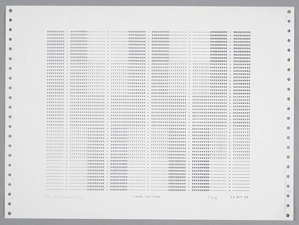
Frederick Hammersley, EQUAL TEA TALK, 1969

Frederick Hammersley, Orchestra, 1987, oil on rag paper on linen on wood in artist-made frame

Frederick Hammersley, Hot & heavy, 1990, oil on cotton on birch in artist-made frame
I don't know what the current prices are for Hammersley, but I would take anything, even a print. He made some gorgeous prints based on the computer drawings in the early 1970s.
7. Sheila Hicks

Sheila Hicks, Never Say No, 2015
I haven't seen much of Hicks' work in person. She is well-known for her large-scale commissions and installations. These days, we're having a resurgence of traditional craft-based work such as weaving, ceramics, etc. Hicks has made textile-based sculptural work and weavings since the late 1950s, when she traveled on Fulbright scholarship through South America. Like Jaffe, she spent most of her career in Paris, having moved there in 1964. For half a century, she made what she refers to "minimes," small studies, approximately the size of one's hand. She has created over 1,000 of these studies during her long career. They are diaristic, employing whatever materials might be at the ready in a given day: along with colored yarn or thread, they might include scraps of wood or other natural materials, or rubber bands and the like. Hicks uses a small, portable makeshift loom to make these woven sketches. On the occasion of her 2011 retrospective, Artforum's Lauren O'Neill-Butler wrote:
"To weave, to twist, to knot, to wrap—the processes animating fifty years of fiber-based work in Sheila Hicks’s traveling retrospective may conjure several of the actions inventoried in Richard Serra’s iconic 1967–68 Verb List, which is now on view in his survey of drawings at the Metropolitan Museum. Here are a few more connections linking this (very) odd couple: Both received MFAs from Yale (Hicks in 1959, Serra in 1964); both studied with Josef Albers; both make “sculpture in the expanded field”; both use unconventional materials; both make monumental public art. And yet Serra is much more known, his statements made in steel, lead, and paint stick; hers are made in wool, linen, and cotton."
Again, I'm left to wonder about the role of gender as well as expatriate status and how both might have shaped Hicks' career. She had a 2015 solo exhibition at Sikkema Jenkins, so one would expect that her prices are healthy at the moment.

Sheila Hicks, Aube, 2008

Sheila Hicks, Zapallar, 1958, and Cluny II, 2008
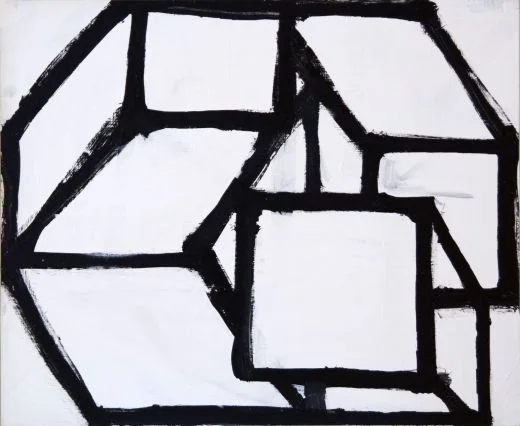
8. Al Held (something, anything, even a little sketch)

Al Held, Untitled, 1967, India ink on paper
Al Held is one of my all-time favorite painters. Most of his work is monumental. So, it's safe to say that his prices absolutely bust my imaginary budget. Throughout this exercise, I have tried to select artists whose primary output is in the "affordable" realm; therefore, I won't resort to "buying" little scraps from super famous artists. However, I will make an exception for my pal, Al. Al Held has such mastery over scale that his small studies, like this one, at a mere 20 x 24 inches, packs almost as much punch as his large-scale works of the same era. The ink drawings combine the bold geometry of his work typical of the mid- to late 1960s with the calligraphic assuredness of an expert Japanese brush painter.

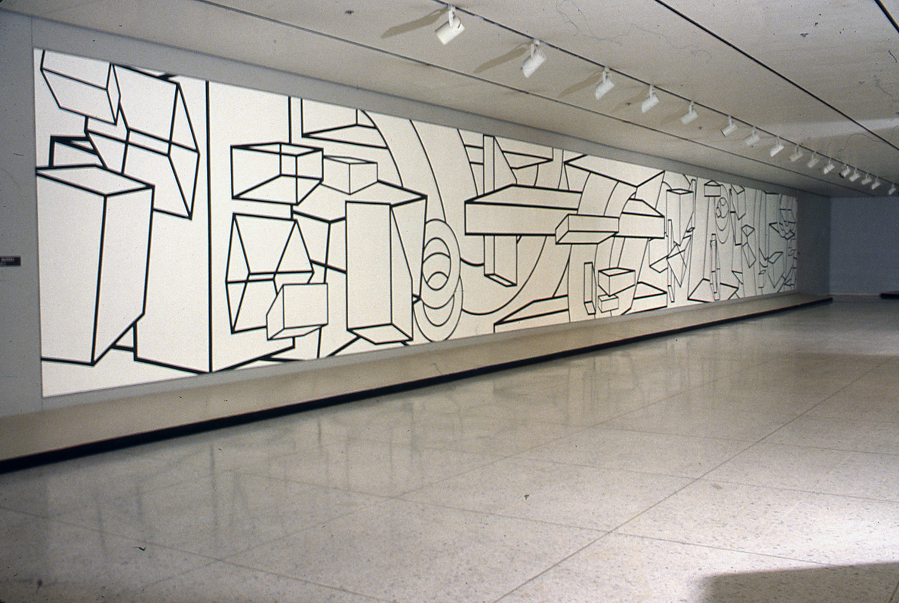
Al Held, The Big "A," 1962, acrylic on canvas, 120 x 168 inches
I was lucky enough to see the terrific exhibition AL HELD: BLACK AND WHITE, 1967 at Loretta Howard Gallery in 2012. According to the press release:
"This exhibition highlights early black and white works from a pivotal moment in the artist’s career before his monumental black and white paintings of the late '60s and '70s. Here we see the artist as he turns a corner, playing with scale, space and geometry but still dedicated to the physical realities of painting. Held’s forms vibrate and collide in space, marking the artist’s shift from flat color to optical geometry and tearing open the picture plane of Abstract Expressionism.
Art Historian Robert Storr writes: “What he was trying to do was to muscle painting back into three dimensions without betraying its character as painting or his own long-standing commitment to the primacy of gesture.” Exceptional in their own right, these pictures mark the beginning of an almost four decade long dialog wherein Held changed the language of abstraction."
The black and white studies were made in preparation for the large-scale works.

Cheim & Read exhibition, Al Held: Black and White Paintings, 2016.
I can't get enough of Al Held's work. There's much to appreciate in each period of his trajectory, but I favor works made up until the late 1970s. The late works are amazing in their compositional complexity, but the use of color doesn't always sit well with me. Still, Held is a true master, no doubt about it.
Al Held, Rothko's Canvas, 1969-70, acrylic on canvas, 10 x 90 feet
9. Suzanne Blank Redstone, 1960s Portal Paintings

Suzanne Blank Redstone, Portal - Descent, 1968
I wrote about Redstone's work in a previous blog post. I'm still thinking about her September 2016 exhibition at Jessica Silverman Gallery. Like some of my other picks, Redstone's work is based in Geometric Abstraction. Like Al Held, she creates a fragmented, topsy-turvy sense of space using simple geometric forms and a limited palette of mostly red, blue, yellow and black, white and grey. When I first saw this exhibition, I was struck by the looseness of some of the paint handling. The works are slightly rough around the edges; gradients are not perfectly smooth and some of the shapes are not as crisply defined as one might expect when looking from a distance. The paint surface is a bit chalky. In other words, these paintings look like they were made in another time, for if they were made now, I think they would be tighter, crisper, slicker. There is a pleasing wonkiness to them.
Redstone is in her 70s and has worked for most of her career outside of the the U.S., and has steadily produced despite not having gallery representation until recently. It's wonderful that she is finally getting some recognition, but once again, I wonder: what took so long? I didn't see prices at the gallery, but I am betting that one of these could be acquired with my imaginary budget. If not, I also love Redstone's works on paper.

Suzanne Blank Redstone, Portal 8, 1968

Drawing for Portal 2 #1, 1967

Suzanne Blank Redstone, Preliminary drawing 3 for After van Doesburg, 1968
From Gwen Allen's Art In America review:
"In a brochure essay for the show, Jenni Sorkin suggests that Redstone’s belated recognition fits a pattern common to women artists. But if the gender politics of the art world have affected the reception of Redstone’s work, her identity and lived experience as a woman have also surely shaped its production. Helen Molesworth provides a compelling framework for such an interpretation in her catalogue essay for “WACK! Art and the Feminist Revolution,” the touring survey that originated at the Museum of Contemporary Art, Los Angeles, in 2007. Though she does not discuss Redstone per se, Molesworth points to the “ambivalence” with which a number of female painters of Redstone’s generation, including Mary Heilmann, Howardena Pindell, and Joan Snyder, have appropriated modernist techniques and tropes that have been historically and culturally coded as masculine. Like the artists Molesworth discusses, Redstone simultaneously deploys the formal devices of modernist abstraction and distances herself from them, reinscribing them with a difference that does not necessarily or simplistically equate with gender, but does lend originality to this particular body of work."
10. Marcia Hafif

Marcia Hafif, Mass Tone Painting: Cadmium Yellow Medium, Oct 2, 1973, 1973
Marcia Hafif, like some of my other picks, lived abroad for a good chunk of her career. Her work is about the materiality of physical matter as applied to a planar surface: the very stuff of painting itself, in the most pure, reductive, systemic way. At 88 years old, her lifetime body of work is freakishly consistent and logical, but also poetic. Her color associations reflect, among other things, her travels in Italy. To me, the color choices are completely evocative of place.
Hafif's website is descriptive, concise and well-organized, reflecting her clearly delineated process. She states:
"The Inventory is a listing by series of works in the approximate order they appeared. One series followed another at approximately two years intervals, in idiosyncratic order, building my project of examining the methods and materials of Western Painting in the form of works of art.
In 1972, in order to start at the beginning, I covered a vertical sheet of drawing paper with vertical pencil marks starting from the top left and ending at the bottom right. Each drawing developed in a slightly different way leading to unexpected patterns within that same procedure. I turned to paint, acrylic at first presenting a palette of fourteen colors on fourteen canvases then oil in The Extended Gray Scale, 106 canvases graduated from white to black.
About this time I was lent Max Doerner's book, The Materials of the Artist and Their Use in Painting that led me to experiment. I bought every color in powdered pigment that I could find using a glass muller to grind them one by one into linseed oil making my own paint. Each color was painted on prepared canvas on a ready-made stretcher each element referring to Painting. Wall painting came next, then grayed colors, the color of "the most beautiful black," and the color of skin in European painting each displaying some technique such as egg tempera, encaustic, watercolor, glaze or scumble."

Marcia Hafif, Mass Tone Painting: English Red, March 5, 1974, 1974
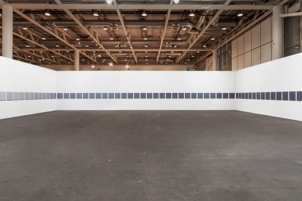
Marcia Hafif, 2015 installation view of An Extended Gray Scale, 1972-73. Hafif painted as many gradations from white to black as she could distinguish, for a total of one hundred and six 22 x 22 inch oil paintings on standard cotton canvases.

Marcia Hafif, Pencil on Paper: February 9. 1972, 1972
So, there you have it.
Until next time.